Become a MacRumors Supporter for $50/year with no ads, ability to filter front page stories, and private forums.

Silver78

Cancelled
Original poster
Aug 24, 2013
524
280
It feels like everything new is just thrown into “accessibility“ … the settings on my ipad is really not intuitive.

The menus are are all over the place..
i find myself having to google the placement of many functions.

lately I had to find “auto screen brightness” under accessibility..

why are these setting menus not intuitive?
 
Last edited:
It feels like everything new is just thrown into “accessibility“ … the settings on my ipad is really not intuitive.

The menus are are all over the place..
i find myself having to google the placement of many functions.

lately I had to find “auto screen brightness” under accessibility..

why are these setting menus not intuitive?
Completely agree with this. Same thing for me with auto screen brightness. How it’s not under “Display and BRIGHTNESS” is way beyond me.
 
I think everything that Apple wants to be hidden from the user goes in the “Accessibility” section. With the auto-brightness, for example, I feel like they want to save from battery replacements and lawsuits for degrading battery, for example (as the users might turn off auto-brightness and use full brightness at all times, which would lead to a faster wearing off of the battery than what is suggested on the Apple’s website). I’m sure these decisions are not made to help the end-user, but the company instead.

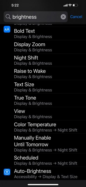
Furthermore, the search function is pathetic and does not really work properly.
 
When I search for brightness, the auto-brightness option does not appear.

IMG_0323.png
 
It is time for Apple to rethink and reorganize the Settings for iOS 16. There is really no reason why some of the entries are placed where they are. No headers indicated why they are placed where they are or what the section of Settings is related to. I think the worst part is the order in a section of the Settings, not alphabetized just seems like a random order of the placement of the entries.

I think this is the perfect example of complication and confusion through complexity.
 
The programmers are presumably doing what the designers tell them. And there were many meetings where designers discussed how the settings should be laid out.

I’ve worked for quite a time in a very large corporation as a software developer.

If they can’t speak up, then they’re not good programmers.
 
I think everything that Apple wants to be hidden from the user goes in the “Accessibility” section. With the auto-brightness, for example, I feel like they want to save from battery replacements and lawsuits for degrading battery, for example (as the users might turn off auto-brightness and use full brightness at all times, which would lead to a faster wearing off of the battery than what is suggested on the Apple’s website). I’m sure these decisions are not made to help the end-user, but the company instead.
This.
It's a catch 22. I believe Apple might originally have good intention to keep things simple by hiding certain settings in accessibility. However, it becomes annoying for some of us who wanted specific things and couldn't find it in the obvious section.
 
I think everything that Apple wants to be hidden from the user goes in the “Accessibility” section. With the auto-brightness, for example, I feel like they want to save from battery replacements and lawsuits for degrading battery, for example (as the users might turn off auto-brightness and use full brightness at all times, which would lead to a faster wearing off of the battery than what is suggested on the Apple’s website). I’m sure these decisions are not made to help the end-user, but the company instead.

Furthermore, the search function is pathetic and does not really work properly.
If what you say is correct that then do you not think that “avoiding degraded batteries” benefits the end-user?
 
Yes, agree it is a hot steaming mess. Sure there is search, but that is just a palliative, it doesn't address the underlying chaotic organization.
I think Settings is/has been due for a restructuring. Something a bit more like the Settings app in modern Windows—most things out of the way with logical, minimal categories presented upon opening the app, resulting in a more streamlined, focused, useful, and simple interface (even with the addition of the search/category drop-down as seen in Windows 11). Or maybe more like macOS’s System Preferences categorization, since it is Apple we’re talking about here.

Perhaps this restructuring could be a setting in itself with its own option-granting toggle for flipping between classic/modern Settings.

Moral of the story, in my opinion as an average user, is Apple could stand to both get things out of the way/break them down (long-ass application-specific list at the bottom, anyone?) and put them where they most graspably fit (auto-brightness) to visually and structurally empower the user over what should be their domain while retaining overall and immediate simplicity and ease of use…and of course the well-loved, unique Apple design approach.
 
Last edited:
  • Like
Reactions: Reggaenald
Apple needs to completely reorganize the Settings app both on iOS and macOS. I really like the grid layout on Mac, but I’m not sure if it would work on iOS, maybe in iPadOS.

If you look under the Focus tab and select a focus mode, the options will have icons and be displayed in the focus color. I don’t think that individual options have icons like this in any other tab. Is this kind of attention to detail that is really missing in Apple software from the last years.
 
Last edited:
Y’all are forgetting that it used to be there in older iOS
Not forgetting at all which makes it more confusing as to why it was moved. Doesn’t change the fact that it isn’t there anymore though. This is not a setting I play with often. Usually only look for it when my auto brightness is acting weird to see if it’s toggled on. So if that’s once every year, I’m sure I’m gonna forget it’s not in the obvious place.

Had a similar situation with Siri Watch Face data resources in the Watch app. One would expect to be under Siri, since they’re Siri suggestions but it’s in the “Clock” setting all the way at the bottom.
 
Register on MacRumors! This sidebar will go away, and you'll see fewer ads.