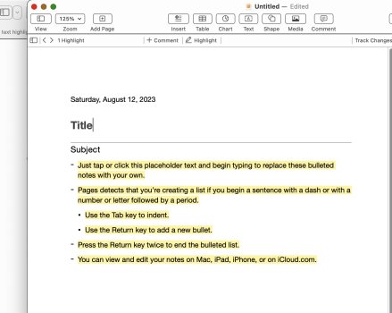
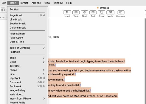
This is how you highlight text in Apple's iWork Pages, their Microsoft Word competitor. In the old Pages '09 version of the software, the highlight function used to be located normally, right next to text background. Now? Instead of locating the highlight feature right next to the text color function, you have to click this little cog wheel, then you have to understand that "Text Background" is what Apple is calling "Highlight," and then use that.
Why this convoluted multi-step process for a very routine part of text editing?? This is so unlike Apple—just awful design. It makes even less sense when you consider that Pages was redesigned based on the iOS version of the app, which is supposed to be more touch-friendly. Yet this is a terribly unintuitive and non-touch friendly design.

Why this convoluted multi-step process for a very routine part of text editing?? This is so unlike Apple—just awful design. It makes even less sense when you consider that Pages was redesigned based on the iOS version of the app, which is supposed to be more touch-friendly. Yet this is a terribly unintuitive and non-touch friendly design.