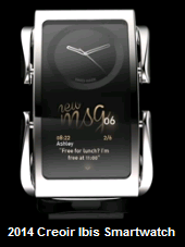
I think the Gear Fit is a rather interesting design although I think the orientation of the screen is not quite right. However, I also do feel that a horizontal display is advantageous to a vertical display because of how information, particularly text, can be laid out better on a horizontal display.
I think a horizontal display works if it is wrist-down, and you can interact with it while holding your hand wrist facing yourself. On the other side, a more traditional looking circular clock-face can be employed to serve the function of a time-piece. To keep battery consumption low and to have an always-on display, this clock-face can use an e-ink screen.
A photoshop hack-job just to illustrate:

I suppose dual-displays isnt really an Apple thing and that it may be technologically difficult to keep the device form factor thin and elegant, but I think it still makes some sense by offering a horizontal display, an always-on watch-face when the device is not being actively used, and also a more traditional looking watch that serves as a fashionable timepiece not too different from existing watches.
I think a horizontal display works if it is wrist-down, and you can interact with it while holding your hand wrist facing yourself. On the other side, a more traditional looking circular clock-face can be employed to serve the function of a time-piece. To keep battery consumption low and to have an always-on display, this clock-face can use an e-ink screen.
A photoshop hack-job just to illustrate:

I suppose dual-displays isnt really an Apple thing and that it may be technologically difficult to keep the device form factor thin and elegant, but I think it still makes some sense by offering a horizontal display, an always-on watch-face when the device is not being actively used, and also a more traditional looking watch that serves as a fashionable timepiece not too different from existing watches.


