Become a MacRumors Supporter for $50/year with no ads, ability to filter front page stories, and private forums.

mariahlullaby

macrumors 6502a
Original poster
Jan 19, 2005
852
3
NYC
Hi guys!

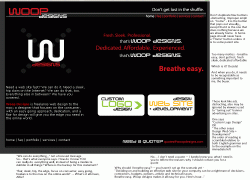
I've finally started work on a web site for my freelance web work. I've gotten the first "draft" of the web site done and I've uploaded it to my school account. Obviously, the links, etc. don't work (and the intro text is off).

But can I get some critique on the design/layout? It sort of seems cluttered to me. Suggestions? Thanks!

http://homepages.nyu.edu/~mkw254/
 
I'd say splash some different colors in the main site. The two boxes to the bottom right look too much like advertisements, because they stick out too much. I'm not too much of a fan of the color scheme.

Do something subtle to section off the space. You can tell that you're going for four different "sections" in the main window, but maybe a line down the center will help clear things up.

Great name, great logo.

Is it necessary to have the menu show up twice?

I'm being picky, but thats probably what you wanted. It looks great, it really looks very professional.
 
Here are some comments attached to a screenshot

Lots of work yet to do...
 

Attachments

  • woop.gif
    woop.gif
    57.2 KB · Views: 205
I don't mind the use of the two call out boxes on the bottom right- but the font is overkill. I realize it is your logo font- but fonts like that need to be used sparingly. I would at the least bring the Myriad in for the smaller words in the boxes as you've done just above it.

Also, bump your body copy in off of the left edge.

Having the navigation repeated is a bit silly for a page with such little content.

Try putting a little more space between each of the nav elements at the top right.

Looks pretty good though.
 
dornoforpyros said:
ohh white and red on a black background....how every 1998 of you.

also, is there any paticular reason your logo appears to be a knock-off of
Web Agent 007?:rolleyes:

You mean because it's a similar font? Give me a break.
 
I like the look of some of the individual elements, and I love the name, but you're right, it looks a bit cluttered. There are three, maybe even four, eye-catchers that compete for first attention, instead of one main eye-catcher. I don't think that's good, but someone with more design experience will probably be able to tell you more on how to fix it up a bit.

Other than that, I agree with most of what CanadaRAM suggested.
 
Am I the only one who's a fan of centered sites? Even if there's a static box of content, I rather prefer it to be centered to my browser window.

That's a hot critique, CanadaRAM.
 
decksnap said:
You mean because it's a similar font? Give me a break.


It's not just the font (although that's a big part of it)

hmm
WOOP looks a lot like
WA007 in that font. (double zeros & O's, 7 & P both look pretty similair)

ohh and look...there's red again
 
dornoforpyros said:
It's not just the font (although that's a big part of it)

hmm
WOOP looks a lot like
WA007 in that font. (double zeros & O's, 7 & P both look pretty similair)

ohh and look...there's red again
There's a vague similarity, but the WOOP DESIGNS logo looks better, and the red colour is used in a very differen manner on those two sites. If there has been some inspiration from the WA007 site, I hope woop doesn't borrow more from them, because the webagent007 site is a complete mess, in my opinion. (Except for the cartoon animation, which was great.)
 
gekko513 said:
There's a vague similarity, but the WOOP DESIGNS logo looks better)


what? wow, I guess un-inspired derivative design is rewarded more than I thought around here.

I'm not saying either logo is great, (their both just a word mark based on a font really) but calling WOOP the better of the two is surprising.
 
dornoforpyros said:
It's not just the font (although that's a big part of it)

hmm
WOOP looks a lot like
WA007 in that font. (double zeros & O's, 7 & P both look pretty similair)

ohh and look...there's red again


Good point. No two companies have ever used similar fonts or colors for their logo.
 
gekko513 said:
There's a vague similarity, but the WOOP DESIGNS logo looks better, and the red colour is used in a very differen manner on those two sites. If there has been some inspiration from the WA007 site, I hope woop doesn't borrow more from them, because the webagent007 site is a complete mess, in my opinion. (Except for the cartoon animation, which was great.)

Agreed. That wa007 site is god-awful. Back to school.
 
decksnap said:
Good point. No two companies have ever used similar fonts or colors for their logo.


yeah your right, and the fact that as soon as I saw WOOP's logo I thought of some one else's company speaks volumes about how original it is.

Hey, is this logo here nice? It's for my new company, orange computers. No one's ever used a silhouette before :rolleyes:
 

Attachments

  • orange.jpg
    orange.jpg
    5 KB · Views: 274
dornoforpyros said:
yeah your right, and the fact that as soon as I saw WOOP's logo I thought of some one else's company speaks volumes about how original it is.

Hey, is this logo here nice? It's for my new company, orange computers. No one's ever used a silhouette before :rolleyes:

OK well that's just ridiculous.:rolleyes:

If wa had CREATED that typeface you might have a point.
 
CanadaRAM:

Wow! I appreciate all the time you put in to helping and giving suggestions; they're invaluable. I definitely see what you mean about the extra buttons looking like graphics, so I'll look into streamlining -- or simply removing them.

Yeah, I'm sort of playing around with slogans/focus at the moment. I have to figure out how to market myself (as well as distinguish between "company/we" and "freelance web designer").

With the navigation, I had the "home" in white with the idea that the page you're currently viewing would be in white (when I did the subsequent pages). But maybe that's too gimmicky?

Also, with the second navigation, that's really for later pages but placed there for uniform sake. The index page is the smallest, but my later pages will be longer....but I suppose even so it's redundant. I think I'll remove them.

ohh white and red on a black background....how every 1998 of you.

also, is there any paticular reason your logo appears to be a knock-off of
Web Agent 007?

Never seen that site until you posted it today. Pure coicidence. I've been using the font (SavedByZero) for some time, and I chose to call my venture "Woop" as it's a phrase associated with me by friends, family, etc. that I thought would merge well into the web design field by retaining a younger, but still ME type of image.


Thank you for all the suggestions, everyone! I obviously still have a lot of work to do, but I like getting input from real users as soon as I'm in my "idea" stage. Thanks!
 
dornoforpyros said:
ohh white and red on a black background....how every 1998 of you.

also, is there any paticular reason your logo appears to be a knock-off of
Web Agent 007?:rolleyes:

Ignore the tripe comments about colour and web design, mariahlullaby.

It does not matter what choice it is, as long as it is inline with your concept and context. Who gives a crap if it's 'very 1998' (which sounds so bloody camp)... As a customer, I wouldn't know or want to care about that in the slightest. Only those same characters who have to follow the trends set by other designers, and have no courage to say bollocks to what someone thinks was 'fashionable' years ago. Think first; Why use these colours, and what do I want to say? Then; What do they say about my company? What does it say to my potential customers?

If it works it for your concept and audience, then use it. That's the main focus of anything you do for your site, mariahlullaby.

Take a leaf out of CanadaRam's book, decksnap, that's how you think as a designer.
 
MagicWok said:
Ignore the tripe comments about colour and web design, mariahlullaby.

It does not matter what choice it is, as long as it is inline with your concept and context. Who gives a crap if it's 'very 1998' (which sounds so bloody camp)... As a customer, I wouldn't know or want to care about that in the slightest. Only those same characters who have to follow the trends set by other designers, and have no courage to say bollocks to what someone thinks was 'fashionable' years ago. Think first; Why use these colours, and what do I want to say? Then; What do they say about my company? What does it say to my potential customers?

If it works it for your concept and audience, then use it. That's the main focus of anything you do for your site, mariahlullaby.

Take a leaf out of CanadaRam's book, decksnap, that's how you think as a designer.

Haha, thanks! I appreciate that.

Well, I've updated the site a bit. I'm still working on getting some color in there, and I'll probably get rid of the "Don't get lost in the shuffle" thing too. I'm afraid the "Breathe Easy" doesn't make sense though. I think I'll do an actual graphic of my signature, instead of just my name, and in white.

How do you guys feel about splash pages? Waste?

Thank you so much! Usually the most feedback I get is "It's nice" or "Cool" but nothing I can actually build on.
 
no splash pages

customers will want to get to the point as fast as possible
 
decksnap said:
I am a designer. Or did you mean Dorno...
Dorno's a designer too...

Point being everyone has opinions.
The task here is communication -- what is going to motivate the buyer of design services to contact MR's favorite Mariah Carey fan?

Put yourself in the shoes of your customer, find out what their goals and concerns are (not what you 'imagine' them to be or what you think they 'should' be) * What market research have you done? How many potential clients have you surveyed for what their requirements are? Would you advise a CLIENT to choose a slogan and a product package design for a major product launch without doing extensive market research? In this case, YOU are the client. Do the homework, homey.

Proactively answer their concerns
Show them how their goals will be met
Differentiate yourself.
Speak their language

Here's one concern to address:
"What, you're one young guy with a new business? I have a business that has been going for 18 years, I need to grow it for the next 10. I've already had one designer do a runner on me when they couldn't handle the job - left me with a non-functional website. I lost 6 months and $2000 on the creep and now he won't answer my phone calls. Why should I trust YOU with my critical business commmunications? How do I know you will take the job to completion and be there in 5 years when I need you for more work?"
 
Let me preface this by saying this: I don't claim to be a designer, but I play one on TV :) OK really I ran a web development business in the past, but my partner was the designer and I was the developer so take my opinion for what you will.

I don't mean to be a downer, but there is not really anything about your site that I like. The dotted line seperator is very annoying, it makes my eyes hurt. It's not valid html. the w background image is distracting. "that's woop designs" is like a phrase from the 90's or something (meaning it's not old enough to be retro and cool, so it's just out of date). the three steps to breath easy is lame. you don't need two logos, lose one of them. i would take the white lines out of the header, but i guess that's a personal preference. the reds in the graphics don't match the reds in the actual text in the page (you probably need to adjust your proof setup options in photoshop).

I want to make your project, large or small, my priority. I will work with you until you web site is perfect.
So you only want to make my project a priority? It's not actually going to be one? And "until you web site" should say "until your web site"

again, sorry for being such a downer, it certainly is far from the worst web sites I've seen from people who want to be designers, but you did ask for opinions.

Edit:
mariahlullaby said:
With the navigation, I had the "home" in white with the idea that the page you're currently viewing would be in white (when I did the subsequent pages). But maybe that's too gimmicky?
The problem is the white, not it being gimmicky. Make it a darker colour so that the nav stands out compared to it.
 
My only feedback would be that if you are planning to run a professional web design service, you should read up on this book (for example) and try to steer away from WYSIWYG editing (I could tell just from a quick glance at your code).
 
As an Amazon Associate, MacRumors earns a commission from qualifying purchases made through links in this post.
CanadaRAM said:
Dorno's a designer too...

Point being everyone has opinions.

Exactly, just because I don't like it doesn't mean I know a damn thing. Yeah, I've got some experience and opinions pulled from the industry, as do others in this forum.

Just to give you an example, the first time I saw a mouse with a scroll wheel I said "What the hell? that is so stupid" as it turns out I was very, very, very wrong.

So as always, take my post (and everyone elses) with a grain of salt.

I saw your design, I immediately thought of Web Agent 007 and assumed it was a knockoff. But since you've never seen it before that's not the case, so hey, the best advice I can offer to a designer just starting out, don't let one person's opinion (positive or negative) set the course of your career.
 
Register on MacRumors! This sidebar will go away, and you'll see fewer ads.