Got a tip for us?
Let us know
Become a MacRumors Supporter for $50/year with no ads, ability to filter front page stories, and private forums.
work in progress
- Thread starter jhu
- Start date
- Sort by reaction score
You are using an out of date browser. It may not display this or other websites correctly.
You should upgrade or use an alternative browser.
You should upgrade or use an alternative browser.


I figured it was 3D but I was not sure. Here's a few tips to get a more realistic look. I work in Maya but I think most of the tips will work for any 3D program.
First, I would go back to your model and add rounding to the edges, they are unnaturally sharp. In particular the stucco window frame but some rounding to the white window frame and ledge would help. Sharp edges are the first give away that it's cg.
Are you using Radiosity, Image Based Lighting with HDRI or Global Illumination? If you aren't you should try it. Lighting is one of the key elements used for getting realism, single lights don't come as close as what I mentioned above. Also if you are using a light you might want to add a very slight amount of color to it. For example you may want to try a warm light for early morning look and add a cool color to the shadows. If you are using HDRI it will do a lot of that for you but sometimes you will have to add an extra light. HDRI tends to be a little flat on it's own.
Looking at your textures I would guess you are using procedural textures. Try replacing those with photographic textures. I would also use that texture for a bump and a specular map. This is not only for the stucco but the white painted wood as well. The stucco would have very little specular (if any) but the white wood should have a good amount.
Another thing that might bring this along is using a object in front of the light to break it up (called a Gobo). For example if the light passed through a tree or if it was a cloudy day. In some programs you can add this directly to your light source. It does not have to have sharp detail to work, a blurred image works well.
Hope that helps a little.
good points. the stucco is actually a heightfield bitmap converted for use as a normal. the window has the same heightfield but scaled differently. i'm using radiosity in addition to a convential area light. i like the idea of a tree breaking breaking up the light.
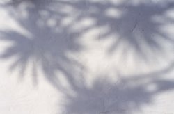
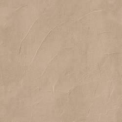
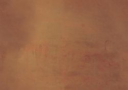
Some things are looking better, rounding the edges and adding detail helps. I still think the plaster needs some work, it still looks too even and I like the shade of the first one better. I put a handful of images to give you an idea of what I was talking about. The first one has light coming through some palm trees, it breaks up the light nicely. Even if it were a cloudy you would expect some variation of light on the plaster. The next ones are just different shots of plaster, there is a lot of unevenness in the plaster, both in color and form. These may be a little much but you get the idea. It's the unevenness that will make your image look more real. The last one is tileable texture you can use if you like.
You can get good textures for cheap from
http://www.istockphoto.com/
Most are $1 to $5.
Also you might look at these
http://www.doschdesign.com/products/textures/
There are DVDs full of textures for $79 and they are all tileable with color and bump maps.
Hope this helps.
You can get good textures for cheap from
http://www.istockphoto.com/
Most are $1 to $5.
Also you might look at these
http://www.doschdesign.com/products/textures/
There are DVDs full of textures for $79 and they are all tileable with color and bump maps.
Hope this helps.
Attachments
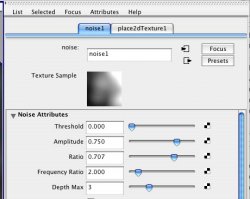
One more example of something I did if this helps. The first one is the finished image. The next 3 images are a texture that made the stone, a color map, the same image as a bump map and again for the specular map. The last image is a noise I put in front of the light, it gives you that uneven lighting look. To get a real look you need to build your textures like this, this is a very common way. The blueness of the finished image come from an HDRI (Image Based Lighting) and I used Final Gather (Mental Ray) to get the Radiosity solution.
Attachments

interesting. i've been playing around with adding objects in front of the light but they don't quite come out right. i'll try some other ways to get around that. as for specular maps, i povray doesn't directly support it, but there might be a way to simulate it.
A specular map in this case is not that important. Plaster would have little if any specular. I would try to get some color variation in a color map as your first step. As far a a gobo, the Area light may not be the best way to get that, it's way too soft see detail passing through it. Many people will use a Parallel light to get the look of sunlight. Or try using a very small Area light.
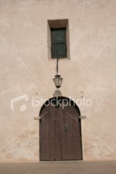
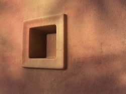
The tree shadow is way too sharp and the image has gotten a bit dark. The farther away an object is the softer it's shadow is going to be. The plaster still needs a lot of work, it's the largest part of your image. No matter how hard you try, a flat color with a even texture is not going to look real. I did a render that's a lot like what you are working on. It's not as far as I would take it but it gets the point across. Here's some notes about the render, not much new from the other posts
The model is rounded and slightly irregular.
The wall has a photographic color map (below) and photographic bump map (same as the compass above). In this case they are different textures, a plaster/stucco is a painted rough surface, the color often has little relationship to the texture making 2 different maps work just fine. The textures were projected (Tri-Planar) instead of UV mapping.
It's shot off angle.
It is lit with a shadow casting spot light. A slight noise was used in the lights color to break it up.
A grey scale HDRI was used to add environmental light to the image. I use grey scale HDRIs to keep out extra color casts.
Final Gather was used to add Occlusion to the render (Radiosity in your terms).
I added the palm trees image (above) in Photoshop as an Overlay.
That's it, I'm at loss to tell you anything above and beyond that.
Attachments
hmm... that looks a lot better than my image. i like that off-center look. well, i'll see what i can come up with. thanks for the tips!
btw, how did you get that plaster texture? what i did was take a picture with my camera, perform a high-pass filter, colorize it, and then smooth the edges to make it tileable.
btw, how did you get that plaster texture? what i did was take a picture with my camera, perform a high-pass filter, colorize it, and then smooth the edges to make it tileable.
I have a vast library of images, 10s of thousands from CD collections, scans, images I took plus online stock photos. The plaster color map was made tileable by using Offset in Photoshop (Filter/Other/Offset). Take the image into Offset and slide the numbers to half the image size (ver and hoz), then clone out the cross in the middle so the texture is seamless. Go back to the original numbers and clone again because you may get a slight cross from the last Offset. It's now tileable.
The maps for the Compass I got here
http://www.thegnomonworkshop.com/dvds/jen02.html
This DVD set has color, bump and spec maps, all tileable. The DVD also includes training for how to apply the textures in Maya and 3D Studio Max. It may help you understand how to do it in your program, hard to say but they are great textures.")
As far as Bump and Spec maps I will take the color image and convert it to greyscale then back to RGB (Maya doesn't like greyscale images). Then I will use Curves on it to get the look I want.
BTW I found this the other day, I think that they are all free
http://www.cgtextures.com/
The maps for the Compass I got here
http://www.thegnomonworkshop.com/dvds/jen02.html
This DVD set has color, bump and spec maps, all tileable. The DVD also includes training for how to apply the textures in Maya and 3D Studio Max. It may help you understand how to do it in your program, hard to say but they are great textures.
As far as Bump and Spec maps I will take the color image and convert it to greyscale then back to RGB (Maya doesn't like greyscale images). Then I will use Curves on it to get the look I want.
BTW I found this the other day, I think that they are all free
http://www.cgtextures.com/
jhu said:made an update with link in the first post. i'm having a little bit of trouble varying the color of the stucco without ruining the indentations.
WOW, much better. Maybe some texture in the flower box and the metal supports. The cats eyes are a little intense to be real but you seem to like that
. I'm sure there are lots of small details you could do but this is well along. Good job.
Register on MacRumors! This sidebar will go away, and you'll see fewer ads.