This logo reminds me of the offerings that get served up here as a joke. Unfortunately this is not joke. Is this the worst official logo of all time?

Got a tip for us?
Let us know
Become a MacRumors Supporter for $50/year with no ads, ability to filter front page stories, and private forums.
World Chess Championships Logo
- Thread starter dogbone
- Start date
- Sort by reaction score
You are using an out of date browser. It may not display this or other websites correctly.
You should upgrade or use an alternative browser.
You should upgrade or use an alternative browser.
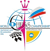

It would make a good competition. How many things can you find wrong with this logo...
Possibly the two worst individual howlers are the red white and cyan/blue? slash, I presume it's meant to be the russian colours, but the designer seems to have forgotten that white doesn't show up too well on a white background and made it a very light shade of grey instead. Also the words 'world championship' appear to be gratuitously and randomly coloured blue or black.
Possibly the two worst individual howlers are the red white and cyan/blue? slash, I presume it's meant to be the russian colours, but the designer seems to have forgotten that white doesn't show up too well on a white background and made it a very light shade of grey instead. Also the words 'world championship' appear to be gratuitously and randomly coloured blue or black.
dogbone said:It would make a good competition. How many things can you find wrong with this logo...
LOL, I would not know were to begin. Looks more like a dagwood sandwich than a logo.
Register on MacRumors! This sidebar will go away, and you'll see fewer ads.