I wouldn't say disaster, but...
-With the iPad version, in year view of calendar you need to scroll to see september - december; it seems unprofessional.
- (mentioned loads of times) calendar needs dots / way of viewing how many events on each day.
- The selectors at the top (day|week|month|year) seem tacky.
- Elements need shadows to show layering, especially popups (like the share button) -- more on iPad than iPhone and iPod
- The content needs to be more separated from the UI by shadows and contrast (a light grey background, with grey options, which are highlighted darker grey, with UI bars that are light grey means the whole app becomes a splodge where you don't know where the content ends and where the UI starts.
- the popups on both iPad and iPhone need redoing - it's a mix of coloured icons, with outlined icons, with white UI bars and white options with small text, and grey smaller text and a larger blue cancel button) - clean it up. You can also see why it needs shadows.
eg:
Link
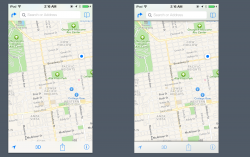
- transparency can look nice, but not the UI bar in maps - it looks a dirty green colour.
- talking about UI bars they need subtle gradients with shadows (see attachment)
- Space in notification center (especially on iPad) can be better utilised - a little pictures of upcoming weather is better than a wall of text. What's the point in showing me an empty grid with no events in - show me some reminders instead, or better yet -- some actual notifications!
- icons
- icons need shadows
- text need shadows, or needs to be adaptive so it can stand out even in wallpapers that change colour (a wallpaper which is white at top, black at bottom makes the half the text unreadable and the other half readable.
- the dock looks like poo
- Calendar month view needs improving (by dots) and at a glance viewing of events on a specific day.
- On iPad and iPhone, notes needs better icons (yellow on a pale yellow background, really?) and on iPad, there needs to be a better definition between the 'notes selector' (left hand panel) and the right hand side.
- On iPad the music app was perfect originally -- now there's 9 options at the bottom and stretched out UI. Make it like iTunes on the mac, with those fancy album views. Make it more 'desktopy' and less big iPhone.
- Folders can be bigger than 3x3 on the iPad - I mean there's space. In fact, make opening folders on iPad like it is in 10.9
- Why are folders so damn ugly?
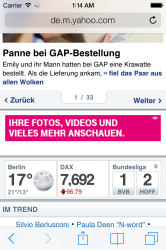
- Safari's icon (bookmarks, back, forward, share) aren't great.
- Reminders and Notes should look similar (on the iPad), but they look like they were made by 2 different companies.
And little things to - like it would be nice if I could swipe between today, all and missed rather than tapping - it just 'feels' like I should be able to do that. Also, the swipe back gesture works great on iPhone, but on iPad where there's normally two views (a small left panel and a large right panel - like settings), it would be nice to be able to use this gesture as well.
One tiny thing that annoys me is that every time you're in maps you can see thumbnails of photos - I'd like it if I could see the fullscreen version of these instead of being pulled out to the app store and told to get yelp.
Overall, do I like the direction iOS 7 took iOS? Yes
Will I update? Yes


