Become a MacRumors Supporter for $50/year with no ads, ability to filter front page stories, and private forums.

PsykX

macrumors 68030
Original poster
Sep 16, 2006
2,714
3,883
So far I have just opened Xcode DP3, haven't had the time to play with it. But I did notice those (ugly) new flat icons. I'll definitely have to keep a copy of Xcode 5 and steal them from the package, this is not acceptable.

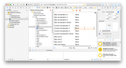
Also in the constraints area, you get a new diagram clearly depicting what constraints you added. This is a nice touch. However, I still find myself not understanding how to remove ONE constraint at a time. It seems like all I can do is remove all of them and start from scratch.

Any other changes ?
 

Attachments

  • Capture d’écran 2014-07-08 à 07.28.28.png
    Capture d’écran 2014-07-08 à 07.28.28.png
    542.1 KB · Views: 314

Simplicated

macrumors 65816
Sep 20, 2008
1,422
254
Waterloo, Ontario, Canada
I don't know about other changes, but I honestly hate the lack of a titlebar. I get it – they combined the toolbar with the titlebar because (ostensibly) the app design itself is recognizable enough to not have one. But we're talking about a document-based app where there's a high chance of multiple documents being open. The loss of the titlebar makes it hard to discern between documents/windows.

Also, proxy icons are gone from the titlebar in toolbar-less windows (not sure if this has been fixed – I have only used DP1), I can't even navigate through the directory trees by Cmd-clicking the icons, nor can I drag the files to somewhere else.

Bad design on every conceivable level.
 

PsykX

macrumors 68030
Original poster
Sep 16, 2006
2,714
3,883
I don't hate having no titlebar, but they sure removed some functionality to it.

Any word on how to do pragma mark comments in Swift in DP3 ? If not, is this a hint we're going to lose this feature ?
 
Register on MacRumors! This sidebar will go away, and you'll see fewer ads.