Got a tip for us?
Let us know
Become a MacRumors Supporter for $50/year with no ads, ability to filter front page stories, and private forums.
Yet another critique request!
- Thread starter eyeon
- Start date
- Sort by reaction score
You are using an out of date browser. It may not display this or other websites correctly.
You should upgrade or use an alternative browser.
You should upgrade or use an alternative browser.
can you provide some information about your company
from that cover I feel I am looking at this outgoing promoting company, or extreme sports along the those lines.
Just give the mentality of the company.
Is there a reason for orange type? Just wondering since we have cool colors and that orange is just popping out. Kinda detach in my opinion.
Good luck on the project
Yes, background info. Sorry I neglected to include that...
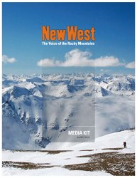
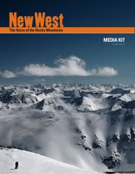
We are a reigonal online media magazine ( www.newwest.net ) about growth and change in the rocky mountain west.
As far as the orange font, it needs to stay that color. We are fairly new, and don't want to make any changes to our identity just yet, so we are sticking with orange for the time being. My boss and marketing manager both think that it looks nice against the blue background, because it stands out. So, the color can't change.
We are really beginning to push the "wintery" feel to our collateral for a seasonal flair, as there is quite a large skiing/snowboarding/winter sports community here.
Hopefully this helps. Thanks a lot for the input!
I hope you're going to be using a higher quality/resolution background pic.
The transparent box doesn't have much contrast, it doesn't look quite "there"... what I mean is, make it more apparent. It ends up looking very dirty over the picture, maybe you could try white or something.
Too many typefaces! Try sticking to the one from the logo, and maybe one other (make sure it contrasts enough with the logo).
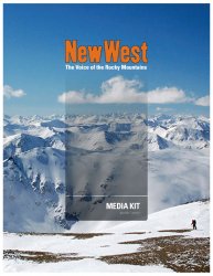
Yes, I will absolutely be using a higher-resolution image for the final product. The truth is, we haven't paid the photographer yet and so have not yet received the high-res version. So this one's jsut a low-res placeholder.
Anyway, here's a version with a darker background gradient. Improvement?
<EDIT> I forgot to mention -- as for the typefaces, believe it or not, "MEDIA KIT" and "The Voice of the Rocky Mountains" are the same font. "2006 / 2007" is our standard text body font and the logo "NewWest" is custom built. Still too many?
Attachments
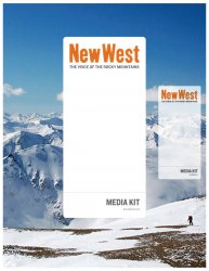
If it were my project, I would remove the black stroke from the title. It seems out of place. Oh and I do like transparent gradient you used; it's a nice touch. ")
Here is my 2 cents.
I disagree that the orange creates a disconnect. I see it more as contrast, although it could be treated a bit differently. Namely, as one other pointed out, removing the black stroke. And what about letting it interact w/the background? On the website it textured, as in, it has texture to it. Why not see how it plays with the background by letting it multiply? Might not work, just an idea.
Second, the type isn't too bad - the faces certainly contrast eachother pretty extremely. Knockout Welterweight + Hoefler Text? However, I would change the subtitle text to All Caps and use the same weight as you did for "MEDIA".
In terms of the box - gradients tend to not play nicely in production, but you are on the right track I think. Grey sends sort of a dirty snow message to me, which I don't think is what you want. What about white? It can still have transparency, but the gradient is overkill.
Anyways, I hope that points you somewhere. You never mentioned a concept, so I wasn't sure if there was something specific you were going after or just looking for tight and clean design for quick dissemination of information.
And, here is my take on the edits I suggested playing with.
Attachments
I tried a couple of versions, but I like yours the best.
Redbandit made some good suggestions. Change the color of the gradient to white and make the MEDIA KIT black.
Unlike most people here, I like the orange, its a good compliment to the blue sky and you need something to balance the hard contrast at the bottom of the image. Dont get me wrong, I like the repention of lines that the dry ground and the mountains make, but I think it has too much visual weight.
Attachments
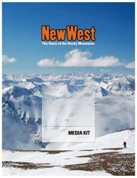
Mydriasis said:Change the color of the gradient to white and make the MEDIA KIT black.
I actually used about 60% black in my versions. It helps to soften things up a bit and maybe give a bit of a more refined look to the piece.
Wow, thanks so much for the replies. They have been incredibly helpful. Unfortunately, it appears that my boss and marketing manager have changed their minds about an hour ago and now want something that more closely resembles the web site and the rest of the media kit (which is also subject to change).
So, in case anyone is interested, here is a new draft which I just made. Critiques are welcome and appreciated, but I do not expect anyone to think too hard about it as, when my boss is involved, things are always subject to change.
Thanks again.
So, in case anyone is interested, here is a new draft which I just made. Critiques are welcome and appreciated, but I do not expect anyone to think too hard about it as, when my boss is involved, things are always subject to change.
Thanks again.
Attachments
Register on MacRumors! This sidebar will go away, and you'll see fewer ads.