Become a MacRumors Supporter for $50/year with no ads, ability to filter front page stories, and private forums.

Laird Knox

macrumors 68000
Original poster
Jun 18, 2010
1,958
1,346
I've been kicking around some ideas for a watermark. Am I on the right track? Thoughts?

1380799_618644104854759_1058355386_n.jpg


It is pretty basic but I like the simplicity and it reproduces well at small sizes.
 
So no comments - either it is horrifically bad or I knocked it out of the park. ;)

I've refined it a bit and added a © to it. It reproduces fairly well on different backgrounds.

I'm still toying with the levels. The text is 100%, the circle is 30% and the copy write is knocked out. It is loaded as a PS brush so I can tint it if desired and in this sample image the layer is set to 50% opacity.
 

Attachments

  • ghostRiderLogo.jpg
    ghostRiderLogo.jpg
    235.5 KB · Views: 297
Or you posted late one night and again Sunday morning ;) This forum doesn't really get a ton of traffic either.

Honestly...it's ok. The use of what looks like Arial feels very "default" to me, the general alignment and weight of it isn't bad but I'd do some looking for another sans serif typeface that's at least a bit more unique.

Definitely not a fan of the typeface in your last example.
 
Well there were several hundred views over a couple of days. :D

In any case I agree about the Arial. I like the reproducibility of it but the first design wasn't there. Anything in particular you don't like about the second font? I went through my current fonts and didn't really like what I saw. Probably time to look at adding to the collection.
 
The first one is fine, it is simple and it does the trick. There is no wow factor or show of amazing design but it is just a watermark and with that, it serves the purpose. I'm not a huge fan of watermarks that cloud the overall view of photos, but then again, to my knowledge people are not using my work without my permission.

Also, you will find in life in any anonymous forum that people may look at your post and really have nothing to say or add to the discussion. I mean, you made a circle and wrote your name. I'm not sure it required a whole lot of discussion. Also consider that since this forum is public, it is possible that searches show this post as a result, people click and find out it is not what they were looking for. You certainly should never look at the views and then panic. Your skin needs to be much thicker than that if you're going to be around any area of design.
 
No panic at all. Hence the quip about it being either really good or really crappy.

I'm of mixed mind on watermarks. Right now I'm looking at them more as branding than preventing theft. I want something simple for reproduction purposes but at the same time I want it to be at least a little bit interesting. It is a bit of a fine line.

Regarding the first one I had a friend remark that it looked like a talk show logo. Not that that is necessarily a bad thing but I does have a bit of a late night feel to it.

Just looking to get a bit of feedback but if you would prefer to school me on this Interwebs thing then have at it. People haven't changed all that much since the FidoNet days but there sure are a lot more of them. ;-)
 
The font on your second option doesn't feel at all professional to me. Again has that kind of default feel, but the varied line weights of the font also come off as kind of casual.

The last poster has a point, as is it's not much to look at. If you're truly going for something branding related it might be worth hiring a designer to help develop an identity for you.
 
The font on your second option doesn't feel at all professional to me. Again has that kind of default feel, but the varied line weights of the font also come off as kind of casual.

I agree about the version 2 font choice. I also prefer the circle not having the copyright and year in it. It's too much.

I do like how you "nested" the words in version 1.
 
No panic at all. Hence the quip about it being either really good or really crappy.

Design is all about opinion, there will always be someone that likes something and someone that doesn't. The way to tell if its 'good or bad' is if it answers the brief. Don't get stuck thinking what other people think about your work, you will never win. Answer the brief and create something that YOU think looks good. If you're not sure about it then its not finished. ;)
 
I agree about the version 2 font choice. I also prefer the circle not having the copyright and year in it. It's too much.

I do like how you "nested" the words in version 1.
I'm not too sure on the font. Haven't really found one that I like. The first one has a nice feel to it but is a bit too plain. In the second one I like the way the line of the f's interact with the o. I'm not sold on it but it is growing on me.

I want to try fitting the copyright to the curve of the circle and moving it to the seven o'clock position. I haven't had a chance to try it yet but I suspect you will still find it a bit too much. ;)

Design is all about opinion, there will always be someone that likes something and someone that doesn't. The way to tell if its 'good or bad' is if it answers the brief. Don't get stuck thinking what other people think about your work, you will never win. Answer the brief and create something that YOU think looks good. If you're not sure about it then its not finished. ;)
Sometimes that differing opinion can help you to see something you missed. In this case I'm trying to balance some elements that are a bit at odds. I want something that is clean, reproducable at small sizes and is easily recognized. On the other hand I want it to have some flair and whimsy. To that end I solicited for some feedback.

I actually find some of the replies in this forum a bit amusing. The typical answer is hire a designer. Such a difference from the photo forum where you often get great critiques. With that said, I do appreciate the people that took the time to reply.

So far I have just been experimenting with the design on Facebook posts. Last night I uploaded a new picture and used the second design. When the logo is stamped with a color sampled from the image I am liking it even more. I think it still needs some tuning and I'll investigate other fonts but I feel that it is close.

1410701_624376910948145_16374276_o.jpg
 
... So far I have just been experimenting with the design on Facebook posts. Last night I uploaded a new picture and used the second design. When the logo is stamped with a color sampled from the image I am liking it even more. I think it still needs some tuning and I'll investigate other fonts but I feel that it is close.

1410701_624376910948145_16374276_o.jpg

This works. I like the idea of sampling color from the image, but keeping it subtle is key. While it is simple, I don't think there is anything wrong with that. It provides a watermark, an ID and advertises your site. Mission accomplished.

Nice photo, btw!
 
Thanks, that was from my adventures last Saturday night. :) Just a quick process, now I need to spend some time on it for the final print.

Even when I just use "© JeffKnox.com" I tend to sample a color from the image and knock the opacity down to about 50%. The first two images were looking at the design. Thanks for the comments.
 
Sometimes that differing opinion can help you to see something you missed. In this case I'm trying to balance some elements that are a bit at odds. I want something that is clean, reproducable at small sizes and is easily recognized. On the other hand I want it to have some flair and whimsy. To that end I solicited for some feedback.

Of course, take on board what people say but don't let that govern your work. After all, they may know nothing about design and just think that 'pink looks good'. Constructive criticism is great but it has to come from the right people. The reason why people are saying 'hire a designer' is because most people reading this thread will be professional designers - we don't easily give out free info. Just like you wouldn't explain all your tips and secrets on a photography forum if you're a pro photographer. ;)
 
I guess that's where we differ. I love working with people and helping them improve their photography. ;)
 
I actually find some of the replies in this forum a bit amusing. The typical answer is hire a designer. Such a difference from the photo forum where you often get great critiques. With that said, I do appreciate the people that took the time to reply.

Considering that I'm the only one who suggested the potential benefits of hiring a designer, and that I also offered you what I thought was a decent critique, I find that comment amusing at best.
 
That would be why I said "in this forum" instead of "on this post." ;)

I agree that if I were looking to do a whole corporate makeover I would be looking for a designer. In this case I was looking for an honest critique and I did get that.
 
Some Logo Ideas

Nice Ghost Rider!

Some ideas:

1. Fonts do require a good deal of effort to get the right feel so do spend some time and search different font families to hone in on the direction you want but also find the a version that is a little more off the beaten path.

2. Consider shrinking the height of the letters to make the whole thing more compact.

3. Try shifting the big circle to the right to encompass the .com. Since our eyes always go from left to right, we start on the circle but then go off it which is perhaps 'anticlimactic' if that makes any sense. Build the logo to move your eye to come to rest on a spot with visual weight and the most interest.

3a. Maybe get rid of .com. It gets busy with the copyright. People nowadays can figure out how to find you on the web. Maybe it is gratuitous like www.

4. Or how about moving the copyright under the .com. Right now it ping pongs the eyes back to the left at the end.

5. I know it should be unobtrusive but maybe give the circle a very subtle hue to add some flavor.

6. If you haven't already, do searches for 'award winning logos' and see what other people have done. Take inspiration or steal. Cheaper than hiring a designer if that is not in the cards at the moment. But it will also help you figure out what styles you like.

7. Write down some adjectives which you feel describe your photography style and what you want viewers and customers to come away with. Then think about these things as you study other logos or work on your own design and whether or not the font choices, the colors, the feel embody what your photography is all about.

Good luck!
 
Fair enough, no offense intended or taken then :) I've also found that most designers are pretty helpful until things get to the point of someone wanting them to do their work for them.

I do think your comparison of critiquing photos isn't quite a fair one. You can look at a photo someone has taken and pretty directly critique it and suggest ways to improve it, comment on the way it was framed, lighting and exposure, etc.

A design concept may be just completely off, you may have a solution that's 180 degrees from what it actually should be. You can give suggestions, but it can be tough to critique that when it currently looks nothing like the end product should or will look.

It's also based largely on opinion, as bad as a design might be it's rarely "wrong" and I've watched even experienced designers defend awful designs. A photo can be obviously underexposed or overexposed, you might argue for the intent you had behind capturing the image but if something has the wrong exposure, is out of focus, etc., that's something that can be observed. (And yes, one can nitpick if something should be slightly one way or the other, but that's not what I'm referring to.)

As per the reasoning behind suggesting someone hire a designer, i think it largely depends on application.

Generally speaking the best amateur design effort is going to fall short of what a pro will do and most of time it's not tough to pick out. The same certainly applies to photography as well, but that amateur photographer isn't going to hire a pro to come shoot photos at the park for them. Someone designing or photographing for a business purpose often decides to "save money" by doing it themselves but ends up spending far more time and gets a substandard result.
 
I guess that's where we differ. I love working with people and helping them improve their photography. ;)

I too like to help people improve their work. I absolutely love constructive criticism. My point was you are asking Pro designers for free tips.

If you are a pro photographer and designer came along and asked you how to take great photos and he then went off and made millions or took your clients from your free advice you'd be a little miffed ;) I know thats taking thing to the extreme somewhat but that was my point.
 
First one serves the actual purpose and looks more realistic and meaningful. Second one looks somehow unprofessional..!
 
I like it! What software are you using for the water mark?

I created the logo in Illustrator then used the vectors to create a custom brush in Photoshop. Then I can simply pick the brush, sample a color out of the document and adjust the opacity until I like it.

I haven't had time to work on the design lately but still want to evaluate the above comments.
 
Logo seems OK, I really like your photos. I don't know if they're meant to, but they have a kind of weird vibe (if that makes sense!)
 
Hi Jeff,

Slow day at work for me so thought I'd offer my 2 cents... for what it's worth.

Your photos are very clean, bold and strong (and American) so a font with the same qualities would suit. Although possible over used Gotham is a good option in my eyes. Mixing weights is a good way to add dynamism between copy too, maybe having Knox in bold and the others in light or the other way round.

Lock up wise (the logo/water mark) I think you are close... it might be nice to get the shapes of the words locking up tighter... ie The far left point on the J's curve aligns with the top right part of the K, and bottom of the f to one of the points on the x?

The circle is a bit redundant in my eyes, it's neither adding nor saying anything?

Hope the input is of some help/interest!
 
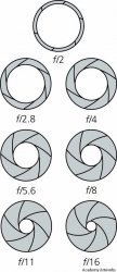
Consider moving the circle so the o in Knox becomes the center of a very subtle aperture graphic (f11 or f16). Drop the .com. Lighten the font. Also play with the f's in Jeff to recall the f in f stop of a large format photographer you admire. Most have pictures of themselves with their cameras.

Or not.;)
 

Attachments

  • image.jpg
    image.jpg
    65.1 KB · Views: 135
Register on MacRumors! This sidebar will go away, and you'll see fewer ads.