Got a tip for us?
Let us know
Become a MacRumors Supporter for $50/year with no ads, ability to filter front page stories, and private forums.
You opinion
- Thread starter rontheancient
- Start date
- Sort by reaction score
You are using an out of date browser. It may not display this or other websites correctly.
You should upgrade or use an alternative browser.
You should upgrade or use an alternative browser.
What would the logo be used for?
Also, is that stray pixel supposed to be there (in the white one)?
I'm leaning towards the white one, but get rid of that pixel and find a way to separate "Wilson" and "Prowler"
Also, is that stray pixel supposed to be there (in the white one)?
I'm leaning towards the white one, but get rid of that pixel and find a way to separate "Wilson" and "Prowler"
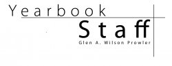
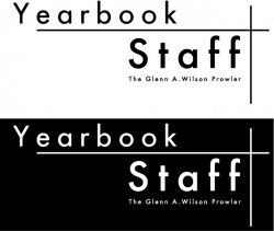
The logo will be used everywhere, flyers, press passes, forms, letterhead. It comes in a whole set, without "Glen A. Wilson Prowler" and one with. Also in black and white, with the previous options. I was thinking of using the one w/o the extra text internally within the school (since everyone knows which high school yearbook staff it is) and the other for external uses like letters to other schools and parents. As for a way to separate the two words, I was thinking of using a | or a hyphen but im thinking that it would kinda disturb the look. I will fix the stray pixel, thanks.
Oh, I get it. I thought we were supposed to pick between the two.
I like it.
Maybe add a "The" to make it "The Glen A. Wilson Prowler" - something doesn't seem quite right IMO.
...And personally, I would just use the "full" logo on everything (the one w/ the school name and paper name). It makes it look more official, plus, it simplifies things to only have two different logos to keep track of.
I was thinking of inserting THE, but if you take a closer look, the phrase is the same width as STAFF, and im worried that if I insert THE, the phrase could be too small to read on some of the places that the logo is placed. Thanks for the help.
Make Staff bigger.rontheancient said:I was thinking of inserting THE, but if you take a closer look, the phrase is the same width as STAFF, and im worried that if I insert THE, the phrase could be too small to read on some of the places that the logo is placed. Thanks for the help.

rontheancient said:My high school annual staff needs a logo, something that can be noticable and simple. I put this together..what do you think?
BTW, Glen A. Wilson is the name of the school and Prowler is the name of the yearbook.
I like it...very simple, which is good.
a few things:
the two lines that cross? I would make them just a bit heavier, pretty much exactly the same line weight as the letters in the "Yearbook" font. It'll give you a little more consistency and help tie the whole thing together.
the tracking on the word "Staff" you should fix. Make sure there is reasonably even spacing between all the letters. The two "f's" at the end are too close together when compared to the S, t, and a...
and this is just a personal thing that only I would notice:
I love the sans-serif look. The only thing I would do is find a font where the letter "o" is about as perfectly round as it can get. The letter "o" is "Yearbook" is a bit on the oval side. IMHO, having rounder letters for that font will make a little bolder statement, and contrast better with the overall linearity of the design.
But overall, very nice work. It should do well for you.
DISCLAIMER: Take this post with a grain of salt, I'm just one person and this is just one opinion. And often my opinions don't jive with the rest of the forum
YUCK
What's with people in this forum and praising mediocre amateur work? I realize everyone has to start somewhere, but that's no reason to not truthfully judge poor quality work, telling people that "oh I like it, it's good" only teaches them that their mistakes are in fact correct.
/rant
Ok, now some usefully tips
KERNING
Pull those letters closer to together (certainly the y e a r b o o k part). A sans serif font can look great, but right now it just looks like text on a page.
Spacing
Why is the Y from yearbook over the edge of that line? I find the whole design to be rather loose looking, being clear is one thing, this just looks messy & empty. Line some of the elements up, create some kind of unified composition.
beatsme said:I like it...very simple, which is good.
a few things:
the two lines that cross? I would make them just a bit heavier, pretty much exactly the same line weight as the letters in the "Yearbook" font. It'll give you a little more consistency and help tie the whole thing together.
the tracking on the word "Staff" you should fix. Make sure there is reasonably even spacing between all the letters. The two "f's" at the end are too close together when compared to the S, t, and a...
and this is just a personal thing that only I would notice:
I love the sans-serif look. The only thing I would do is find a font where the letter "o" is about as perfectly round as it can get. The letter "o" is "Yearbook" is a bit on the oval side. IMHO, having rounder letters for that font will make a little bolder statement, and contrast better with the overall linearity of the design.
But overall, very nice work. It should do well for you.
I will make the lines heavier, that was a problem before where the lines were not visible when I printed them. As for STAFF, its just a Photoshop thing, I dont know how to fix it. The font is something that I cant easily change, most people in the staff like it, but in any case, do you have any suggestions for a replacement. Do you recognize where this font comes from?
dornoforpyros,
Your right, im just a amateur, not even advanced in photoshop. And you are also right in differing opinions such as you and beatsme, The Kerning problem is something with photoshop, I dont know how to fix it. The YEARBOOK is positioned like that, notice that the horizontal line ends exactly with the E.
Thanks for the comments, I will work on a new one tonight.
It looks like the two "f"s in "Staff" have been automatically connected together by a ligature from the software you used. I would turn ligatures off in this text block to correct this unless it's something you find desirable here (I don't).
rontheancient said:I will make the lines heavier, that was a problem before where the lines were not visible when I printed them. As for STAFF, its just a Photoshop thing, I dont know how to fix it. The font is something that I cant easily change, most people in the staff like it, but in any case, do you have any suggestions for a replacement. Do you recognize where this font comes from?
dornoforpyros,
Your right, im just a amateur, not even advanced in photoshop. And you are also right in differing opinions such as you and beatsme, The Kerning problem is something with photoshop, I dont know how to fix it. The YEARBOOK is positioned like that, notice that the horizontal line ends exactly with the E.
Thanks for the comments, I will work on a new one tonight.
ah ok...this is really the kind of thing that should be done in Illustrator. I would assume if you have Photoshop then you must have it as well, since they're usually sold in bundles.
anyway, while you're fixing, you're probably going to want put a little more space between the word "yearbook," the horizontal line, and the word "staff." Give your elements a little breathing room.
and think about a different font...The Futura font would be a really good choice for this design.
here's what I mean...
I put the word "the" in there because I liked it better...but whatever you wanna do...
this version is a bit shorter than yours, horizontally, but that was my preference...if you want longer by all means go for it
rontheancient said:I was thinking of inserting THE, but if you take a closer look, the phrase is the same width as STAFF, and im worried that if I insert THE, the phrase could be too small to read on some of the places that the logo is placed. Thanks for the help.
I put the word "the" in there because I liked it better...but whatever you wanna do...
this version is a bit shorter than yours, horizontally, but that was my preference...if you want longer by all means go for it
Attachments
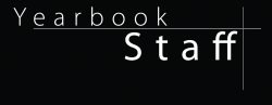
kaboutertje said:The one with the black background is for what use? I really wouldn't use it in a letterhead.
Letterhead wont use the black one, unless the paper is actually black. Letterheads will most likely use the white one.
I will add the spacing issue to the to do list for tonight, but as for illustrator, I dont know how to use it. The futura font looks really nice, Futura Light for YEARBOOK and Futura Book for STAFF, but I dont have those and its 22.00 for each font. I will take a look around Font Book for substitutes. Helvetica Neue and Andale Mono looks nice. BTW, the current font is Myriad Pro.
EDIT: Wow, you got to it before I did. Aside from mispelling GLEN, its great. Although I would like YEARBOOK to stand out more with a light font. I will play with what fonts I have and post some samples. Thanks
My tests with Andale Mono and Helvetica Neue didnt go so well so I stayed with Myriad Pro. But here is a fixed version with increased spacing, bolder lines, lack of ligatures and the word THE. Basically the same as beatsme but with the original font. Also attached is a sample of the letterhead, but this one has the original version.
Attachments
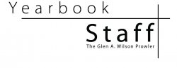
rontheancient said:My tests with Andale Mono and Helvetica Neue didnt go so well so I stayed with Myriad Pro. But here is a fixed version with increased spacing, bolder lines, lack of ligatures and the word THE. Basically the same as beatsme but with the original font. Also attached is a sample of the letterhead, but this one has the original version.
I think it's better. I hope you prefer this to the original, because IMHO it's a real improvement.
dornoforpyros said:DISCLAIMER: Take this post with a grain of salt, I'm just one person and this is just one opinion. And often my opinions don't jive with the rest of the forum
YUCK
What's with people in this forum and praising mediocre amateur work? I realize everyone has to start somewhere, but that's no reason to not truthfully judge poor quality work, telling people that "oh I like it, it's good" only teaches them that their mistakes are in fact correct.
/rant
Ok, now some usefully tips
KERNING
Pull those letters closer to together (certainly the y e a r b o o k part). A sans serif font can look great, but right now it just looks like text on a page.
Spacing
Why is the Y from yearbook over the edge of that line? I find the whole design to be rather loose looking, being clear is one thing, this just looks messy & empty. Line some of the elements up, create some kind of unified composition.
with due respect, you could've made your point about the design without the <rant></rant>
not trying to start a flame war and definitely not trying to be insolent, just saying...
beatsme said:with due respect, you could've made your point about the design without the <rant></rant>
not trying to start a flame war and definitely not trying to be insolent, just saying...
what? due respect? umm yeah, just cuz I post here doesn't mean I'm entitled to any respect
Also I never had a starting rant tag <rant> I only ended it. So my code's not even valid
But hey, we're all entitled to our opinion, and my opinion doesn't involve sugar coating criticism of poor design. I'm not sure where the whole "huggy feeling" attitude towards new designers came from, but I personally don't like it. Yes, everyone has to start somewhere (as I stated before), but there's no reason to praise mediocre work just to avoid hurting feelings.
I say point out the mistakes, bruise a few feelings. The people who are meant to design will get past this and be better for it.
/rant
dornoforpyros said:what? due respect? umm yeah, just cuz I post here doesn't mean I'm entitled to any respect
Also I never had a starting rant tag <rant> I only ended it. So my code's not even valid
But hey, we're all entitled to our opinion, and my opinion doesn't involve sugar coating criticism of poor design. I'm not sure where the whole "huggy feeling" attitude towards new designers came from, but I personally don't like it. Yes, everyone has to start somewhere (as I stated before), but there's no reason to praise mediocre work just to avoid hurting feelings.
I say point out the mistakes, bruise a few feelings. The people who are meant to design will get past this and be better for it.
/rant
that's a fair point, though my personal feeling is that negativity doesn't help anyone. IMHO it's much better to say "here's what you need to know" than it is to say "you don't know what you're doing," especially when speaking to those who seek your advice. If they respect you enough to ask, then they should be treated with respect when you answer.
of course, you didn't ask me...
anyway, it's just my opinion...
You should Check out the Pixar logo. I think it will give you some ideas in putting up the yearbook logo..as it seems to be along the same lines as the following image.

P.S. using the typeface,,,myriad pro semibold might be a good idea and also...try to use all small letters or caps..don't mix them..doesn't really work out as a logo
P.S. using the typeface,,,myriad pro semibold might be a good idea and also...try to use all small letters or caps..don't mix them..doesn't really work out as a logo
Register on MacRumors! This sidebar will go away, and you'll see fewer ads.