Become a MacRumors Supporter for $50/year with no ads, ability to filter front page stories, and private forums.

tactical store

macrumors newbie
Original poster
Mar 19, 2017
2
3
Dammam
Hello

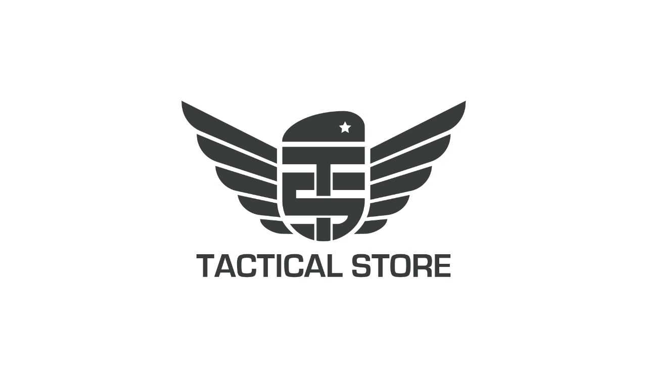
I've made some development to my logo. And would like to see your opinion.

TS stand for Tactical Store almost like a shield, with a beret on top of it. The shield is winged.

Thanks in advance.

PS: about me, I'm an online retailer. I sell military, tactical, hunting and outdoor gear and clothes.
%E2%80%8F%E2%80%8Fimg-20170227-wa0000-%D9%86%D8%B3%D8%AE%D8%A9-jpg.692739
 

Attachments

  • ‏‏IMG-20170227-WA0000 - نسخة.jpg
    ‏‏IMG-20170227-WA0000 - نسخة.jpg
    37.3 KB · Views: 853
Last edited:
  • Like
Reactions: Meister
Some adjustments I would at least try:
  • Make the feathers of the wings the same thickness as the TS lockup.
  • Make the counters between the feathers the same size as the counters of the TS lockup.
  • Do something with the star. It won't reproduce at small sizes (like how the attached file looks in your post)
  • The S is a little awkward with the varying thickness and the way it wraps to the shape of the shield on the outside, but not the inside
  • Nothing aligns. The tops of the wings don't align with the top of the beret, TACTICAL STORE doesn't align with the edge of the wings, etc.
 
I really like your logo and I would agree with @tobefirst points. Alignment is a subtle thing that can make a world of difference. I would like to see your logo in color as well. For the B&W version, like the one you're showing, you might consider using different shades of black and gray to help separate elements. The wings could be a medium gray while the TS is full black. The hat could be a different shade of gray or match the wings. For the S, perhaps you could round off the top left corner slightly to give it the S feel inside of the number 5. Nice job!
 
  • Like
Reactions: arkitect
I like it.
Thanks.
:)
[doublepost=1490200278][/doublepost]
Some adjustments I would at least try:
  • Make the feathers of the wings the same thickness as the TS lockup.
  • Make the counters between the feathers the same size as the counters of the TS lockup.
  • Do something with the star. It won't reproduce at small sizes (like how the attached file looks in your post)
  • The S is a little awkward with the varying thickness and the way it wraps to the shape of the shield on the outside, but not the inside
  • Nothing aligns. The tops of the wings don't align with the top of the beret, TACTICAL STORE doesn't align with the edge of the wings, etc.
Appreciate it, thanks.
Will try out.
[doublepost=1490200814][/doublepost]
I really like your logo and I would agree with @tobefirst points. Alignment is a subtle thing that can make a world of difference. I would like to see your logo in color as well. For the B&W version, like the one you're showing, you might consider using different shades of black and gray to help separate elements. The wings could be a medium gray while the TS is full black. The hat could be a different shade of gray or match the wings. For the S, perhaps you could round off the top left corner slightly to give it the S feel inside of the number 5. Nice job!

I tried different colors and it was a nightmare for me. After some advice and a little research, I decided to stick with one color only. It's a tone of black.

For the (S feel inside 5) the 5 must represent something, otherwise it would be meaningless.


I'm an online retailer. I sell military, tactical, hunting and outdoor gear and clothes.
 
Register on MacRumors! This sidebar will go away, and you'll see fewer ads.