Become a MacRumors Supporter for $50/year with no ads, ability to filter front page stories, and private forums.

Blue Velvet

Moderator emeritus
Original poster
Jul 4, 2004
21,929
265
Now and then, people post here wanting help with designing a logo for a new startup or for some other use. And they sometimes assume that it all takes is the right piece of software and they're off and running.

But before they put the pedal to the metal, this evening I'd like to draw your attention to a blog I found out about today.

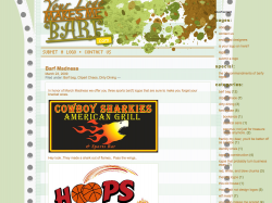
http://www.yourlogomakesmebarf.com/

If you're designing a logo for the first time, please ensure that you also check out its list of ten commandments. Professional designers are trained to avoid these common mistakes which can impact on the perception and brand of your enterprise.

This has been a public service announcement on behalf of the Concerned Designers Association (logo pending). Thank you.
 
THiS MIgHT bE My fAvoritE:

schroeder-homes-and-remodeling.gif


Meanwhile, how'd they miss this one?
591px-All_London_2012_logos.svg.png
 
I think we need to resurrect the Design Activities. Let competent designers take a stab at designing a logo using every possible bad logo cliché - Comic Sans, starbursts, glows, etc.

Then again, I am kind of sadistic.
 
I know.... I haven't met a single person who like that. It sort of growing on me, but still not impressed. However, I heard the designers are coming up with a revised more fluid design.

Good. That one looks like the event they're most excited about is rock climbing or something. :D
 
Let competent designers take a stab at designing a logo using every possible bad logo cliché - Comic Sans, starbursts, glows, etc.

I am only too happy to make this an open thread:


This has been a public service announcement on behalf of the Concerned Designers Association (logo pending). Thank you.

If anyone feels that that CDA™ needs a logo, show us your worst. ;)
 
London Logo

THiS MIgHT bE My fAvoritE:

schroeder-homes-and-remodeling.gif


Meanwhile, how'd they miss this one?
591px-All_London_2012_logos.svg.png


You know, when it was first announced, I felt the same. It was only when you saw it being used for olympic sponsors that you realised that it was inspired.

They could have done better, but it is starting to work.

London%20logo%20in%20union%20jack%20colours_4.jpg


london2012_logo.jpg


_44217024_lloydslogo203.jpg


Cadbury_olympic_flag.jpg
 
I checked out the site last night when I was on my MacBook. When I use that computer, I don't surf with the browser full screen. As a result, I got a website that didn't scale very well at all. Tons of overlapping text and menus. I found it humorous that a site that talks about bad design couldn't have been designed better itself. :)

EDIT: Even the browser window I use on the 23" screen I have at work is the same way. I very rarely have problems with this size window. I wonder how wide the browser has to be before it displays properly; granted, I don't have my browser window full screen here either. Screen shot attached.
 

Attachments

  • Picture 1.png
    Picture 1.png
    375.6 KB · Views: 110
I think the Union Jack version is a step in the right direction. In fact all of those without the yellow shadow are better.
 
What is fun is to look back in history to see which logos were the big ones of that day, that and hairstyles. :)

The '80s had their overuse of tan and purples, much like the then popular parachute pants, mullets, and pastel shirts of '80s fashion. BARF! But one day, if not now, that stuff will be classic.

Logos evolve and what was once appropriate would be a joke today. note IBM below
 

Attachments

  • itr.gif
    itr.gif
    30.8 KB · Views: 140
My effort:
The stress on the word 'concerned' signifies, erm, concern. The flow of the word 'designer' indicates our flair. The surroundingness of the word 'Association' shows how it encompasses us as an association - of designers - that are concerned.
And if you didn't get it yet, the designer in the picture has 'shards of concern' emanating from his head.
All courtesy of Bill.
 

Attachments

  • cda_logo.jpg
    cda_logo.jpg
    9.9 KB · Views: 109
My effort:
The stress on the word 'concerned' signifies, erm, concern. The flow of the word 'designer' indicates our flair. The surroundingness of the word 'Association' shows how it encompasses us as an association - of designers - that are concerned.
And if you didn't get it yet, the designer in the picture has 'shards of concern' emanating from his head.
All courtesy of Bill.

Cooper Black, please.
 
Register on MacRumors! This sidebar will go away, and you'll see fewer ads.