Become a MacRumors Supporter for $50/year with no ads, ability to filter front page stories, and private forums.
the big square Zb one isn't a bad start - tweak the height of the b, its a bit smaller, I would personally change the gradient to a grey rather than a green and how exactly are you doing the grey box as it looks a bit rough around the corners compared with ours.

Now the benefit of that simple square is
1. it can be used on iphone/touch desktops
2. its simple enough to just tweak the colour if you change the site for example.
3. change the b to an f, g (or any other letter) to represent forum or gallery - the b obviously representing blog.

You could if you wanted to use one of the other options (do the same with the b height) as a main title on the page but lose the iphone/touch button and just make it a normal letter as the square from the button is used in the 'main' logo.

And are you really sure you want to go for green?

edit: on the new blog, try making the links at the top centred (depends on logo layout though) as it could make it nicer to look at - visuals are everything these days :)

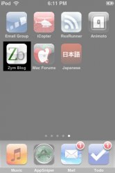
With the gray box I just made a rounded corner shape in photoshop, also the icon automatically gets rounded corners when it's put on the home screen.

Do you really think it's that bad to use the home screen instead of the square, I really want to include that in the 2 designs I did(as the o's).

Eh, yeah kinda, Originally the colors of the site were going to be green and black/white/gray

And I really dont understand this, sorry could you explain:
You could if you wanted to use one of the other options (do the same with the b height) as a main title on the page but lose the iphone/touch button and just make it a normal letter as the square from the button is used in the 'main' logo.


I think the icon is fine and done (well at least IMO) and I'd like to make a logo and header off that (like I have been doing) is that okay or should I take a different route?
Zym
 

Attachments

  • 3.21.jpg
    3.21.jpg
    51.7 KB · Views: 145
  • 3.02.jpg
    3.02.jpg
    42.4 KB · Views: 114
  • 3.13.jpg
    3.13.jpg
    56.6 KB · Views: 98
  • IMG_0002.PNG
    IMG_0002.PNG
    5.4 KB · Views: 212
  • IMG_0001.jpg
    IMG_0001.jpg
    85 KB · Views: 121
Zym is a great example of someone open to learning.

I have been following your progression on this ZYM blog project from the start and I tip my hat to you for your never seeming to ever become discouraged. That is saying a lot about your character and you wanting to actually learn and grow as a designer. Few understand that criticism (constructive crit) is a big part of becoming great at what you do. Who needs to be surrounded by yes men and women ? How could you grow if everyone says "Great Job" , "I like it", "Perfect" ? You are listening and not being combative and it shows in your progression. Zym, Just keep at it and remember that becoming great and staying great at anything, means continuously learning, finding and evolving.

- Vigorblade
Hey,
Thanks a bunch. I just hope that these guys dont get tired of me :). I really am trying to keep at this. I really wanna learn how to become a better designer, and hopefully I have, or will achieve that.

Thanks again

Zym
 
Okay, so I asked but no one answered, is he logo as good as the others people made?, or no?

Honestly, it's ugly. Try to concentrate on the simple and effective use of type and colors. You don't need any weet-floor, etc. things. If your design doesn't work in 2 colors (black & white) it won't work with colors either.

Also, is the one with the apple better, or without?

You don't need any "Apple logo", be original. The apple logo will not help you, if your "design" is poor.

And finally, I redid the icon, how do you like?

No. Try to think, write down the words to a paper. Make a list. Make a selection. Choose one element. Try to sketch the thing on paper. If you are satisfied, sit down to computer and try to make it.

EDIT: the last one is not that bad, but it still need the WOOOAW. If you know what i mean? Think of the Nike logo.
 
You need to let go of:

LogoAnnotated.jpg


... This. I can see your thinking, but because it's solid black, the whole of the rest of the logo falls away behind it and it becomes a distraction.

Cheers

Jim
 
You need to let go of:

LogoAnnotated.jpg


... This. I can see your thinking, but because it's solid black, the whole of the rest of the logo falls away behind it and it becomes a distraction.

Cheers

Jim
do you think if I make the rest of the letters black in blog it'll be better?

Zym

EDIT: I made a few with black letters instead of gray better? worse?
 

Attachments

  • 3.23.jpg
    3.23.jpg
    52.9 KB · Views: 168
  • 3.14.jpg
    3.14.jpg
    60.9 KB · Views: 117
  • 3.121.jpg
    3.121.jpg
    59.5 KB · Views: 123
  • 3.03.jpg
    3.03.jpg
    45.1 KB · Views: 113
Register on MacRumors! This sidebar will go away, and you'll see fewer ads.