Not a big fan lol.. Though I kinda like the black opaque menu bar!
Got a tip for us?
Let us know
Become a MacRumors Supporter for $50/year with no ads, ability to filter front page stories, and private forums.
10.7 All the Little Things!
- Thread starter inkhead
- Start date
- Sort by reaction score
You are using an out of date browser. It may not display this or other websites correctly.
You should upgrade or use an alternative browser.
You should upgrade or use an alternative browser.
What was leaked on Gizmodo? (related to UI)
it was a screenshot of lion with the old flower desktop with a completely new UI. It was obviously fake, and even more so now that we have the first build of lion.
it was a screenshot of lion with the old flower desktop with a completely new UI. It was obviously fake, and even more so now that we have the first build of lion.
You never know.. Apple might be holding out on the UI improvements until the GM because we (devs) don't need the UI of the main system to develop apps!
O and just before I did my post before I discovered this as well. The right click menu thing now has an arrow if you highlight something and right click low enough down the screen, it puts an arrow underneath because theres not enough space to show all the menu functions cause you clicked so low down the screen, and as soon as you hover your mouse down it automatically starts scrolling down and pushing up the right click menu to show you the remaining functions..
OS X already does this for menus that aren't big enough to display on the screen.
You never know.. Apple might be holding out on the UI improvements until the GM because we (devs) don't need the UI of the main system to develop apps!
I would argue that the old background gives it away. I don't think that BG even ships with the OS
You never know.. Apple might be holding out on the UI improvements until the GM because we (devs) don't need the UI of the main system to develop apps!
true but it simply looks fake (which i guess is just my opinion.)
but it doesn't even have the launchpad icon in the dock
true but it simply looks fake (which i guess is just my opinion.)
but it doesn't even have the launchpad icon in the dock
Im not saying its real.. all I'm saying is that Apple could have some fun UI goodies for us but won't disclose them till later..
it was a screenshot of lion with the old flower desktop with a completely new UI. It was obviously fake, and even more so now that we have the first build of lion.
You never know.. Apple might be holding out on the UI improvements until the GM because we (devs) don't need the UI of the main system to develop apps!
I would argue that the old background gives it away. I don't think that BG even ships with the OS
true but it simply looks fake (which i guess is just my opinion.)
but it doesn't even have the launchpad icon in the dock
The point is that we ARE getting more themes in the GM. Be it similar to Gizmodo's or the new navigation menu on Apple's website, more IS coming. Pretty sure.
Im not saying its real.. all I'm saying is that Apple could have some fun UI goodies for us but won't disclose them till later..
okay i can agree with that. i'm just happy with all the UI refinement we have gotten already.
But another general facelift maybe some different color tones or customization would be welcome.
Resize window in fullscreen
Don't know if this is mentioned yet, but at least i haven't seen a screenshot of it.. in full-screen mode you can still resize the content window, at least in Safari (haven't tried it elsewhere, but i guess it's the same)
Don't know if this is mentioned yet, but at least i haven't seen a screenshot of it.. in full-screen mode you can still resize the content window, at least in Safari (haven't tried it elsewhere, but i guess it's the same)
Attachments
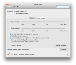
So you cannot specify different settings for Battery/Power anymore?! Oh that's really bad..

Here it is in Lion on a laptop.
Attachments
totally! i really do like spotlight, however i think that they should have made the icons smaller (or at least give us an option to make them smaller). i would prefer to see more search results.I agree. Spotlight is also much better now. It offers previews of almost anything it finds. Even calendar items are getting previewed and overall it seems really cool.
skype 5? its still in beta, as is osx. i wouldnt expect much success!Skype? I just tried to run it a couple of times but it crashed. As it is only a test, I don't really care.
you cant really, its really only for when you logout, or abruptly reboot (go to the logout option and you will see the tickbox showing the "restore" feature that i am talking about).How do you configure versioning and the behaviour of apps regarding saving their status? I didn't find anything.
from what ive seen (so far), mail and textedit preserve unsaved documents when quitting.
very cool, i am going to test this today at work! it is almost terminal app style!
i wonder if this works with ARD....
imac, actuallySome kind of reboot system if the systems freezes
 Hellhammer took the screenshot on a Mac Pro or Mac mini, which explains why he did not see the Battery/Power Adapter settings on these machines.
He could be on a desktop.
EDIT: not actually on a lion computer atm, but i like how you can resize a window from any size (like in Windows), as opposed to the bottom left hand corner.
Which is a desktop
im glad you realised
i am just showing my love and affection towards Mr. Hammer. <3
Some windows animate when you hit the little green maximise button or whatever it is... Only happens on certain apps, like Safari and the App Store...
Some windows animate when you hit the little green maximise button or whatever it is... Only happens on certain apps, like Safari and the App Store...
and when you open apps they now "zoom" in from the middle of the screen. anybody noticed that?
You can now delete files while the Trash is emptying! YES!
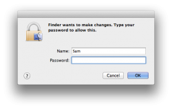
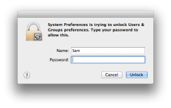
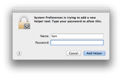
Also, the language on Authentication dialogs has changed:
Also, the language on Authentication dialogs has changed:
Attachments
the "graphite" theme from prefs is gone. It used to make the stoplights all grey. (i'm only pretty sure it was called graphite as i never used it.)
nooooooooo!!!!
"10.7 Hides the library folder in your home directory, so you dont' put it full of junk, this is because mobileme will shortly automatically sync your home directory if you choose
"
How do you disable this, permanently?? I access my home library frequently to remove unwanted application support files, remove .plist files when issues arise, etc.
I know the terminal command to 'unhide' folders,
but it still appears ghosted when I navigate to ~/library.
How do you disable this, permanently?? I access my home library frequently to remove unwanted application support files, remove .plist files when issues arise, etc.
I know the terminal command to 'unhide' folders,
but it still appears ghosted when I navigate to ~/library.
"10.7 Hides the library folder in your home directory, so you dont' put it full of junk, this is because mobileme will shortly automatically sync your home directory if you choose…"
How do you disable this, permanently?? I access my home library frequently to remove unwanted application support files, remove .plist files when issues arise, etc.
I know the terminal command to 'unhide' folders,
but it still appears ghosted when I navigate to ~/library.
I'd just drag it to the sidebar.
The Finder sidebar icons must be vector PDFs. They occasionally don't draw all elements of the image. Also attached is how they should appear.
Attachments
Is QuickTime VR in Lion QuickTime?
Can someone check if QuickTime VR is supported in Lion?
Try out these links and please respond if they display the panorama:
a) (more modern) Full spherical VR:
http://taphotographic.com/services/samples/San_Jose_Basilica_FullScreenPano.html
b) (old school) cylindrical VR:
http://taweb.com/issues/issue_001/frameset_IrelandVR.html
Thanks much!
nooooooooo!!!!
im sure its because they havent added it yet to the beta, the option is there - but it is greyed out.
Yeah, but does Lion's screen sharing pass sound to the remote machine? That's the one thing it's been lacking, especially w.r.t. Windows.
Got another one. You can now search for files and see whether they are supported by directly right clicking on them, and click App Store and see if that file u are trying to open is supported by anything in The Mac App Store.
That is awesome.
Register on MacRumors! This sidebar will go away, and you'll see fewer ads.


