What are the symptoms you are experiencing with your SE 3?@DisplaysShouldntBeTVs
Many thanks for your post. It actually validated what I observed with Surface Laptop and Surface Laptop Go. Both seemed to mess with my vision similar to MacBooks. And I couldn’t figure out if it was my mind playing with me. Unfortunately a lot of laptop makers are now moving to OLED.
And like you pointed out I am also noticing it with my SE 3. But at least it is somewhat usable compared to OLED which gives me pain within minutes.
Got a tip for us?
Let us know
Become a MacRumors Supporter for $50/year with no ads, ability to filter front page stories, and private forums.
15” MBA — any reports on PWM, dithering, and eye or brain sensitivity?
- Thread starter Saturn007
- Start date
- Sort by reaction score
You are using an out of date browser. It may not display this or other websites correctly.
You should upgrade or use an alternative browser.
You should upgrade or use an alternative browser.
Exactly the ones @DisplaysShouldntBeTVs mentioned—rainbow look to the lettering instead of just steady black letters.What are the symptoms you are experiencing with your SE 3?
Ok quick update before I hit the sack. I think it’s amazing so far. Normally my eyes are hurting and watering after using the phone for a few 10s of minutes but haven’t had that problem so far. Will see how it goes and report back tomorrow.
Yep, my experience exactly, text was feeling way too shiny and floaty to me but after applying double invert, text feels so much more flat like it's printed on paper and there's so much less "rainbow effect" on the edges.Ok quick update before I hit the sack. I think it’s amazing so far. Normally my eyes are hurting and watering after using the phone for a few 10s of minutes but haven’t had that problem so far. Will see how it goes and report back tomorrow.
I'm so glad that I stumbled on these settings completely by accident, I swear no one has ever discovered this method before. A lot of people stop at just trying reduce white point or color filters — but one day I wondered why there were two seemingly identical switches to invert colors in two different menus, and then I wanted to see if it would let me activate both of them at once. And somehow, this curiosity has led to what seems like the definitive fix for newer LCD iPhones and iPads, and miraculously working on the latest iOS 17.
Pro tip: I set up a shortcut called "toggle reading mode" that toggles both Zoom and Classic Invert at once, so I can temporarily turn double invert off if I want to view an image or video in full color, but just as quickly turn it back on before I start looking at some text. It's really interesting how quickly the shimmering effect and more distracting motion starts again for me when toggling it off.
By the way, keep in mind that although screenshots still save in perfect color in double invert mode, screen recordings (and AirPlay Mirroring on some devices) will come out actually inverted — needs to be toggled off in those cases.
Last edited:
Thank you for the great tips! I am trying it now on my iPhone and iPad Pro M1 (both are iOS 16). So far so good.Yep, my experience exactly, text was feeling way too shiny and floaty to me but after applying double invert, text feels so much more flat like it's printed on paper and there's so much less "rainbow effect" on the edges.
I'm so glad that I stumbled on these settings completely by accident, I swear no one has ever discovered this method before. A lot of people stop at just trying reduce white point or color filters — but one day I wondered why there were two seemingly identical switches to invert colors in two different menus, and then I wanted to see if it would let me activate both of them at once. And somehow, this curiosity has led to what seems like the definitive fix for newer LCD iPhones and iPads, and miraculously working on the latest iOS 17.
Pro tip: I set up a shortcut called "toggle reading mode" that toggles both Zoom and Classic Invert at once, so I can temporarily turn double invert off if I want to view an image or video in full color, but just as quickly turn it back on before I start looking at some text. It's really interesting how quickly the shimmering effect and more distracting motion starts again for me when toggling it off.
By the way, keep in mind that although screenshots still save in perfect color in double invert mode, screen recordings (and AirPlay Mirroring on some devices) will come out actually inverted — needs to be toggled off in those cases.
That's amazing!! Please check back in- and I'm so glad to hear this might have worked!!Ok quick update before I hit the sack. I think it’s amazing so far. Normally my eyes are hurting and watering after using the phone for a few 10s of minutes but haven’t had that problem so far. Will see how it goes and report back tomorrow.
I'll be trying this on my iPad 9th gen here when I get a chance.
Just a quick followup from yesterday as promised --
Definitely a big improvement. Actually I'm still quite amazed. Why doesn't Apple provide a simple option to "turn off fancy software that screws up the display for sensitive folks" and just use what the hardware and display natively support? It's time for Apple to step up and start accommodating those of us with sensitive vision.
Look at the iPhone X and later eye strain thread. Started Nov 2017, and 6+ years later and 417 pages of responses still going strong! This display sensitive issue is not an isolated thing.
These new devices should come with a cigarette box style statutory warning for the user so they are aware the product they are buying is known to cause eye strain and headaches for some people.
Last edited:
That's amazing, thanks for sharing! And thanks to @DisplaysShouldntBeTVs for the tips!!Just a quick followup from yesterday as promised --
Definitely a big improvement. Actually I'm still quite amazed. Why doesn't Apple provide a simple option to "turn off fancy software that screws up the display for sensitive folks" and just use what the hardware and display natively support? It's time for Apple to step up and start accommodating those of us with sensitive vision.
Look at the iPhone X and later eye strain thread. Started Nov 2017, and 6+ years later and 417 pages of responses still going strong! This display sensitive issue is not an isolated thing.
These new devices should come with a cigarette box style statutory warning for the user so they are aware the product they are buying is known to cause eye strain and headaches for some people.
I have not had a chance to pick up my iPad yet, but will be trying this in the next day or two to see if it does help with the dry/burning eyes I get from it. (it still boggles my mind that they would be pulling this unnecessary nonsense even on an iPad that doesn't use P3 colors!)
unfortunately I went through these steps on my iPad 9 and my own experience is still the same- very dry sensation in my eyes, and they start to water just a bit shortly after looking at the display.Yep, my experience exactly, text was feeling way too shiny and floaty to me but after applying double invert, text feels so much more flat like it's printed on paper and there's so much less "rainbow effect" on the edges.
I'm so glad that I stumbled on these settings completely by accident, I swear no one has ever discovered this method before. A lot of people stop at just trying reduce white point or color filters — but one day I wondered why there were two seemingly identical switches to invert colors in two different menus, and then I wanted to see if it would let me activate both of them at once. And somehow, this curiosity has led to what seems like the definitive fix for newer LCD iPhones and iPads, and miraculously working on the latest iOS 17.
Pro tip: I set up a shortcut called "toggle reading mode" that toggles both Zoom and Classic Invert at once, so I can temporarily turn double invert off if I want to view an image or video in full color, but just as quickly turn it back on before I start looking at some text. It's really interesting how quickly the shimmering effect and more distracting motion starts again for me when toggling it off.
By the way, keep in mind that although screenshots still save in perfect color in double invert mode, screen recordings (and AirPlay Mirroring on some devices) will come out actually inverted — needs to be toggled off in those cases.
maybe I need to use it for a while this way to see if I notice any improvement.
if this is disabling any dithering (even this display is not P3, as you and others said, it sounds like they still employ dithering on this device), I have no idea why I would feel this way when using the device.
i can use my work Dell Latitude laptop all day long for work with no issues, and no issues with my 2017 iMac, either.
Did you notice the shift in reds? Almost become maroons. If you didn't then you might not have done it right. The other thing is that true tone gets disabled, so maybe you might want to turn on night shift manually. That's what I did. The regular white without true tone is too much for my eyes.unfortunately I went through these steps on my iPad 9 and my own experience is still the same- very dry sensation in my eyes, and they start to water just a bit shortly after looking at the display.
maybe I need to use it for a while this way to see if I notice any improvement.
if this is disabling any dithering (even this display is not P3, as you and others said, it sounds like they still employ dithering on this device), I have no idea why I would feel this way when using the device.
i can use my work Dell Latitude laptop all day long for work with no issues, and no issues with my 2017 iMac, either.
When I did the initial invert, the screen looked very strange- the colors were really odd looking. Then I did the zoom thing, and chose the invert there. With the default window zoom, that square looked normal while the rest of the screen had the weird colors.Did you notice the shift in reds? Almost become maroons. If you didn't then you might not have done it right. The other thing is that true tone gets disabled, so maybe you might want to turn on night shift manually. That's what I did. The regular white without true tone is too much for my eyes.
i switched zoom to full screen.
At that point the screen looks normal as far as I can tell. Reds might look ever so slightly different, but it’s difficult to tell.
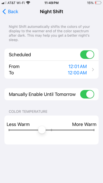
Assuming you have true tone off, have you tried manually turning on night shift? Attached is my setting.When I did the initial invert, the screen looked very strange- the colors were really odd looking. Then I did the zoom thing, and chose the invert there. With the default window zoom, that square looked normal while the rest of the screen had the weird colors.
i switched zoom to full screen.
At that point the screen looks normal as far as I can tell. Reds might look ever so slightly different, but it’s difficult to tell.
Attachments
I think the reds don’t look different like yours do because this device doesn’t have p3 colors To be turning off like I’d have on an Air or Pro?When I did the initial invert, the screen looked very strange- the colors were really odd looking. Then I did the zoom thing, and chose the invert there. With the default window zoom, that square looked normal while the rest of the screen had the weird colors.
i switched zoom to full screen.
At that point the screen looks normal as far as I can tell. Reds might look ever so slightly different, but it’s difficult to tell.
True Tone is still on- but I did have to turn on night shift.Assuming you have true tone off, have you tried manually turning on night shift? Attached is my setting.
FYI @ghanwani @jm31828 the shift in reds to maroons after changing the settings only happens on devices that are P3 to begin with, and those are the devices I've actually seen the most dramatic improvement on with these settings. (iPad Pro 2018, iPhone SE 2)I think the reds don’t look different like yours do because this device doesn’t have p3 colors To be turning off like I’d have on an Air or Pro?
On sRGB devices like the iPad 6 I tested it on, it's true that the maroon shift that @ghanwani is talking about does not happen, but at least on my iPad 6, the colors actually do change but to ones that are even *more* saturated, like an even more colorful red.
However, my iPad 6 is still on iOS 15 whereas the P3 devices I have are on iOS 17, so it might be that some sRGB devices do not work with this method or that Apple has changed something for sRGB between 15 and 17.
All I know is that on my P3 devices on iOS 17, that's actually where I get the most noticeable "stillness feeling" and great reduction of screen strain from these settings.
BTW @jm31828, I'd recommend if possible to go to an Apple Store, try this method on *P3* LCD devices like the latest iPad Air/Pro 11-inch, and see if the maroon shift does happen on those or the noticeable change in screen comfort that I've been mentioning...
It kinda seems counterintuitive, but it might be possible this actually only works for P3 devices, weirdly enough
It kinda seems counterintuitive, but it might be possible this actually only works for P3 devices, weirdly enough
Makes sense. Thanks again for the discussion!FYI @ghanwani @jm31828 the shift in reds to maroons after changing the settings only happens on devices that are P3 to begin with, and those are the devices I've actually seen the most dramatic improvement on with these settings. (iPad Pro 2018, iPhone SE 2)
On sRGB devices like the iPad 6 I tested it on, it's true that the maroon shift that @ghanwani is talking about does not happen, but at least on my iPad 6, the colors actually do change but to ones that are even *more* saturated, like an even more colorful red.
However, my iPad 6 is still on iOS 15 whereas the P3 devices I have are on iOS 17, so it might be that some sRGB devices do not work with this method or that Apple has changed something for sRGB between 15 and 17.
All I know is that on my P3 devices on iOS 17, that's actually where I get the most noticeable "stillness feeling" and great reduction of screen strain from these settings.
I wish I knew what about this display causes this. Some days its barely noticeable and others more so.
Yeah, good call!BTW @jm31828, I'd recommend if possible to go to an Apple Store, try this method on *P3* LCD devices like the latest iPad Air/Pro 11-inch, and see if the maroon shift does happen on those or the noticeable change in screen comfort that I've been mentioning...
It kinda seems counterintuitive, but it might be possible this actually only works for P3 devices, weirdly enough
Probably turn off night shift, night shift (and true tone) will change the white point meaning white is less close to rgb(255, 255, 255), making it more likely that 255 will become some in-between number that the color management system will want to temporally ditherTrue Tone is still on- but I did have to turn on night shift.
(However, for some reason, double invert is still very successful on my SE 2 even while leaving the default True Tone on, which I'm def surprised about)
Two I've found to be VERY successful, but don't actually fix the screen of the device itself:Now find a hack for me for the current MBA and/or MBP.")
1:
Stream Mac display through Sidecar to an iPad that you know works successfully with double invert, so the iPad can now be used as the monitor.
2 (Just found this yesterday and I'm actually amazed at how well this works):
The two Macs method...
For this method, one MacBook needs to be Intel, and I would recommend the other Mac to be Apple Silicon for performance reasons.
It's true for me and many others that Intel MacBooks become very comfortable when used in Safe Mode (since hardware UI acceleration is entirely turned off).
(By the way, you can disable UI acceleration without having to boot into Safe Mode by checking "Disable 2D acceleration" in Quartz Debug.app, which can be found in the Additional Tools for Xcode .dmg for your respective macOS. This can be downloaded through signing into the Apple Developer website.
Also, please note that UI acceleration is forced on for Apple Silicon Macs because checking this box will simply crash to the login screen and Safe Mode is still accelerated on them, so one Mac needs to be Intel for this to work.)
Usually, an Intel Mac is unusably slow without UI acceleration. But guess what — the hardware video decoding chip is still active even without acceleration enabled.
This means that you can enable Remote Management on the newer Mac, open up Screen Sharing on the Intel MacBook, and sign into the newer Mac. What blew my mind is that Screen Sharing still works as fast as it usually would — but if it works like it did for me, screen shimmer will now be entirely gone on the Intel, while still being able to maintain usable performance through the Screen Sharing stream.
Sure, Screen Sharing has it's own compression artifacts, but they don't bother me at all because each artifact usually stays completely still after it happens once, and it definitely isn't changing the screen every single frame. The frame drops also don't bother me at all when the experience is dither-free anyway.
(If needed, you can also prevent compression artifacts entirely by activating "Full Quality" mode from the menu bar, but this will cause lag — this may still be useful if you're just reading something though.)
It's also a good idea for the "newer Mac" to be Apple Silicon, since it will be able to encode the video really smoothly and reduce screen broadcasting lag to a speed that's fast enough to not slow down my workflow at all.
Honestly, with this method, this is the best a MacBook screen has looked to me in the past ten years. The experience on the "hardware acceleration disabled" Intel Mac is the closest I've ever got to the stillness and calm of a great Windows laptop, and I can still benefit from the faster e.g. app launch, compile, and render times that the Apple Silicon Mac is providing. My vision actually ends up feeling better after using my Mac through this method for a while, which is pretty mindblowing.
Since all the Intel MacBook is doing is remotely controlling another Mac, battery life on the Intel will also be better than usual.
Of course, this setup is pretty hacky, lags sometimes, and doesn't let you use the newer Mac directly, but all of those trade offs are worth it IMO for what I've found to be the most comfortable, text shimmer-free Mac experience possible.
TLDR: Newer (Apple Silicon recommended) Mac and older (Intel required) MacBook. Disable UI acceleration on older Intel Mac with Quartz Debug.app to get Safe Mode-level comfort without needing to actually use Safe Mode. Use Screen Sharing to use newer Mac from older Mac. Screen Sharing will still be fast despite UI acceleration being disabled. If done correctly, the Intel MacBook screen will be entirely shimmer free — and you'll still be able to benefit from your newer Mac's performance and OS.
This works because the macOS screen capture APIs record screen contents as static RGB values that are most likely rounded to whole numbers, similar to the pure data you'd get in PNG screenshots — meaning that the data reflects the desktop UI before any extra processing that's between the raw desktop frame and say, a problematic HDMI output, isn't applied.
This is also the best setup if you're having issues with "an external monitor, but only when a Mac is plugged in" too, since the dither-free Intel MacBook can be plugged into the monitor but will stream the newer Mac through it. (This won't work if the older MacBook has a dGPU however, because video out on those Macs are hard-wired to the dGPU and can't access integrated graphics.)
If anyone here tries this and it doesn't work as well as I'm describing, I can share my exact working setup.
Last edited:
I will try that- thanks!Probably turn off night shift, night shift (and true tone) will change the white point meaning white is less close to rgb(255, 255, 255), making it more likely that 255 will become some in-between number that the color management system will want to temporally dither
(However, for some reason, double invert is still very successful on my SE 2 even while leaving the default True Tone on, which I'm def surprised about)
True Tone is still on- but I did have to turn on night shift.
I made an account here just to say that nightshift does cause more pixel color flickering / dithering as the site admin at flickersense.org has tested. Dark mode, and reduce whitepoint does also. Unsure about true tone but I'd assume so too?
Regarding your comments on Windows laptops (especially the Surface devices but I guess this tech could find its way to other brands as well) ...Honestly, pretty sure that the notebookcheck report is just incorrect at this point, since apple devices have used temporal dithering for a really long time.
I have a 2015 15" MBP that aggressively dithers in both Intel and AMD graphics modes, and it has an sRGB display that only supports 8 bit color depth. Applying the Intel nvram set boot-args="dither=0" fix in recovery mode actually causes a noticeable difference on this machine in macOS Monterey, suddenly when adjusting display gamma or color profile in integrated graphics mode, you start seeing color banding shifts (indicating dither disabled), compared to before the fix where everything looks "smooth" no matter what the display settings are.
A lot of people seem to be wondering why it still feels like dithering is being used even on devices with native 8-bit sRGB, no P3 etc. — as a designer I can weigh in on this and say that this is 99% likely because of ColorSync / color management. The level of intricate effect that ColorSync has on display output is something mostly unique to Apple devices for a really long time... it's actually only in 2022 where Windows 11 started integrating something similar called Advanced Color (that will probably be switched on by default in the future...😖)
There's basically a bunch of post processing layers between a program displaying a color and the color that actually shows up on your screen, and ColorSync means that even if an application attempts to show each possible R+G+B color in a row, it won't actually be able to reach all of these colors once it goes through OS color management — because it's basically never the case that e.g. rgb(127,127,127) actually results in the exact same "127 127 127" being sent for that pixel to the monitor. This is true even on seemingly "native" profiles like sRGB, Color LCD, or Generic RGB Profile, because they apply a gamma ramp that has a curve to it instead of representing a direct linear map from 0 to 255.
Now think about what happens when adjusting the gamma and white point sliders in the macOS display calibrator. If there are only 255 values per color, adjusting the gamma would be forcing those 255 physical shades into some smaller set that seemingly would have to still be whole numbers. So there would have to be some sort of "rounding" or loss in precision that you would notice on the display between each color profile — like color banding appearing at different locations, right?
But that doesn't happen, and e.g. a smooth grayscale gradient remains "smooth", no matter if using 8-bit, 10-bit, internal or external monitor, etc. This is because ColorSync — which is a fundamental part of the macOS window server which every window is forced through, with essentially no way to disable — basically is causing temporal dithering to be activated at all times. This is the reason why text (which relies on all shades of gray because of antialiasing) looks awful and shimmery on macOS for everyone who notices this, not the actual font smoothing algorithm itself or DPI scaling. Of course all of this was inherited into other Apple operating systems like iOS and iPadOS as well, since they use the same color management system.
This is in stark contrast to Windows, which has had mostly none or very primitive color management forever (only changing with Windows 11 in late 2022 as previously mentioned). Windows graphics drivers can still cause temporal dithering, but the OS window manager itself mostly works with pure "native" colors, so the problem is fairly easier to get around on Windows 11 (when Advanced Color is off) and Windows 10 and prior by choosing the right graphics card and monitor.
Actually, because a ColorSync-like system has recently been integrated into Windows 11, Microsoft's own article on their Advanced Color Management system accidentally ends up hinting at the same temporal dithering issue that macOS has:
>> When ACM is enabled, the DWM (Desktop Window Manager) performs its composition using IEEE half-precision floating point (FP16), eliminating any bottlenecks, and allowing the full precision of the display to be used. With ACM, apps can access billions of colors with 10-16 bits of precision, and even on displays that only support 8-bit precision, ACM unlocks additional quality using techniques such as dithering.
There are use cases where color management and temporal dithering is useful, mostly in photo and video work. I've heard a lot of people in that space having the opposite issue — not being able to use Windows for their work because the lack of color management makes colors look "inaccurate" or banding artifacts appear after they try to "calibrate" their display, warping the processing of RGB values into something very different and not easily rounded in a smooth way into what is accepted by the actual 8-bit or 10-bit values that monitor hardware requires in the end.
And of course, photo and video is the line of work that the Mac business makes the most money from, with Apple's most expensive machines being marketed towards that sector.
But Macs have always been famous with writers, developers, and students too — where text is important, not images. And us people get the short end of the stick, with every word (regardless of app or text rendering method) passing through way too many layers of ColorSync post-processing and becoming a dithered and shimmery mess, where the entire screen feels like it's moving in the corner of your eye even when displaying a seemingly static page, causing your eyes to constantly refocus or jump to random things unrelated to the text you're trying to read, like the blinking cursor or some brightly colored icon.
And the fact that all of this tech was brought into iPhones and iPads meant for general purpose use, with not one clear accessiblity setting to control the amount of color post-processing used is what makes this unacceptable to me at this point.
It's making me seriously question being a Mac and iPhone user, despite vastly preferring the core Mac workflow over Windows and my work (web design and development) basically relying on a Mac environment.
On macOS, the only way around dithering by messing with system parameters like the boot-args to tell ColorSync not to apply the dithering step, or by running the window server with no graphics acceleration, like in Safe Mode on Intel machines. But that boot parameter only worked for integrated graphics on my 2015 Macs, but changed nothing at all on my newer 2018 MacBook Air, despite the Air also only claiming to support 8-bit sRGB, not supporting True Tone — and heck, even still running Mojave. Based on an old blog post about OS X temporal dithering from 2010, it has been a core part of macOS in some way since at least 10.6 Snow Leopard, and possibly since 10.3 Panther when ColorSync expanded to becoming a part of the monitor output chain for the first time.
So any Intel Mac after that is also probably not able to be fixed either aside from switching to Windows through Boot Camp and using older Intel graphics drivers. M1+ machines are basically a lost cause.
This reply is getting way too long to elaborate, but I'm pretty sure the XDR MBPs, Pro Display XDR, and Studio Display even apply ColorSync and hence dithering even deeper at the display level, based on a comment I read from someone in the Linux on Apple Silicon space and the OS trying to force you into using limited "hardware reference modes" on those devices instead of ICC color profiles.
This is basically the shortest possible way to explain why this seems to be a persistent issue with specifically Apple products — and getting worse every year — when it's always felt way easier to find Windows or Android devices where this is not an issue at all, text looks COMPLETELY fine, and my eyes don't feel any strain.
TLDR:
Apple ColorSync display color management almost always forces color shades into values that aren't whole numbers and more precise than what screens can physically show.
Instead of rounding values and causing color artifacts, temporal dithering is used at almost all times to keep colors "smooth". (This can even affect white if the white point is not native, like in Night Shift mode)
This is why Apple products affect screens where dithering usually wouldn't even need to be used, like 8-bit sRGB or even native 10-bit panels.
People working in photo and video can benefit from this, but people working with text get a massively degraded experience because of this — especially if their eyes are sensitive enough to constantly notice the shimmering text effect over and over when trying to read on Apple devices, like I do.
———
@jm31828 If you've made it this far, I've found a combination of accessibility settings that has actually improved my experience massively with newer LCD iPhones and iPads, which I've never seen anyone mention before. I'm calling it "Double Invert":
Enable Classic Invert in Display accessibility settings. Then enable Zoom, use the three figure gesture to zoom out all the way. Then enable the "Inverted" Zoom filter.
Since there are two inverts happening at once, the screen is now no longer inverted, but something will start to feel VERY different. Some colors will appear slightly off, and if this works for you, static pages will suddenly feel completely still.
I have NO idea what this combination of settings is doing under the hood, but I've tested it on:
- iPad 6 (iOS 15, sRGB, auto brightness off, night shift off)
- iPad Pro 2018 (iOS 17.2, P3, 120hz, auto brightness off, true tone off, night shift ON)
- iPhone SE 2 (iOS 17.2, P3, auto brightness ON, true tone ON, night shift off)
On all three devices, the screen became 10x easier to read. Prior to this, I hated using my iPad Pro 2018 for years, but I actually like using it again after applying double invert.
In fact, this entire reply was written on my SE 2020 with the double invert settings applied — my eyes feel surprisingly just as great as they did before using the phone, so I guess that's the proof that this method actually does work for me — and the way colors are processed actually does have an effect on the eyes of some people.
On sRGB devices double invert makes colors look oversaturated, on P3 devices it makes reds way too washed out. But text looks SO MUCH better — I honestly don't know why.
I actually tested double invert on an OLED iPhone too, and it even caused a very noticeable and sudden difference there too. Of course, PWM is also an issue there too and this method can't be used at the same time as the "reduce white point" strategy for reducing PWM, so I ended up not using this method there since OLED backlight flicker bothers me even more.
But the OLED screen actually felt SO STILL with it on, and I noticed all HDR content (like the "brighter than white" screenshot flash) and P3 colors were entirely disabled and clipped off. So whatever this is doing, it's definitely disabling some layer of color post-processing.
(I'd say the effect of double invert on OLED devices feels like the screen is transformed into an older era of OLED, such as e.g. the Galaxy S5, where PWM was still just as much of an issue but the actual contents on the screen is a lot more "stable" compared to modern devices.
For people who know they aren't affected by PWM but still have issues with new iPhones, it honestly might be worth trying double invert on OLED devices too. In my case though, I just left the OLED iPhone on default settings in the end, and I'd say the optimal use case for double invert is on LCD devices.)
As mentioned, double invert works on the latest version of iOS as of January 2024 which is amazing. Unfortunately, there is no equivalent setting on Mac.
I am closing with:
Journalists should stop reviewing monitors and phone displays as if they are TVs. In so many use cases, text matters, not HDR, how "realistic" a movie looks, contrast ratio, display gamut, or even color accuracy, if you think about areas like general office work or programming where how images look doesn't matter.
If a screen is displaying still text or graphics, the screen should not be acting as if something is still moving, even if "the typical person isn't likely to perceive this". Unfortunately, this isn't the case with most displays or operating systems today, and guess what — no human is going to be 100% typical.
For now, I'm sticking with displays that can actually just succeed in displaying words correctly.
🌀🐚
If we were to run Linux on them would that totally get rid of any temporal dithering?
Register on MacRumors! This sidebar will go away, and you'll see fewer ads.