Become a MacRumors Supporter for $50/year with no ads, ability to filter front page stories, and private forums.

Warped9

macrumors 68000
Oct 27, 2018
1,724
2,419
Brockville, Ontario.
Technology in general has always evolved to be lighter, leaner and more compact. The thin new iMac makes perfect sense in context of how it began and has evolved. Televisions, monitors, tablets and phones have long been trending to get thinner, lighter and pushing the display as close to the edge as possible. So why not an AIO desktop?

A laptop is really just a portable AIO and laptops are following the same trend to get lighter and thinner to make them ever less cumbersome to carry around.

Reducing a desktop’s footprint allows for more workspace on the desk itself. The disagreement on what the new iMac looks like is based on differing priorities. Apple could easily have designed the new iMac to have been a nothing-but-display unit with everything tucked behind it—and thats what many were expecting based on rumours that were either deliberately misleading or simply based on incomplete information. Nonetheless Apple had technical reasons for their new design direction, but they also chose to capitalize on the established design language of the previous iMac that made it so recognizable. It’s new yet still immediately recognizable.

Other AIOs already had thin bezels and chin or no chin designs, but the iMac has always sported a clean and highly refined look. It’s what allowed the previous iMac to still look good for so long. The new iMac, rather than other PC AIO designs, is what finally makes the older iMac look dated.
 

zachz

macrumors 6502
Original poster
Jun 18, 2012
272
889
@zachz, when you get a chance, what are the screen resolution options under System Preferences > Displays? I’m particularly interested in the “More Space” option(s).

I run my 5K iMac at slightly higher than native resolution and was curious about the options for doing the same on the 4.5K iMac; if I can run at roughly 5K resolution on the 4.5K display I’d be very interested. Thank you!

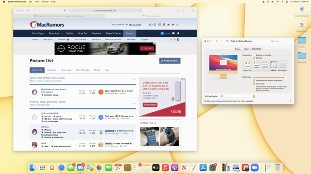
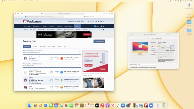
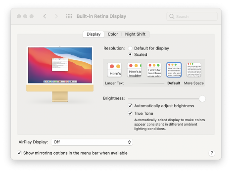
Here are the options for screen resolutions. Let me know if there's anything you'd like to see with the different resolutions! I may actually keep it with "more space" -- makes it a bit nicer
 

Attachments

  • Screen Shot 2021-05-27 at 9.06.30 PM.png
    Screen Shot 2021-05-27 at 9.06.30 PM.png
    1.3 MB · Views: 296
  • Screen Shot 2021-05-27 at 9.06.49 PM.png
    Screen Shot 2021-05-27 at 9.06.49 PM.png
    1.3 MB · Views: 291
  • Screen Shot 2021-05-27 at 9.09.56 PM.png
    Screen Shot 2021-05-27 at 9.09.56 PM.png
    815.3 KB · Views: 301

jonblatho

macrumors 68030
Jan 20, 2014
2,529
6,241
Oklahoma
Here are the options for screen resolutions. Let me know if there's anything you'd like to see with the different resolutions! I may actually keep it with "more space" -- makes it a bit nicer
Nice, thanks! What are the dimensions of the “more space” resolution, if you don’t mind?
 

zachz

macrumors 6502
Original poster
Jun 18, 2012
272
889
Nice, thanks! What are the dimensions of the “more space” resolution, if you don’t mind?
No worries! It says it looks like 2560 x 1440 with "more space" and 2240 x 1260 with "default" when hovering over the scale options, is that what you mean? Sorry I haven't really looked into this before!
 
  • Love
Reactions: jonblatho

jonblatho

macrumors 68030
Jan 20, 2014
2,529
6,241
Oklahoma
No worries! It says it looks like 2560 x 1440 with "more space" and 2240 x 1260 with "default" when hovering over the scale options, is that what you mean? Sorry I haven't really looked into this before!
Exactly what I was looking for, thanks again!
 
  • Like
Reactions: zachz

rpmurray

macrumors 68020
Feb 21, 2017
2,148
4,330
Back End of Beyond
If anyone is having trouble deciding between the 24" or the 27" replacement, or wanting to go from the 27" down to this, let me know if you have any questions or want to see any of apps/websites side by side and I'll do my best to compare them!
Is that yellow tint on the 24" display an artifact of your camera or is that real? Are the brightness levels and temperature set to the same levels on both?
 

Damian.

macrumors regular
Jan 3, 2009
157
26
Here are the options for screen resolutions. Let me know if there's anything you'd like to see with the different resolutions! I may actually keep it with "more space" -- makes it a bit nicer
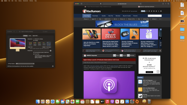
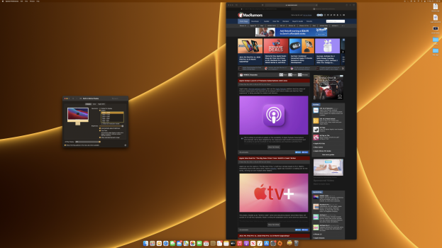
Can you visit the Macrumors frontpage or forums and make the Safari window taller vertical? (touching the menubar and dock) and show the following resolutions: Default, More Space and 4480x2520 (Press Option while clicking the Scaled button for 4480x2520)

Thanks!
 

zachz

macrumors 6502
Original poster
Jun 18, 2012
272
889
Is that yellow tint on the 24" display an artifact of your camera or is that real? Are the brightness levels and temperature set to the same levels on both?
Hm I just realized I had NighShift on the 24", both are at the same brightness. Sorry about that, I didn't realize it was on, probably should've turned it off!

Can you visit the Macrumors frontpage or forums and make the Safari window taller vertical? (touching the menubar and dock) and show the following resolutions: Default, More Space and 4480x2520 (Press Option while clicking the Scaled button for 4480x2520)

Thanks!
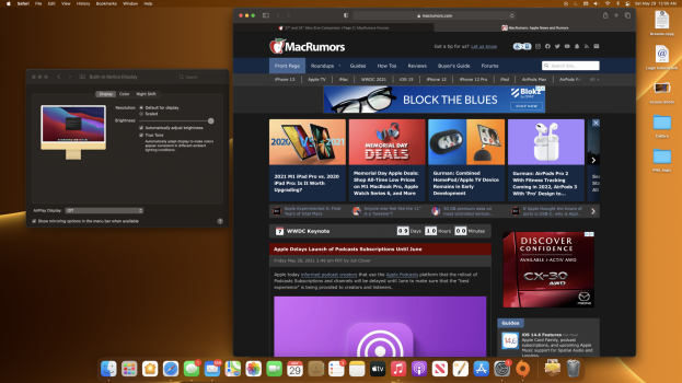
Here they are! Should be in the right order, default to scaled :) I didn't know there were more options when pressing option, that's neat!
 

Attachments

  • Screen Shot 2021-05-29 at 12.00.27 AM.png
    Screen Shot 2021-05-29 at 12.00.27 AM.png
    1.5 MB · Views: 273
  • Screen Shot 2021-05-29 at 12.00.39 AM.png
    Screen Shot 2021-05-29 at 12.00.39 AM.png
    1.5 MB · Views: 268
  • Screen Shot 2021-05-28 at 11.59.59 PM.png
    Screen Shot 2021-05-28 at 11.59.59 PM.png
    1.7 MB · Views: 270

russell_314

macrumors 604
Feb 10, 2019
6,740
10,347
USA
Technology in general has always evolved to be lighter, leaner and more compact. The thin new iMac makes perfect sense in context of how it began and has evolved. Televisions, monitors, tablets and phones have long been trending to get thinner, lighter and pushing the display as close to the edge as possible. So why not an AIO desktop?

A laptop is really just a portable AIO and laptops are following the same trend to get lighter and thinner to make them ever less cumbersome to carry around.

Reducing a desktop’s footprint allows for more workspace on the desk itself. The disagreement on what the new iMac looks like is based on differing priorities. Apple could easily have designed the new iMac to have been a nothing-but-display unit with everything tucked behind it—and thats what many were expecting based on rumours that were either deliberately misleading or simply based on incomplete information. Nonetheless Apple had technical reasons for their new design direction, but they also chose to capitalize on the established design language of the previous iMac that made it so recognizable. It’s new yet still immediately recognizable.

Other AIOs already had thin bezels and chin or no chin designs, but the iMac has always sported a clean and highly refined look. It’s what allowed the previous iMac to still look good for so long. The new iMac, rather than other PC AIO designs, is what finally makes the older iMac look dated.
I agree with this. The chin is a non issue but the thickness or lack of allows me to push it farther back on my desk. The screen is amazing. I upgraded from a 2018 Mac mini with a 32" Samsung 1080P monitor. I was worried about going smaller but no it's perfectly fine for me.
 

zorinlynx

macrumors G3
May 31, 2007
8,354
18,580
Florida, USA
I hope they announce the 27" successor at WWDC, or at least this year. I really need to upgrade and simply cannot handle a reduction in screen size. This forum post just clinches it for me.
 
  • Like
Reactions: turbineseaplane

rpmurray

macrumors 68020
Feb 21, 2017
2,148
4,330
Back End of Beyond
Now that Apple is making the iMacs so thin I'm hoping they might consider making one with a 40" curved display. In all black (bezeless or black bezels), with matching accessories, and a backlit keyboard, and no chin.
 
Last edited:
  • Like
Reactions: SsSsSsSsSnake

georgivelev

macrumors regular
Jan 23, 2011
103
107
Today I saw the new 24” iMac in our local Apple store. It was placed next to the old 27”. The 24” looks, hmm, small, but I have a 34” ultrawide at home. Watching movies on the new iMac feels very strange partly because I’ve been accustomed to the 34” , partly because it’s very strange to have the picture in the middle, black stripes above and white bezels on top.
 

zorinlynx

macrumors G3
May 31, 2007
8,354
18,580
Florida, USA
One thing I wish is that Apple would release a standalone 5K 27" monitor at a reasonable price point, that uses the same panel as the existing 27" iMacs.

I would buy one of those in a heartbeat and switch to using a Mac Mini, so I no longer have to worry about what display comes with the computer.

Unfortunately Apple wants to keep that wonderful panel to themselves so people buy more iMacs. I understand it, but I don't like it!
 

rpmurray

macrumors 68020
Feb 21, 2017
2,148
4,330
Back End of Beyond
Not to mention many people (like me!) can't STAND curved displays and it would instantly alienate a subset of their users.
Not trying to start an argument so this is a serious question: What do you find that you can't stand about a curved display? I think once a display gets up to about 40 inches it becomes uncomfortable to use it as a flat panel computer monitor considering how close you'll be. But maybe that's just me. I'm talking widescreen displays.
 

Warped9

macrumors 68000
Oct 27, 2018
1,724
2,419
Brockville, Ontario.
A curved screen is designed with the idea that everything on the display is of equal distance from your eyes, assuming you’re sitting in the optimum position. If you’re off-centre then one side of the screen is going to look foreshortened. In real life, though, everything is not of equal distance to your eyes so for some people a curved screen feels weird.

It works for some, but not for others.
 
Last edited:

zorinlynx

macrumors G3
May 31, 2007
8,354
18,580
Florida, USA
Not trying to start an argument so this is a serious question: What do you find that you can't stand about a curved display? I think once a display gets up to about 40 inches it becomes uncomfortable to use it as a flat panel computer monitor considering how close you'll be. But maybe that's just me. I'm talking widescreen displays.
A curved screen is designed with the idea that everything on the display is of equal distance from your eyes, assuming you’re sitting in the optimum position. If you’re off-centre then one side of thevscreen is going to look foreshortened. In real life, though, everything is not of equal distance to your eyes so for some people a curved screen feels weird.

It works for some, but not for others.
Pretty much that. I sit in a lot different positions and move around in my chair a lot.
 
  • Like
Reactions: artfossil

mdgm

macrumors 68000
Nov 2, 2010
1,665
406
I'm used to the 21.5" screen size, so would be fine with a 24" iMac. However I want them to bring back more ports, improve the performance and I'd also want BootCamp to return. The lack of BootCamp means that I'm seriously considering getting a 2019 or 2020 iMac if I can find one for the right price.
 

rpmurray

macrumors 68020
Feb 21, 2017
2,148
4,330
Back End of Beyond
I'd also want BootCamp to return. The lack of BootCamp means that I'm seriously considering getting a 2019 or 2020 iMac if I can find one for the right price.
That would require Microsoft to sell an ARM version of Windows.

I'd go with the 2019 iMac. No T2 means fewer complications.
 

Racineur

macrumors 6502a
Jun 11, 2013
578
176
Montréal, Québec
You have a point here friend.
I think so. Wherever people will place their iMac, this wonderful piece of tech will probably end up on a desk for 98% of the time. Most of desks sold in stores or online are 24-36 inches deep so they will accommodate a 4 inch thick piece of glass as they would for a 6 inches thick or even 8 inches. So 4 inches is irrelevant on a desk. Now, to be honest, how many people will be looking at the back of the iMac. In your home office. Probably you and your wife or husband if you place your desks back to back. At the office, probably no one cause there mostly will be mobile walls between you and your work mate. Would I like to look at the back of a computer even if it's ruby red, my preferred color? No. I wanna see what's happening on the screen. So yes I still think the logo should have been put in the front and this iMac could have been 6 inches deep to accommodate a card reader (yes yes since the iMac is still the preferred tool of pro photographers with DSLR that still use SD cards and high end camera even use Compact Flash cards), and put the audio jack in the back where it should be. All this being observations, not my personal tastes.
 
Register on MacRumors! This sidebar will go away, and you'll see fewer ads.