Got a tip for us?
Let us know
Become a MacRumors Supporter for $50/year with no ads, ability to filter front page stories, and private forums.
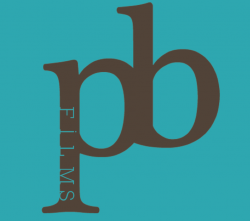
2nd attempt at logo design
- Thread starter bluap84
- Start date
- Sort by reaction score
You are using an out of date browser. It may not display this or other websites correctly.
You should upgrade or use an alternative browser.
You should upgrade or use an alternative browser.
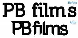
the original has a poor choice of font, while the second looks inconsistent, and the spacing feels very condensed.
the original has a poor choice of font, while the second looks inconsistent, and the spacing feels very condensed.
there both the same font
ok...so what would you do to make PB films look awesome...im open to new font ideas
I understand that the font is the same, it's just that it's a poor use and modification of it. It's boring, and needs something to make it look unique. Look at the Miramax logo for example. It's also plain, but it's not in a single line of text. It's arranged a certain way to stand out. Try playing with two different fonts (one for PB and the other for films). Maybe have the first as bold, while the second in cursive/script, or the other way around. Or maybe try making a different custom set of lettering, connecting each letter in the word "films" where it flows as a single line.
It's hard to give advice on design when you know nothing about what you are designing but the name. What kind of films do they make? Do they want to look professional, or new, or modern, or old, or what? Are they targeting children or adults? More info would help me to critique your work.
It's hard to give advice on design when you know nothing about what you are designing but the name. What kind of films do they make? Do they want to look professional, or new, or modern, or old, or what? Are they targeting children or adults? More info would help me to critique your work.
Extreme sport films, snowboarding / mountain biking
but also would like a modern design, and not to limit to just sport As i create other films..it wouldnt be aimed towards kids no.
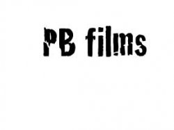
what do you think...please comment, good and bad.
i think its simply but would look good in 3D as a film intro in AE
I think it obvious that you have had no formal training in design. Right?
Hire someone to design it, unless you don't care what your logo looks like. If you can't afford it, then just stick with a basic font and your name - maybe vary the weight and kerning. What you have shown us is terrible and looks like someone who doesn't know how to design did it. Seriously.
You can't just throw type together, modify it, and then expect it to look good as a logotype. I've had extensive formal training in symbol/logo development and it still can take me hours and hours of trial and error to come-up with a good mark. It is especially difficult if you are doing one for yourself. Creating your own identity is one of the hardest things to do in design.
You should go to logopond.com and take a look around before going any further.
I think it's pretty clear from the previous comments that the concept isn't that popular... The issue being is that you're designing for yourself I'm guessing from typographic treatment and font choice it's really out of your realm of expertise, further more I'm also guessing you're doing a thing called tooling and just jumping into Photoshop without a clear idea of what you're trying to achieve.
I would refer you to this link about design a logo and this link about vital tips.
From experience a font can make of break a good logo, I'm still not sure why you've used a slab serif and how it's going to communicate what you're doing. I'd also like to refer to the type, each versions the type is very jilted and uneven with spacing between the letters. This means it looks sloppy and unprofessional, fixing this up would greatly increase the crispness of the logotype and would improve the previous versions.
My advise would be:
1) Learn some typography techniques
2) Use nicer fonts. There are very good free fonts out there Vegur, Eau and Code would be good examples of this. Try Font Squirrel
3) Don't design for yourself... Not saying don't design your own logo rather try and remove yourself so it's not a personal thing.
4) Stay clear of slab serif, I've yet to find a nice looking typographic logo done with slab serif.
what do you think...please comment, good and bad.
i think its simply but would look good in 3D as a film intro in AE
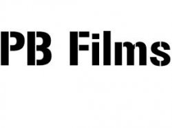
try making the "PB" part lowercase, and it may look a little more pleasing and balanced to the eye.
try making the "PB" part lowercase, and it may look a little more pleasing and balanced to the eye.
Yeah... that's probably all it needs.

Logo's are not my specialty but I echo the comments by ezekielrage_99 & THX1139. Here is just a quick/rough concept idea or starting point, it may be a bit cliche but do something that is simple, bold, clean and professional that states "film". Just my 2 cents.
Follow the links provided by the posters (ezekielrage_99 & THX1139) above, they should get you on the right track. If this is for an actual legitimate or professional company and not just for a "hobby" et. then definitely hire a professional designer.
Good luck.

Follow the links provided by the posters (ezekielrage_99 & THX1139) above, they should get you on the right track. If this is for an actual legitimate or professional company and not just for a "hobby" et. then definitely hire a professional designer.
Good luck.
Last edited:
Logo's are not my specialty but I echo the comments by ezekielrage_99 & THX1139.
BTW nice logo
Not a fan of your original concept. Its impossible to convey years of design training in a thread but I'll try to help. Look around at current logos. What do you see? Simplicity. The days of cluttered logo's are over. As for the typeface you want to use, remember that each typeface has a personality and if the first thing people notice is that over your title you have a problem. Try not to over-think it but sit down for a few hours and just experiment with different layouts/typefaces/placement. If in the end you cannot reach a design that you feel accurately tells others what your brand is, hire someone.
could someone lend a hand? im really struggling.
its only for personal use and to put at the front of my videos as abit of self promotion
id really appreciate it
Bluetooth already gave you a hand by posting a decent start. Take his idea and expand on it. I suggested to you that if you can't do the logo, or afford to hire anyone, then just use type. Look at some classic fonts and see if something grabs you. I've seen quite a few successful people just use Helvetica and their name. One of my clients is a successful photographer who just used Arial and her name. I hate it, but she doesn't seem to mind. She more interested in creating the images and can't justify hiring me to "fix" her non-existing logo (arial and your name doesn't make a logo).
So, other than that, you can't expect people to do something without some kind of compensation. It would be one thing for you to post several concepts and ask people to help you refine them. But quite a different thing if you want more help than that in order to get a really quality product. If so, then you should get out your checkbook.
No offense, but you seem to be quite picky for someone who is asking for free help.
How would you like it if your boss called to ask you to work on Saturday for no pay.... because he's really struggling?

Better.
I have no design experience, but as they say I know what I like.
Your new logo at least suggests film or photography. That is part of what a logo should do - impart to the viewer what your business does.
Again, like the others said this is your brand, your image. Either go all out, spend time and resources to decide what you mean to convey and make it perfect, or go simple with an off the shelf font. Don't go half way.
Good luck.
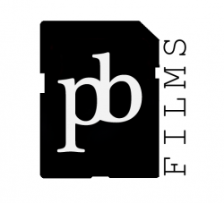
is this better?
i have taken the idea of the film, as i dont use film and only digital i thought a silhouette of a SD card would work..
its a rough edit but the idea is there
Image
I only spent 5 minutes on this, but with some tweaking it could look cool.
This is cool, but it maybe sends out the wrong message about the quality of films.
That said, it is my favourite element. I grew up drinking water laced with it.
Image
I only spent 5 minutes on this, but with some tweaking it could look cool.
Well... when you spend 5 minutes on something, you get 5 minutes worth of value. My questions is, what does PB films have to do with lead?
This is why research is so important, instead of throwing ideas at the wall hoping one will stick.
I noticed above how the OP used the silhouette of an SD card for his latest concept. While it appears to be more concept driven (because it certainly relates to his brand more so than the symbol for lead) does anyone see a problem doing that? Anyone?
Probably not a problem IF he doesn't mind redesigning it in few years due to relating to an ever changing technology. Imagine if someone based their logo on a floppy disk icon? Or, how about a Zip Disk? Remember those? One should be careful to attach meaning to time sensitive materials unless they don't care about being dated to a trend. Think about all those logos out there that look like soon to be discontinued CD/DVD media, or Film strips with sprocket holes? In another 10 years, a lot of people aren't going to know what sprocket holes are!
That being said, the OP could get a few years off basing his logo off an SD card... but does it say the right message? Is it cliché?
Creating a good logo is NOT easy! Some people get lucky, others just throw crap out there. And the smart people invest to have someone do it for them. A properly designed logo is supported by research, is not overly derivative, is not cliché, is timeless, is scalable across media types, and it conveys the brand in a positive light. To get all that, it costs money.
If you don't have money, then you're better off not trying to fake it unless you and your target audience doesn't care about quality perception. For example, I don't care that the handy-man has a cheesy logo on the side of his pickup truck... but I would probably not see a specialist who has a bad logo.
Go with a simple type solution and a clever tag line instead. Especially since it's more of a hobby. If one puts out a crappy logo to support a hobby, it will come across as pretentious and cheesy. Using a type only solution will help to alleviate that perception.
Register on MacRumors! This sidebar will go away, and you'll see fewer ads.