Got a tip for us?
Let us know
Become a MacRumors Supporter for $50/year with no ads, ability to filter front page stories, and private forums.
A 4 inch screen is definitely not the ideal size for a smartphone
- Thread starter SomeDudeAsking
- Start date
- Sort by reaction score
You are using an out of date browser. It may not display this or other websites correctly.
You should upgrade or use an alternative browser.
You should upgrade or use an alternative browser.
No the body isn't much larger, it's the screen size that makes the S3 more cumbersome.
Lol. That makes sense. Not.
Lol. That makes sense. Not.
...?
Look at your picture. If I wanted to touch something at the top of the S3 screen it would be equivalent to reaching to the top of the iPhone 5. Plus it's wider...trying to reach the top left corner of the S3 would be a chore.
I been enjoying the GS3 since the beginning of August. My only real complaint is the auto screen rotate is too damn sensitive. Sometimes I have to toggle off.
...?
Look at your picture. If I wanted to touch something at the top of the S3 screen it would be equivalent to reaching to the top of the iPhone 5. Plus it's wider...trying to reach the top left corner of the S3 would be a chore.
...?
...?
Look at your picture. If I wanted to touch something at the top of the S3 screen it would be equivalent to reaching to the top of the iPhone 5. Plus it's wider...trying to reach the top left corner of the S3 would be a chore.
Actually not really. Might seem that way at first, but you'll develop a way of holding it that makes one handed use easy.
Actually not really. Might seem that way at first, but you'll develop a way of holding it that makes one handed use easy.
Easy? I'm sure easier, but I doubt it'd ever be completely painless to use one-handed. I suppose I'm talking out of my a** since I don't own one, but I've used it on many occasions and I can't ever imagine it being easy to use one-handed.
The truth of the matter is there is no perfect or ideal size screen.
...?
Look at your picture. If I wanted to touch something at the top of the S3 screen it would be equivalent to reaching to the top of the iPhone 5. Plus it's wider...trying to reach the top left corner of the S3 would be a chore.
Only iOS would put things at the top of the screen that require constant touching (back/cancel usually). Back is part of the OS on Android and always at the bottom be it on screen or capacitive.
If Samsung wasn't using AMOLED displays the S3 would be more appealing. Those screens just dont look very good at this point. Brightness and blue-ish contamination being a big problem.
Also, American iterations really need to stop being gimped with Qualcomm SOC's.
Also, American iterations really need to stop being gimped with Qualcomm SOC's.
Only iOS would put things at the top of the screen that require constant touching (back/cancel usually). Back is part of the OS on Android and always at the bottom be it on screen or capacitive.
Notifications? UI buttons? There's tons of stuff on Android at the top...just not Back.
----------
If Samsung wasn't using AMOLED displays the S3 would be more appealing. Those screens just dont look very good at this point. Brightness and blue-ish contamination being a big problem.
Also, American iterations really need to stop being gimped with Qualcomm SOC's.
Agreed. AMOLED is a drawback.
Easy? I'm sure easier, but I doubt it'd ever be completely painless to use one-handed. I suppose I'm talking out of my a** since I don't own one, but I've used it on many occasions and I can't ever imagine it being easy to use one-handed.
The truth of the matter is there is no perfect or ideal size screen.
Everyone is built differ. My hands can manuver through the GS3 screen easily. The same way you feel about the GS3 is the same way I feel about the Note(2) being to big for one handed use.
Notifications? UI buttons? There's tons of stuff on Android at the top...just not Back.
----------
Agreed. AMOLED is a drawback.
You don't need to reach to the opposite corner (left or right handed) for notifications. What UI buttons?
I'm not saying you NEVER need to reach the opposite corner, just unlike iOS where regardless of app there is something important in the upper left and/or right.
...?
Look at your picture. If I wanted to touch something at the top of the S3 screen it would be equivalent to reaching to the top of the iPhone 5. Plus it's wider...trying to reach the top left corner of the S3 would be a chore.
I conclude that The picture shows that the actual size between the two devices is very close, so if people like one versus the other, then, largely, the reason is for some reason other than size.
Last edited:
Notifications? UI buttons? There's tons of stuff on Android at the top...just not Back.
Can you give any specific examples?
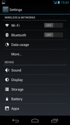
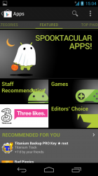
I've just tried doing a few things one handed on my Galaxy Nexus with no issues.
(Chrome, Settings, Play Store and GReader below).
Holding the handset in my right hand, everything I needed was in reaching distance of my thumb. I was also able to easily pull down the notification tray and flick away any unneeded notifications.
Attachments
A couple of things...
Are we seriously still talking about how "difficult" it is to get an S3 into one's pockets? This is such a non-issue. (Personally, I feel the S3 actually feels amazing in the pocket. It just disappears because it's so thin and rounded.)
And... the back button, people. It's a beautiful thing.
Are we seriously still talking about how "difficult" it is to get an S3 into one's pockets? This is such a non-issue. (Personally, I feel the S3 actually feels amazing in the pocket. It just disappears because it's so thin and rounded.)
And... the back button, people. It's a beautiful thing.
A couple of things...
Are we seriously still talking about how "difficult" it is to get an S3 into one's pockets? This is such a non-issue. (Personally, I feel the S3 actually feels amazing in the pocket. It just disappears because it's so thin and rounded.)
And... the back button, people. It's a beautiful thing.
S3 is too big.
I agree the back button is one of the greatest innovations in Android.
Big surprise. On a big screen things look.... bigger.The thing that swayed me to the Galaxy S3 is the gorgeous screen. Comparing the iPhone 5 screen with the Galaxy S3 screen, the Galaxy S3 wins hands down. The size of the iPhone 5 screen at 4 inches was so small compared to the Galaxy S3 at 4.8 inches.
I loaded up YouTube videos, Google Maps, and Macrumors on both devices. It was striking how much more useable these apps/websites are with the extra screen space of the Galaxy S3. I could see more content and also with larger font sizes, which meant much less scrolling.
The question is where's the right balance. I've have 3.5, 3.7, 4.0, 4.3 inch phones. I found the 4.3 too big. iPhone 5's 4" screen seems like a good compromise. I could see a very thin no bezel 4.3", but the 4.8" S3 screen is simply too big. If you want something that huge, why not get a Galaxy Note II, its even bigger, its likely stuff on the screen will look bigger too. Or get a 7" tablet and use it as a phone. Where does it stop. The bigger the display the better it looks, but the more awkward to carry around.
Of course its a personal decision. If its the right size for you thats great. But its easy to forget about how much larger it is to carry around when you look at it in a store and see pretty big pictures. Back when the iPhone was announced with its 3.5" screen, folks thought that was huge. My how times have changed. Rather than trying to get more into a smaller package, we seem to reward a bigger package.
AMOLED screen works different. Black is really black. Black on an LCD is the LCD trying to block the light that's still there. I have/had an AMOLED screen phone. Its ok but has some downsides including:To add to my decision, the blacks on the Galaxy S3 are true black. One of the biggest things that has bugged me about the iPhone that I''ve had all these years is that it's screen can't render true blacks. For example, if you've ever tried watching a video on the iPhone screens, the blacks on it are actually grayish because of the backlighting that bleeds the blacks. This bugs me a tremendous amount.
- can get screen burnin. Didn't happen to mine but its possible.
- colors can be unrealistic. The S3 colors are a little off but most folks wouldn't notice.
- AMOLED can be harder to see in the sun. I think the technology has continued to improve.
- Battery life. The more bright areas there are on the screen the more power is needed. The worst case is displaying an all too common white page at maximum brightness. Can be much worse than LCD. On the other hand, looking at a white on black page in relative darkness has minuscule power drain.
And, BTW, at least to my eyes, the iPhone 5 display is the best LCD display I've seen or owned. Blacks are excellent. Color reproduction is spot on. Automatic brightness is just right so you're never staring into a headlight. To me, it looks like a richly colored piece of bright paper, not a display.
Have you used both? Asking seriously. I traded my 4S for the S3 and before I put the 4S into my front pocket on my lab coat at work. I had to change that for the S3 because yes it is larger and it would've fallen out of my front pocket if I bent over, so I put it in the lower pocket. Not really a big deal, but there's a good size difference here...Not to mention I feel obligated to use a case with the S3 because it felt so fragile.
Plus the feel of the S3 in front jeans pocket is noticeably different than the feel of the Razr M in pocket. Both fit no problem but there's a different feel and a large area of my thigh ist tightened down from the S3 but not as much with the M.
Yes I have and I'll actually be picking up the Note II when it comes out. I've never placed a phone in my front shirt pocket, that's just asking for trouble. The S3 is bigger than the 4S, I agree with you there but I'm sure you'd feel a noticeable difference with an iPhone 5 in your pocket compared to the 4S as well..
I disagree. A 4 inch screen is a perfect size. I had the razr maxx, and the phone was too bulky. I looked at a GS3 and Note, and it's like carrying a brick around.
LOL...so funny to see this. Before the iP5 came out, most in here said 3.5" was the perfect size.
So, remind me why this is posted on an Apple forum instead of the Samsung or Android forums?
Glad you found a smartphone you enjoy. But it seems a meme to post about it here.
It's posted in a section called "Alternatives to iOS and iOS devices" so I don't see any issue with this thread. If you don't like Android devices then don't read about them.
----------
LOL...so funny to see this. Before the iP5 came out, most in here said 3.5" was the perfect size.
Funny thing is the reverse has happened with the iPad. Before the iPad Mini came out most in here said no one would ever want a tablet with a display smaller then 9.7 in.
It's posted in a section called "Alternatives to iOS and iOS devices" so I don't see any issue with this thread. If you don't like Android devices then don't read about them.
----------
Funny thing is the reverse has happened with the iPad. Before the iPad Mini came out most in here said no one would ever want a tablet with a display smaller then 9.7 in.
Yeah, this forum is filled with a bunch of iRobots.
Yeah, this forum is filled with a bunch of iRobots.
Devoted Apple users may seem to blow with the winds of apple, yet I'm sure that has to do with a sense that apple delivers a decent overall set of products. Even I was having second thoughts about apple in the late 90s. Nonetheless, apple continues to deliver, thus, too much emphasis on Consistency could be considered the hobgoblin of small minds.
I'm sure if apple came out with a 4.3 or a 4.8, there would be a large number of converts, but for now, 4" works pretty good - and by the large number of adopters is probably the best for many, if u can afford it, or can rob a bank.
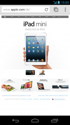
I love my iphone but I have to rant on the hypocrisy of the whole "perfect for one hand" iPad Mini/iPhone 5 excuses. With phones we are to believe any bigger is for mutants. but then the iPad Mini page shows this gigantic caveman hand displaying how this 7.9"iPad can easily be held in one hand. If handling a Mini is that easy with one hand then I'm not convinced that 4.3" phones wouldn't work.
I don't think anyone, including Apple, is claiming the iPad Mini can be used one-handed. The issue many have regarding phone size is using it one-handed. I also agree that 4.3" would be ideal--I've also owned a Galaxy Nexus and personally found its 4.65" screen a touch too large for one-handed use but again that's just my personal experience. I also own a Nexus 7 and love how comfortable it is too hold one-handed, suspect I would have a similar experience with the iPad Mini.
Update: Well I stand corrected after watching the promo video--Apple clearly does think the 7.9" form factor is perfect for one handed use.
Last edited:
Only iOS would put things at the top of the screen that require constant touching (back/cancel usually). Back is part of the OS on Android and always at the bottom be it on screen or capacitive.
Thank you thank you thank you!
I cannot believe iOS put the back button in the top left of the screen. Unless you're left handed it's a real pain and something Android uses won't have to bother with.
p.s, How often do you really type with 1 hand? unless of course you're driving illegally
Register on MacRumors! This sidebar will go away, and you'll see fewer ads.


