Become a MacRumors Supporter for $50/year with no ads, ability to filter front page stories, and private forums.
FW is for FireWorks (which is replacing ImageReady i think)
and VC is VersionCue

I put Flash in there as more of a hopeful thing, than being realistic. I wonder with all the Macromedia stuff if they will have to bundle it differently now

CS3 Print= ID, PS, AI, Acrobat Pro/Distiller
CS3 Web= PS, AI, FW, DW, FL
CS3 Ultra= ID, PS, AI, Acrobat Pro/Distiller, FW, DW, FL

for everyone who doesn't know what the icons are check this site out
http://theflashblog.com/icons.html

-JE
 
At first glance I didn't like them but after a couple of minutes I realise that they are a brilliant concept.

I'm using CS still and I wouldn't mind having a new powerbook for each time I've hit the ImageReady icon instead of InDesign.

However seeing as I won't be ugrading until CS4, it's no biggy.
 
At first they were ok, now I no longer like them. Why not use more transparent type icons, like the feather? :confused:

I believe these icons are a step below the CS2 ones.
 
I actually laughed-- out loud-- when I saw the image.

Then I saw it was linked from an Adobe page.

I'm terrified. These are HORRIBLE excuses for a "new icon". I admit it, I didn't mind CS2 (CS3, eh). What the hell happened to pretty icons? InDesign 2, anyone? Photoshop 7? Sure, they weren't "functionally related", but you knew they had something to do with each other.

1. They are square. Every app icon in the Dock is on a slant. This is just plain stupid.

2. Text on an icon DOES NOT WORK. Ever. The worst thing about the Macromedia MX icons was how ridiculous they looked-- it's insulting. Dw, F? At least MS Office managed to make shapes of letters that stood out in a way that DIDN'T LOOK STUPID IN THE DOCK (since they were mostly transparent). You'd think Adobe would know better than to follow Macromedia's example and create another nonstandard shape...

(with no other way to determine the different apps aside from slight color shifts, we're reduced to reading--and deciphering--a 2-letter "code". Icons in OS X are supposed to be image-based, to AVOID these very problems.

3. The suite's corporate branding is now "we're square and colored"? These are DESIGN apps-- what are they smoking? Show me DESIGN! Give me something that conveys the function of the app or its logo (these are Human Interface Guidelines for a REASON)

I don't even want to know what the splash screens are going to look like. [sigh] Photoshop always had such wonderful splash screens until v6...

I'm really upset by this, simply because the Macromedia acquisition seems to have really screwed up Adobe in a lot more ways than I thought.
 
I think they suck.

So my dock will soon look like a periodic table? Surely they can do better than that?

:(


Maybe Adobe should work with Apple to design some nice icons. :)
 
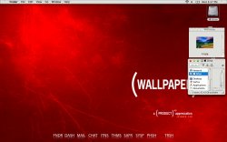
Everytime I see those lame lettered icons it always makes me think the Adobe people have been lurking about the macthemesforums.net as I've always seen this style in a lot of users desktops there, just like this one for example...
 

Attachments

  • Xirino-1.jpg
    Xirino-1.jpg
    175.4 KB · Views: 119
Register on MacRumors! This sidebar will go away, and you'll see fewer ads.