Got a tip for us?
Let us know
Become a MacRumors Supporter for $50/year with no ads, ability to filter front page stories, and private forums.
An app icon I made
- Thread starter chumawumba
- Start date
- Sort by reaction score
You are using an out of date browser. It may not display this or other websites correctly.
You should upgrade or use an alternative browser.
You should upgrade or use an alternative browser.

So I am trying to make an icon which conforms to the iOS 7 UI. What do you guys think?
First off it doesn't conform to the iOS 7 UI because it has square corners.
Also - what sort of an app is it an icon for? An icon should be indicative of the app it represents. It would be easier to give a constructive response if you mentioned the purpose of this 'icon'.
Basically what you've done there is draw a circle inside a square.
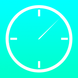
All apps have square corners until the icon mask is given. And the app is supposed to be a timer.
So I am trying to make an icon which conforms to the iOS 7 UI. What do you guys think?
Poor contrast between the circle and background. Leave the circle alone, except add something that indicates a timing function (circular arrow or SOMETHING). Lighten the background to about 20% of what it is now.
That'll do for starters.
Poor contrast between the circle and background. Leave the circle alone, except add something that indicates a timing function (circular arrow or SOMETHING). Lighten the background to about 20% of what it is now.
That'll do for starters.
Here is my second go
Attachments
So I am trying to make an icon which conforms to the iOS 7 UI. What do you guys think?
The circle part of the icon is too small to match the new iOS 7 app icon grid.
First try is bad. Second one is much better, looks like there's an idea behind.
Keep iterating, that seems to be working.
Keep iterating, that seems to be working.
Thanks for your guys's tips. This is my third go, and I even put the icon grid so you guys can see where everything is. (Don't worry, the grid will be gone in the actual icon.)
That text is going to be unreadable when it's 3mm across
")
That text is going to be unreadable when it's 3mm across
Good point. I'll make it thicker.
Avoid text in icons at all costs. There will be the App's name written below it already.
You gotta be kidding
Attachments
You gotta be kidding
Nope. Not kidding. The thing in common with those icons (at least the ones that have more than one letter in them) is that they're HIDEOUS. Even Apple themselves talk about how you shouldn't have text.
Nope. Not kidding. The thing in common with those icons (at least the ones that have more than one letter in them) is that they're HIDEOUS. Even Apple themselves talk about how you shouldn't have text.
Agreed. I was lucky enough to be at wwdc and this was a big theme there.
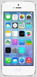
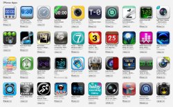
As a side note, your screenshot shows a lot of timers. You know we don't let duplicate apps on the App Store, or anything that just duplicates functionality? I hope yours isn't just another app that will clutter the store and confuse customers / offer nothing new?
...You know we don't let duplicate apps on the App Store, or anything that just duplicates functionality? I hope yours isn't just another app that will clutter the store and confuse customers / offer nothing new?
um...not so much.
Agreed. I was lucky enough to be at wwdc and this was a big theme there.
As a side note, your screenshot shows a lot of timers. You know we don't let duplicate apps on the App Store, or anything that just duplicates functionality? I hope yours isn't just another app that will clutter the store and confuse customers / offer nothing new?
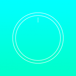
What about this?
Attachments
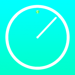
That's better, but while it makes me think of clock, it doesn't make me think of timer. Try replacing the twelve o'clock marking with a dot and maybe even make it a different color. It tells the viewer that once the hand gets to that dot something will happen. Also, that hand needs to be thicker. It's far too narrow to be seen easily. Especially against that background. You're definitely on to something though. I think you're getting closer.
That's better, but while it makes me think of clock, it doesn't make me think of timer. Try replacing the twelve o'clock marking with a dot and maybe even make it a different color. It tells the viewer that once the hand gets to that dot something will happen. Also, that hand needs to be thicker. It's far too narrow to be seen easily. Especially against that background. You're definitely on to something though. I think you're getting closer.
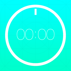
Something like this?
Attachments
Something like this?
Think about what's going to happen to the hand and the dot when you downsize the image (which is how it will be viewed most of the time, as a small icon on springboard). Unless you plan on making a different version for smaller sizes...
Attachments

Something like this?
Something like that, but using green for the dot is going to make it extremely hard to see once it's been shrunk down. I'd also go for a little bolder and rounder with the hand.
Think about what's going to happen to the hand and the dot when you downsize the image (which is how it will be viewed most of the time, as a small icon on springboard). Unless you plan on making a different version for smaller sizes...
That is true, but the retina display does do a good job of capturing details in icons.
Something like that, but using green for the dot is going to make it extremely hard to see once it's been shrunk down. I'd also go for a little bolder and rounder with the hand.
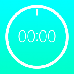
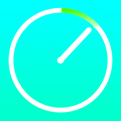
I decided to remove the dot completely
Attachments
Register on MacRumors! This sidebar will go away, and you'll see fewer ads.