Become a MacRumors Supporter for $50/year with no ads, ability to filter front page stories, and private forums.
I decided to remove the dot completely

That works, however you really need to get away from using green if you plan on stick with that background gradient. There's not enough contrast there to make those green markings visible from afar. If you really want to use green then try removing green from the gradient and have it just as a blue. Don't get me wrong, the current gradient looks cool, but it's not necessarily practical for this icon.
 
That works, however you really need to get away from using green if you plan on stick with that background gradient. There's not enough contrast there to make those green markings visible from afar. If you really want to use green then try removing green from the gradient and have it just as a blue. Don't get me wrong, the current gradient looks cool, but it's not necessarily practical for this icon.

I realized that, and thought maybe I will bring some more contrast.
 

Attachments

  • icon 5.png
    icon 5.png
    84.5 KB · Views: 140
I realized that, and thought maybe I will bring some more contrast.

Yikes! That's a little much. Try a color from the opposite spectrum. Right now you're using predominantly cool colors for the background. A more pleasing contrasting color would be something warmer, like red or orange.
 
Yikes! That's a little much. Try a color from the opposite spectrum. Right now you're using predominantly cool colors for the background. A more pleasing contrasting color would be something warmer, like red or orange.

Good point. I made it red and also included the PSD.
 

Attachments

  • icon 5.3.png
    icon 5.3.png
    87.6 KB · Views: 105
  • icon 5.psd
    1.6 MB · Views: 315
<snarky smile> Dang these guys are pickey! </snarky smile>
I like pretty much everything except the first one.

Great jobs!
 
Not that I have any idea of what I'm talking about but what about just erasing the green part so you have a gap there. It gives the notion of motion.


Kinda like this. Just a rough sketch.
 

Attachments

  • timer.jpg
    timer.jpg
    46.5 KB · Views: 122
Last edited:
way better!

I'll recommend you this tip I've learned while preparing slides for talks and images to be printed:

Work with the smallest size you can comfortably work. Use the keynote or illustrator window very small. But work details in full magnification.
 
Mock-Up

Here's a rough mock-up of the finished product - I have to agree with kevinfulton.ca - the green part of the dial is a bit lost there. On the positive side it's a fuss-free, clean design, but when people are looking on the Apple Store for a timer, yours may not be one that stands out in the crowd.
 

Attachments

  • MockUp.jpg
    MockUp.jpg
    248.2 KB · Views: 136
Not that I have any idea of what I'm talking about but what about just erasing the green part so you have a gap there. It gives the notion of motion.


Kinda like this. Just a rough sketch.

Something like this?
 

Attachments

  • Final Icon.1.png
    Final Icon.1.png
    82.9 KB · Views: 119
My new app...

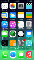
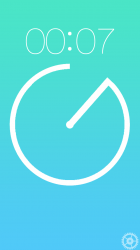
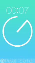
To those of you who have seen my other thread https://forums.macrumors.com/threads/1623298/, you probably know I'm working on a timer app. Well here are some screenshots of it. The gear on the bottom appears when you tap that area, and you can slide it to display 2 toggles: a reset button (It also shakes to reset, and a start at value, where you can add in your own amount to start the timer. Tap the gear again and it will disapear. You rotate the timer hand to the desired time, then you simply let go, and it will start counting down. Any suggestions? It's still in beta, so changes will happen.

attachment.php
 

Attachments

  • App icon skinned.png
    App icon skinned.png
    71.3 KB · Views: 628
  • IMG_1934.PNG
    IMG_1934.PNG
    764.6 KB · Views: 129
  • set 1 copy.png
    set 1 copy.png
    121.5 KB · Views: 118
  • set 2.png
    set 2.png
    136.1 KB · Views: 120
Register on MacRumors! This sidebar will go away, and you'll see fewer ads.