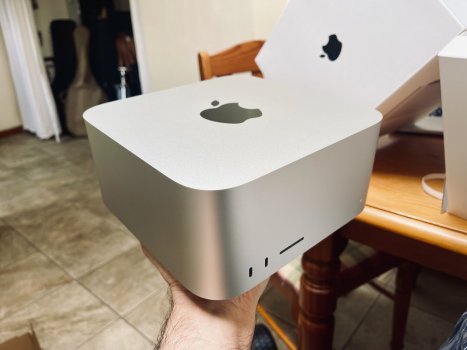
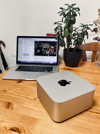
I think it looks a lot better in person… I really like it. The choice of black for the Apple logo really makes it feel a bit more premium/serious.
It
is a bit of a big featureless lump - I've never had an Intel Mac Mini and didn't realise how much the footprint had increased from the G4 Mini until I put the G4 and Studio side by side. Still, the G4 relied on a whacking great external power brick...
(Yes, that's a G4 mini, not a leak of the almost-certainly-coming M2 mini with acrylic lid to let the WiFi in

)
...but then, we've seen "courageous" desktop design with the Mac Pro Trashcan (looked great - turned out to be a design dead-end), which may be why Apple's gone rather boring with the Studio. Also, there are already several docks/drive enclosures designed to "stack" with the Mini, which the Studio can benefit from. There's a lot to be said for simple and functional.
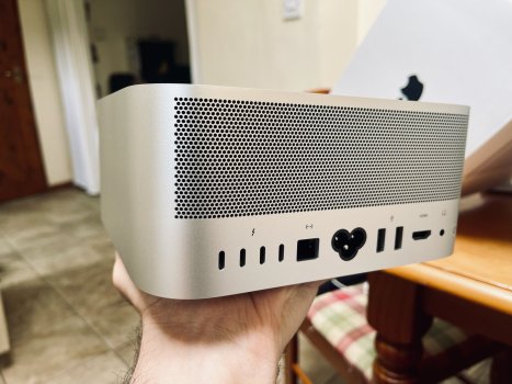
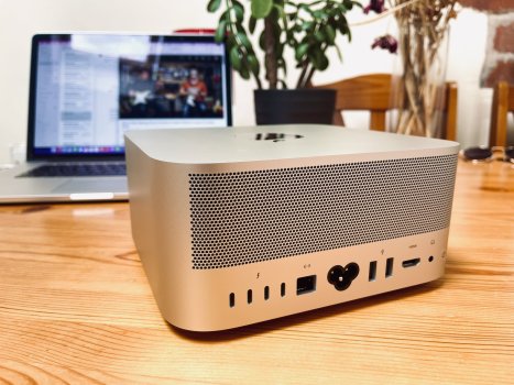
Main practical gripe is that the power button should be on the front, and is very fiddly to find by touch. Longer-term concern is whether the thermal design is up to snuff - it's pulling air in through a rather restrictive grille, then the air has to do a 90-degree turn to get out of the back panel, so there's no natural 'convective' flow which may be why - even with a huge heat sink - the fan has to run continually.
, because of "pros hate colour" or "pros hate risktaking" or whatever.
Well, yeah - colourful systems look great when paired with co-ordinated keyboards, mice, displays etc. but it's a modular system that you don't
have to pair with the official peripherals. Black, white or silver/grey go with everything,
Then, Macs get used by a lot of graphics people who are trying to accurately judge colours on-screen, so they really don't want brightly coloured stuff in their field of vision throwing off your mental white balance.
This could've been a chance to do something like the G4 Cube
Which was a famous form-over-function flop - not just because of price/performance but because the case started cracking up. Apart from that, the Studio
is "something like the G4 Cube" - except it's low enough to tuck in under a display, whereas the Cube wasn't.
However, Apple do seem to be struggling to find a direction for future design, or to find a consistent design language across the range. So we have joined-up-thinking failures like one team dreaming up white bezels on the iMac while another team came up with the MacBook notch - you can think what you like about either of those by itself, but white bezels + notch = totally foreseeable disaster (black is black, so you can make a dark notch vanish against a black bezel, you can't make a glowing notch vanish against a light-coloured bezel). So the MBA can't follow the iMac design language. Then, again with the M1 iMac you've got the whole magnetic connector, ethernet-in-the-power supply thing - which hasn't been picked up by either the Studio or the Studio display. The 2019 Mac Pro "Steampunk" design language seems to be a dead end, too...
...and, although I joked about it above, if the Mythical M2 Mini
does turn out to have a new look, modelling the brand new Studio on the outgoing Mini is a strange decision...


