Got a tip for us?
Let us know
Become a MacRumors Supporter for $50/year with no ads, ability to filter front page stories, and private forums.
Anyone using Dark Mode as default yet?
- Thread starter cammykool
- Start date
- Sort by reaction score
You are using an out of date browser. It may not display this or other websites correctly.
You should upgrade or use an alternative browser.
You should upgrade or use an alternative browser.
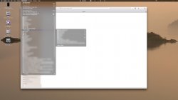
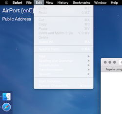
The font rendering on black menus (top bar) is terribly broken and looks just plain ugly.
That's probably the main thing stopping me from using it as the black icons can be fixed sort of.
No issue with the fonts on my system. Can you post a screen shot?
Anyone else have Safari change the color of a highlighted bookmark in the drop down menu? Mine changes from a white folder to blue when the cursor hovers.
Also noticed, after a cold boot (the second one since engaging the "Dark" theme), the menu bars now change more consistently with the colors of the background. After the first reboot they were dark with little color transparency, now they're much more reflective of their backgrounds. I'm loving this GUI much better than the standard white, can't wait to see the final result.
Attachments
I have been having a great experience with the Dark Theme since I installed it.
No issue with the fonts on my system. Can you post a screen shot?
Anyone else have Safari change the color of a highlighted bookmark in the drop down menu? Mine changes from a white folder to blue when the cursor hovers.
Also noticed, after a cold boot (the second one since engaging the "Dark" theme), the menu bars now change more consistently with the colors of the background. After the first reboot they were dark with little color transparency, now they're much more reflective of their backgrounds. I'm loving this GUI much better than the standard white, can't wait to see the final result.
I have been having a great experience with the Dark Theme since I installed it.
Ditto.
I spent some time finding and creating system and third party menubar icons (AirPort, Dropbox, BTT, Chronicle). If anyone wants em, I can archive them and upload them. Some third party app's now have them within their Resources folder with in the app contents, systems icons are in various parts of the /System/Library/ folder(s). I noticed many have a color, black and white icon already made, just change the name of the one currently used by adding (backup) to its name, then rename the white one to the name of the used version, restart and you will have a white menubar icon.
Otherwise, you'll need to use Adobe Illustrator to create them.
I would very much appreciate that bedifferent. Thanks alot
The font rendering on black menus (top bar) is terribly broken and looks just plain ugly.
That's probably the main thing stopping me from using it as the black icons can be fixed sort of.
You can't sub pixel anti-alias when you have no knowledge of what the underlying pixels below the transparent sheet are; it's a technical limitation that OS X never had before because everything was opaque. I really wonder how that'll be fixed, aside from turning on regular anti-aliasing. LCD Font smoothing, is what preferences calls it.
No issue with the fonts on my system. Can you post a screen shot?
Anyone else have Safari change the color of a highlighted bookmark in the drop down menu? Mine changes from a white folder to blue when the cursor hovers.
Also noticed, after a cold boot (the second one since engaging the "Dark" theme), the menu bars now change more consistently with the colors of the background. After the first reboot they were dark with little color transparency, now they're much more reflective of their backgrounds. I'm loving this GUI much better than the standard white, can't wait to see the final result.
My dropdown menus seem to still show up as white in dark mode....
Anyone have any ideas?
Attachments
You can't sub pixel anti-alias when you have no knowledge of what the underlying pixels below the transparent sheet are; it's a technical limitation that OS X never had before because everything was opaque. I really wonder how that'll be fixed, aside from turning on regular anti-aliasing. LCD Font smoothing, is what preferences calls it.
Hm, how does it work on light theme then..?
It has the blur and transparency as well.
My dropdown menus seem to still show up as white in dark mode....
Anyone have any ideas?
OK worked this out.
This happens if you have transparency disabled when in dark mode.
When I set transparency on - it went to dark-mode menus.
(screenshot snipped)
It seems like you're not doing a lot of Work
I don't really like the way it looks unless I'm also using a program with a dark theme. I never use it now, but when it's easier to switch, I may use it under special circumstances.
It seems like you're not doing a lot of Work
Lol touché
----------
I would very much appreciate that bedifferent. Thanks alot
I'll round me up, zip em and upload tomorrow with instructions.
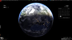
I love the dark mode. Granted, I used third-party mods to have a black menubar in Mountain Lion and Mavericks so I'm somewhat used to digging around ~/resources folders to alter the look and style. But using Apple's Dark Mode (activated by terminal, as described here and elsewhere), turning off translucence, using Bartender, the "WhiteServerUI.menu" in the link below, and iStats (this is totally optional), I've been able to get it almost 100% the way I want it. I couldn't figure out how to change Spotlight or Notification Center but seemed to have got Notification Center the way I want it (I've tried to figure out where the file I altered was, and I can't find the location, but when I do I will post where). The only applications I cannot figure out how to either (a) change the menubar icons white, (b) let Bartender handle them are Google Chrome and MacKeeper but this was also the case under Mavericks.
Screenshot attached.
Screenshot attached.
Attachments
Register on MacRumors! This sidebar will go away, and you'll see fewer ads.


