Got a tip for us?
Let us know
Become a MacRumors Supporter for $50/year with no ads, ability to filter front page stories, and private forums.
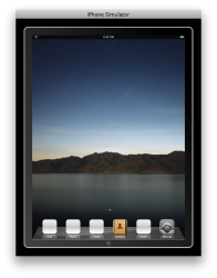
Are you happy with 4 x 5 + 4 apps on one screen setting?
- Thread starter agkm800
- Start date
- Sort by reaction score
You are using an out of date browser. It may not display this or other websites correctly.
You should upgrade or use an alternative browser.
You should upgrade or use an alternative browser.

I'm not overly bothered myself. I admit it does seem a little sparse on the home screen. Would have been nice to see a different approach to managing pages of apps, how they could have done it, I have no idea. 4X4 or 5X5, both seem ok to me.
Are you happy with 4 x 5 + 4 apps on one screen setting?
Not really. I would much prefer 5 x 5 + 5 but it might look too cluttered on the screen.
I would be very very surprised if it ships this way.
I would be very very surprised (pleasantly) if they change the setting.
")
My guess is it will either something you can customize or changed in a later update of the OS once it ships...
It does have an unfinished look to it...
It does have an unfinished look to it...
Not really. I would much prefer 5 x 5 + 5 but it might look too cluttered on the screen.
I had 5X4 on a JB iPhone. Didn't look cluttered at all. And on a Mac, I use the 16x16 icon size with a dock shrunk to the smallest size. Big icons only take up space and offer no additionally functionality.
These icons just make the iPad look like a clunker.
i think it provides a clearer view of the desktop. which is why the iphone doesn't have custom wallpaper on the springboard. it would look too busy.
I agree that this is most likely what Apple is thinking.
I think the "gap" problem is mainly caused by our experience from the iPhone. If there was no iPhone, we would not be having this conversation.
Having said that, IMO both the iPhone and the iPad should have a much smarter app organisation system than presently exists. The multi-page flat icon grid structure we have now is just simply lame. Apple have chosen simplicity over usability. I guess this mimics the form over function design philosophy in hardware.
A better approach would be a hierarchical system, where you can organise, say games, productivity apps etc in folders or whatever you want to call them. But even that is old-school. I'm sure some smart people could think of a way cool new interface that incorporates advanced jestures? How about that each of the "folders" are actually floating bubbles, and you can flick them around and expand them to reveal icons like the photo galleries on the iPad, so you don't have to fully open them to see what's inside... etc
I was thinking the SDK showed you could have six icons on the dock. As far as the screen itself, I plan on just having one icon on the screen (probably Safari) and move all the rest to screen 2. I don't like a lot of clutter on my desktop.
I was thinking the SDK showed you could have six icons on the dock. As far as the screen itself, I plan on just having one icon on the screen (probably Safari) and move all the rest to screen 2. I don't like a lot of clutter on my desktop.
im also going to keep my springboard clear except for the dock. i wish i could put some widgets on there but apple in all their wisdom says no. maybe 4.0 will solve this. if not im definitely jailbreaking when that is possible.
Yeah, you can have 6 apps on the dock:
Whoa. Did you do this? If so, how did you get it so there are no icons on the screen itself? I was thinking, from playing with my iPhone that you always had to have at least one icon on a screen or it disappeared. What you show is exactly what I want.
If Apple has made one mistake, it will be their failure to rethink the UI (just a little) for the big screen and one holds/one handed use. If you're holding the ipad in your left hand it will take considerable movement across the screen to pick the upper left icon with your right hand, for example. On my little Archos tablet I've moved all the icons and the task bar to the right edge. Most I can tap with my right thumb now, the same way I use my iPod Touch.
You know I was thinking about this. Apple had to know there would be a big uproar from everyone complaining the iPad didn't run OS X. It seems to me that it would had been very easy to change the UI so that it mimics the OS X UI as far as the screen and dock go. Allow an applications folder on the dock and perhaps even have a folder on the dock for iWorks documents. Allow icons on the home screen for documents, etc.
Register on MacRumors! This sidebar will go away, and you'll see fewer ads.