Got a tip for us?
Let us know
Become a MacRumors Supporter for $50/year with no ads, ability to filter front page stories, and private forums.
Can anyone help me with some logo advice?
- Thread starter cara0910
- Start date
- Sort by reaction score
You are using an out of date browser. It may not display this or other websites correctly.
You should upgrade or use an alternative browser.
You should upgrade or use an alternative browser.
My $150 is on the fact this is not a project rather Crowdsource or a Logo Comp.
What does this mean? Are you saying I'm trying to get logos for some other purpose than what I said?
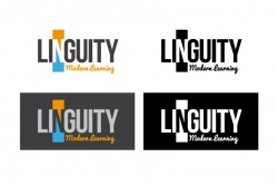
#5 is very clever.
It includes a graphic logo that you can really hang your hat on. A world-class effort.
No.5 would be clever for the fact it didn't look like the Ubuntu logo.
No.5 would be clever for the fact it didn't look like the Ubuntu logo.
Haha, my girlfriend works for the Brazilian government, and they only open-source software, and she said the same thing!
I agree with you and her.
What does this mean? Are you saying I'm trying to get logos for some other purpose than what I said?
Nope, I am saying it looks as though it's part of a logo contest that's all. Not saying that you're doing anything wrong rather undervaluing your skills, I really hate seeing young designers trying to get work while being paid a pittance.
Design wise I think the concepts will fill their needs, it really hard to make a judgement based upon not knowing the brief. I think also the concept needs to work within B&W otherwise it's not going to replicate well.
Ok, I think I understand ... I think you mean undervaluing THEIR skills, right?
I have taught English in Brazil for a few years, so I know what being underpaid is all about. It's something many people go through. As long as the person's work is good, he/she will grow out of it. And remember, I'm paying 1/3 of a month's wage in Argentina. $150 to an American or Briton is worth much more there. A great meal can be bought for $10-15.
Thanks for your input!
I think the 5th remains the best possible option in terms of reproduction, aesthetics and so on. The one improvement I'd do, is to solidify the icon to one solid shade of blue (get rid of the gradients). This will in turn clean up the overall design and make it a little more professional.
I'd really avoid option 6 IMO. It's a bit of an awkward size, and when it comes to scaling up or down, you may find it to fit a little awkward on your company material....that's just my experience.
Best of luck!
I'd really avoid option 6 IMO. It's a bit of an awkward size, and when it comes to scaling up or down, you may find it to fit a little awkward on your company material....that's just my experience.
Best of luck!
I think the 5th remains the best possible option in terms of reproduction, aesthetics and so on. The one improvement I'd do, is to solidify the icon to one solid shade of blue (get rid of the gradients). This will in turn clean up the overall design and make it a little more professional.
I'd really avoid option 6 IMO. It's a bit of an awkward size, and when it comes to scaling up or down, you may find it to fit a little awkward on your company material....that's just my experience.
Best of luck!
Thank you very much for the input! For the sixth one, we were thinking that the Li as a flavicon could be used for anything that needed to be small. On our Facebook page, for example, we just use our flavicon because our logo was really squeezed otherwise. With the 5th we could use the symbol. With the sixth, we could use the Li with the red dot. I'll try to think of ideas of how to change that and make it more interesting/smaller.
Believe it or not, though, we're running out of money here, and we need to get this going SOON. So we may be going with the fastest option at this point and moving forward with it.
Thanks again for the help!
I agree with the others in that #5 is probably going to work well for you (at this stage of your business, rebrand if your business works out).
As for #6, it reminds me of a tech company and not at all with something to do with language or education.
Either way good luck with it all... and when/if you rebrand in the future, hire a designer.
As for #6, it reminds me of a tech company and not at all with something to do with language or education.
Either way good luck with it all... and when/if you rebrand in the future, hire a designer.
I agree with the others in that #5 is probably going to work well for you (at this stage of your business, rebrand if your business works out).
As for #6, it reminds me of a tech company and not at all with something to do with language or education.
Either way good luck with it all... and when/if you rebrand in the future, hire a designer.
Because of all the wonderful advice on this forum, we are going with number 5. Thank you all for lending your good eyes to help me.
And believe me, I respect what you do and will hire a designer when/if we prove our concept. One thing I've learned through researching logos is that logos can be really, REALLY creative. I wish you all the best of luck 🙂
Don't do it!!!!! As a designer I absolutely NEED to pipe in here. I've been watching this thread with so much frustration that I needed to sign up just to give some advice. While it may seem that #5 is simple have a look at it in black and white with absolutely NO gradients and ask yourself if it still gets the message across. I agree 150% with bluetooth. None of these will work in the long term. While others have suggested over and over that "a lot goes into making a logo" I don't feel like they've given you any idea of what they truly mean by that. It's not just about time it's about thought. While to many a lot of huge corporate logos may just look like stylized works and graphics there's subliminal messages that go with it. I'll break down two that work very well.
Ikea: Blue text with yellow circle. Circles usually give us a feeling of completeness or a complete solution. The blue and yellow signify the Swedish flag.
Fedex: This one is brilliant. It's telling you what they do, but without hitting you over the head with it. Take a close look and find the arrow.
These are the types of ideas that go into a good logo and regardless of how much you're paying I would strive to get your guy to attempt the same thing. The simpler the better and the more effective it will be in the long run. Hope that clarifies things for you and gets your mind working a little bit.
i think that the real problem isn't the designs as much as it is the name of the company. No great logo is going to save a company who's name isn't the easiest and most catchiest thing to say in the world.
id also add that theres no golden rule as to how much you should pay. you're gonna generally get a great meal at an expensive restaurant (as you should expect), however theres plenty of cheap options that may serve some great food. You've gotta put in leg work to find those though, and get ready to spend money eating some lousy meals in the process.
id also add that theres no golden rule as to how much you should pay. you're gonna generally get a great meal at an expensive restaurant (as you should expect), however theres plenty of cheap options that may serve some great food. You've gotta put in leg work to find those though, and get ready to spend money eating some lousy meals in the process.
Don't do it!!!!! As a designer I absolutely NEED to pipe in here. I've been watching this thread with so much frustration that I needed to sign up just to give some advice. While it may seem that #5 is simple have a look at it in black and white with absolutely NO gradients and ask yourself if it still gets the message across. I agree 150% with bluetooth. None of these will work in the long term. While others have suggested over and over that "a lot goes into making a logo" I don't feel like they've given you any idea of what they truly mean by that. It's not just about time it's about thought. While to many a lot of huge corporate logos may just look like stylized works and graphics there's subliminal messages that go with it. I'll break down two that work very well.
Ikea: Blue text with yellow circle. Circles usually give us a feeling of completeness or a complete solution. The blue and yellow signify the Swedish flag.
Fedex: This one is brilliant. It's telling you what they do, but without hitting you over the head with it. Take a close look and find the arrow.
These are the types of ideas that go into a good logo and regardless of how much you're paying I would strive to get your guy to attempt the same thing. The simpler the better and the more effective it will be in the long run. Hope that clarifies things for you and gets your mind working a little bit.
Thank you very much for your input on this. None of these may, or have, to work in the long run. This is to prove a concept, and we'll see how it works. Honestly, looking at some of our competition, it looks fine.
I actually agree with a lot of what was said about number 5. The fact that we can just take out the symbol and use that for small spaces is very good for us.
However, when/if we make some money, we will sit down and think about what we want out of our logo and how to get it.
----------
i think that the real problem isn't the designs as much as it is the name of the company. No great logo is going to save a company who's name isn't the easiest and most catchiest thing to say in the world.
id also add that theres no golden rule as to how much you should pay. you're gonna generally get a great meal at an expensive restaurant (as you should expect), however theres plenty of cheap options that may serve some great food. You've gotta put in leg work to find those though, and get ready to spend money eating some lousy meals in the process.
The name was chosen after a kind of focus group we had with our Brazilian friends. It may not sound super catchy (especially in English), but that's what they chose. Plus, nowadays there are MAJOR problems with getting domain names, and also keep in mind that there are roughly a bazillion English schools in the world. That's just an estimate 🙂
Hi Cara
Just seen this post. Personally I like the concept behind number 3, it's simple and the way the speech bubbles make up the 'N' is quite neat and would give you some little icons to use on your website/stationery etc. I wasn't too sure about the font used and the gradients, so I've quickly roughed up a much simpler version, see what you think.
Good luck with it all.
Cheers
D
Attachments
Hi Cara
Just seen this post. Personally I like the concept behind number 3, it's simple and the way the speech bubbles make up the 'N' is quite neat and would give you some little icons to use on your website/stationery etc. I wasn't too sure about the font used and the gradients, so I've quickly roughed up a much simpler version, see what you think.
Good luck with it all.
Cheers
D
Cool! I also liked that design. When we filled out a guide talking about what kinds of logos we liked, I picked out a few that used white space like that.
I actually hate the colors he chose, but your colors are very cool. I think the other logo will be easier for printing for now, though. Trust me, we're starting this with almost NO money. We're just English teachers 🙂
If we have any success, I'll likely hire a designer and we'll work with him/her. But I agree that that logo is definitely creative, and I the colors you chose would stand out here.
Thanks!
A good book
If you even want to update or change you logo or if you simply are interested in how the whole process should go then get this book and read it first.
Brand Identity Essentials
100 Principles for Designing Logos and Building Brands
isbn: 978-1-59253-578-1
$26.40 on Amazon.com right now.
Hope that helps.... Good luck on your new venture.
Recommend that book. 🙂
If you even want to update or change you logo or if you simply are interested in how the whole process should go then get this book and read it first.
Brand Identity Essentials
100 Principles for Designing Logos and Building Brands
isbn: 978-1-59253-578-1
$26.40 on Amazon.com right now.
Hope that helps.... Good luck on your new venture.
Thanks! That looks like a good book to learn the basics 🙂 Unfortunately, I'll have to wait to get back to the U.S. to get a book like that. I can only buy books for my kindle right now. I also stumbled on a book I thought looked interesting recently:
http://www.amazon.com/Logo-Design-L...=sr_1_3?s=books&ie=UTF8&qid=1314718025&sr=1-3
I may check that one out.
----------
Cool and no problem. If you need any help/advice design wise in the future give me a shout.
All the best with your venture and I hope it works out for you.
Cheers
D
Thanks again, Dave. And if I need a designer in the near future and have some money to spend on it, I'll post something on macrumors.
As an Amazon Associate, MacRumors earns a commission from qualifying purchases made through links in this post.
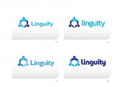
I was just wondering what the relevance of the three dots are on the symbol? Personally I think they over complicate the whole logo especially as you have lower case 'i''s in the name, just seems like a lot of dots! I'd drop them and go with something cleaner like the attached.
Just a thought.
Cheers
D
Just a thought.
Cheers
D
Attachments

I was just wondering what the relevance of the three dots are on the symbol? Personally I think they over complicate the whole logo especially as you have lower case 'i''s in the name, just seems like a lot of dots! I'd drop them and go with something cleaner like the attached.
Just a thought.
Cheers
D
Hey Dave! I think what you did looks nice. The point of the three dots, I believe is that they represent the heads of people holding hands.
Hey Dave! I think what you did looks nice. The point of the three dots, I believe is that they represent the heads of people holding hands.
Oh right yep I see it now!! 🙂

Register on MacRumors! This sidebar will go away, and you'll see fewer ads.