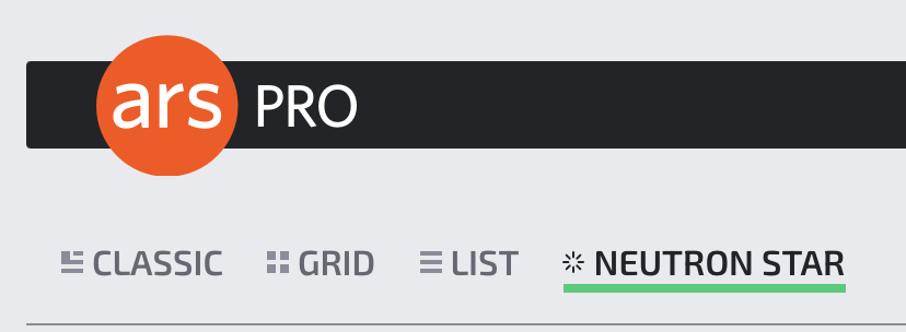
Become a MacRumors Supporter for $50/year with no ads, ability to filter front page stories, and private forums.
I’ve kind of made my peace with the Verge redesign. Still think it’s atrocious web design, but I go there maybe twice a week for keeping up with the news.

I also visit Ars Technica and ExtremeTech and Daring Fireball.
 
I like Ars Technica for the technical commentary...but good Lord the forum commentary there is absolutely insufferable.
 
  • Like
Reactions: sgtaylor5
The recent Ars Technica redesign is almost as bad as The Verge. What is it with tech sites and moving away from a simple list view of topics?
 
  • Like
Reactions: kpluck
The recent Ars Technica redesign is almost as bad as The Verge. What is it with tech sites and moving away from a simple list view of topics?
Classic: A subscriber-only mode—basically, what's already available to current subs. Gives you an old-school "blog" format. You can scroll and see the opening paragraphs of every story. Click on those you want to read.

Grid: The default view, an updated version of what we currently have. We're trying some new ways of presenting stories so that the page feels like it has a little more hierarchy while still remaining almost completely reverse-chronological.

List: Very much like our current list view. If you just want a reverse chronology with fewer bells and whistles, this is for you.

Neutron Star: The densest mode we've ever offered—and another subscriber-only perk. Neutron Star shows only headlines and lower decks, with no images or introductory paragraphs. It's completely keyboard navigable. You can key your way through stories, opening and collapsing headlines to see a preview. If you want a minimal, text-focused, power-user interface, this is it. https://arstechnica.com/staff/2024/10/welcome-to-our-latest-design-update-ars-9-0/
but you have to pay for a subscription, which for Ars Pro is $25/year.
 

Attachments

  • Screenshot 2024-10-03 at 11.47.38.png
    Screenshot 2024-10-03 at 11.47.38.png
    30.4 KB · Views: 41
The Ars Technica "List" view is manageable on desktop... but on mobile it's not great.

Ugh... I hate when websites try to get all fancy.

As fewer people visit websites these days... I find it odd when publishers make the website experience more frustrating.
 
Register on MacRumors! This sidebar will go away, and you'll see fewer ads.