Got a tip for us?
Let us know
Become a MacRumors Supporter for $50/year with no ads, ability to filter front page stories, and private forums.
Choose your favorite logos.
- Thread starter Sutekidane
- Start date
- Sort by reaction score
You are using an out of date browser. It may not display this or other websites correctly.
You should upgrade or use an alternative browser.
You should upgrade or use an alternative browser.


![sony-logo[1].jpg](/data/attachments/38/38583-6f713ae2d11a4eb5a4d82b141d4bc571.jpg)


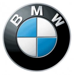
dogbone said:but I also like the bm logo because of it's subtle suggestion of a stylised propeller. They were in the aeroplane manufacturing business before the war.
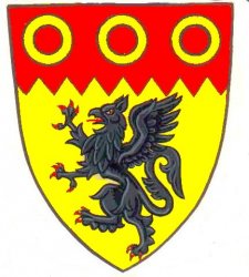
So is, and was, Saab. Their logo is a Griffin, mythological winged lian/eagle hybrid creature....
Hence the name of their current light attack fighter, the Saab JAS-39 Gripen ("Griffin" in Swedish) often found prominently featured in their advertising. It's easy to spot them in the commercials - with their unique forward mounted horizontal stabilizers (set of mini-wings near the front).
Attachments


The best logo you have (probably) never seen...
....
lol i was thinking of posting that exact same logo when entering this thread. that thing blew my mind the first time i saw it.


Can someone explain me, why is that a good logo?
The Spartan golf club and CPN are really good examples, how a good logo should be.
Can someone explain me, why is that a good logo?
The Spartan golf club and CPN are really good examples, how a good logo should be.
Sure...
DESIGN ELEMENTS OF SONY ERICSSON LOGO:
The Sony Ericsson logo is categorized as one of the highly recognized logos in the world because it truly depicts the nature of the company’s business and identity. It serves as an archetype and is one of the first ‘Web 2.0′ logos (which refer to new internet technologies).
Shape of the Sony Ericsson Logo:
The Sony Ericsson logo shows an image of a shiny 3D sphere. If one looks closely, one will also notice the combination of two letters “S” for Sony and “E” for Ericsson inside the sphere. These two letters are aimed to symbolize the joint venture between two great companies.
Color of the Sony Ericsson Logo:
The Sony Ericsson logo comprises of two colors-green and silver. Both the colors give the logo a very contemporary look and also show the company’s desire to grow rapidly.
Font of the Sony Ericsson Logo:
Just as the shape and color of the Sony Ericsson logo, its font style is also modern.
source http://www.famouslogos.org/sony-ericsson-logo


I've always been a big fan of the stuff at UnderConsideration.com (check out BRAND NEW). Always simple and memorable. TDE is my fave of theirs, though.

Surprised nobody posted this yet. Not the most beautiful logo, but memorable and well known.
I don't have much relevant support for this choice, I'm just a sucker for the drums I suspect.

I think it is very interesting that this is really only slightly modified, but it stands out in my mind from the original.
The best logo you have (probably) never seen...
I should say so! That's nice.
OK, thanks for the PR-type explain.
Now, how does it work in black and white?


These are not my sketches. They are pictures taken from the internet. For a more un-PR type response, here is an explanation by the designer Takuya Kawagoi.
You can read the full article if interested by following the link at the bottom of the page.
It's hard to believe that, only about one year ago, Sony Ericsson’s only real branded product was their spherical green logo.
Then again, even their corporate icon was designed to impress. Yesterday, at an informal and intimate product presentation held at Toronto’s Design Exchange building, I had the pleasure of meeting part of the company’s Creative Design Centre team, including vice president Hiroshi Nakaizumi, and art director Takuya Kawagoi, the designer of the distinctive logo.
Although it is meant to look partially like the symbiotic amalgamation of an "s" and a lowercase "e" the logo also represents the company's entire design philosophy, as Kawagoi explained. It's both futuristic and organic, designed to invoke the concepts of flexibility and fluidity. Kawagoi used morphing techniques to draft it in several stages, which is why it's often shown as a quick animation at the end of television ads: with some extra pyrotechnics. Eventually, they may revamp the symbol to make it simpler and more inclusive so the image reflects the evolution and expansion of the company
(Takuya Kawagoi, Sony Ericsson Art Director and designer of the Sony Ericsson Logo)
http://www.digitaljournal.com/article/35008
Works fine imo.
greyscale ≠ black&white
Everything from Paul Rand:


I'm going to say the Triforce and the Aperture Science logo. Triforce because of its simplicity and what it means. Aperture Science because it makes me thing of photography. I just love the parallel between camera lens and portal gun. Brilliant! 


greyscale ≠ black&white
That is what you get under PS image>adjustments>black and white
If you would like it recreated in b&w to your liking, you can talk to the designer Takuya Kawagoi (http://www.zath.co.uk/sony-monolithic-design-concept-interview/).
Seriously though, SE is one of the most successful brands in the world with good reason.
Sony Ericsson is brilliant because it's interesting and it squeezes the hidden meaning of "s" and "e" (representing the merger of the 2 companies) into the logo while invoking the concepts of flexibility and fluidity. Sony Ericsson is different and IS something new altogether, it's not Sony and it's not Ericsson, so the logo is well made imo. It's iconic.
The same interesting concept would apply to FEDEX. You read from the left to the right, the hidden arrow is in between the letters of E and X pointing the way you read. Ie, FedEx is bringing your parcel the right way. It's the same with the Sony Ericson logo; it says more than you see at first.

On another note, out of curiosity (and I do respect and admire Paul Rand), but can you explain to me (in your opinion) why you like or think "Cummins Engine" is an example of a good logo?
That is what you get under PS image>adjustments>black and white
If you would like it recreated in b&w to your liking, you can talk to the designer Takuya Kawagoi (http://www.zath.co.uk/sony-monolithic-design-concept-interview/).
Seriously though, SE is one of the most successful brands in the world with good reason.
Sony Ericsson is brilliant because it's interesting and it squeezes the hidden meaning of "s" and "e" (representing the merger of the 2 companies) into the logo while invoking the concepts of flexibility and fluidity. Sony Ericsson is different and IS something new altogether, it's not Sony and it's not Ericsson, so the logo is well made imo. It's iconic.
The same interesting concept would apply to FEDEX. You read from the left to the right, the hidden arrow is in between the letters of E and X pointing the way you read. Ie, FedEx is bringing your parcel the right way. It's the same with the Sony Ericson logo; it says more than you see at first.
On another note, out of curiosity (and I do respect and admire Paul Rand), but can you explain to me (in your opinion) why you like or think "Cummins Engine" is an example of a good logo?
I don't think that Cummins Engine or Enron are very good logos. I just saw that someone posted the great Westinghouse logo and did a quick google search for Paul Rand and posted it very quickly. In fact it's the first picture you'll find.
Of course not all his logos are as great as the abc or IBM but I admire his work as logo designer in general.
Let's throw some other great designers/artists in the room:
Saul Bass:


Source http://blog.signalnoise.com/2008/08/28/inspiration-logos-by-saul-bass/
Or Lester Beall:

Again: Just a random overview (I don't like those Quaker / Exxon / Kleenex / United Way logos that much) because I find it difficult to pick one logo as a favorite. But I like the work of those gentlemen in general.
As for the SE logo: I don't think that it is bad. I don't like the web 2.0 (glossy/shiny pseudo-three-dimensional gradient stuff) feel of it though.
Oh and speaking of anit-web2.0-glossy-3D-logos:

Too bad they changed it back to a three-dimensional one.. Just like every other car brand.
Register on MacRumors! This sidebar will go away, and you'll see fewer ads.