Working on a logo for a class project; Pineapple Patrol, a gaming company wants a logo of a pineapple using or interacting with police gear. Logo for a game, and not the whole company. My current piece feels somewhat soulless, but I'm stuck for ideas. Any suggestions are welcome.
Got a tip for us?
Let us know
Become a MacRumors Supporter for $50/year with no ads, ability to filter front page stories, and private forums.
Class Project Logo - stuck for ideas
- Thread starter JustinG87
- Start date
- Sort by reaction score
You are using an out of date browser. It may not display this or other websites correctly.
You should upgrade or use an alternative browser.
You should upgrade or use an alternative browser.
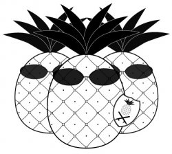
I'd stick with the one pineapple, it's a bit busy like that. I then think I'd either drop the pineapple from the shield (because you're basically repeating yourself), or keep the pineapple on the shield, make the shield bigger and just have that is the logo. Just ideas ")
I'd stick with the one pineapple, it's a bit busy like that. I then think I'd either drop the pineapple from the shield (because you're basically repeating yourself), or keep the pineapple on the shield, make the shield bigger and just have that is the logo. Just ideas
I'd gotten similar feed back (almost the same, actually) to drop the other pineapples and do something with the shield. Good ideas, but the piece still feels lacking (soulless, as it were).
I like the idea of having a the pine apple looking like a police man, Try dropping the other pine apples as already said, and try adding some dimension by playing around with the perspective to give it some depth.
I think if you change the perspective so it was like you were looking up at the pine apple more to make the pineapple appear more intimidating like a law enforcing police man,
Maybe try adding some definition to the glasses, maybe add a tint where the light catches on the glass.
I think if you change the perspective so it was like you were looking up at the pine apple more to make the pineapple appear more intimidating like a law enforcing police man,
Maybe try adding some definition to the glasses, maybe add a tint where the light catches on the glass.
I like the idea of having a the pine apple looking like a police man, Try dropping the other pine apples as already said, and try adding some dimension by playing around with the perspective to give it some depth.
I think if you change the perspective so it was like you were looking up at the pine apple more to make the pineapple appear more intimidating like a law enforcing police man,
Maybe try adding some definition to the glasses, maybe add a tint where the light catches on the glass.
More definition to the glasses is a good idea. The texture of the pineapple needs some work, too. It's difficult to keep it from looking clip-arty.
Besides what has already been mentioned, maybe try drawing it from a worm's eye view, this will help with the big bad cop feeling. Also, the shades could use some work, how about making them more like old school aviators? That would give it a bit more on an authentic feeling (check out the ones they use in the movie Super Troopers).
Also, and I don't normally recommend this, but what if there were more simple elements like the badge to connect this pineapple with law enforcement stuff. I mean you could add a nightstick, big utility belt type deal, etc. and it could help it connect more. Try checking out some pictures of cops online for inspiration (be careful though, too many elements or being too detailed could ruin it!)
One last thing, the pineapple shape might be too geometric, maybe try roughing up the outside edge like a real pineapple?
Besides what has already been mentioned, maybe try drawing it from a worm's eye view, this will help with the big bad cop feeling. Also, the shades could use some work, how about making them more like old school aviators? That would give it a bit more on an authentic feeling (check out the ones they use in the movie Super Troopers).
Also, and I don't normally recommend this, but what if there were more simple elements like the badge to connect this pineapple with law enforcement stuff. I mean you could add a nightstick, big utility belt type deal, etc. and it could help it connect more. Try checking out some pictures of cops online for inspiration (be careful though, too many elements or being too detailed could ruin it!)
One last thing, the pineapple shape might be too geometric, maybe try roughing up the outside edge like a real pineapple?
Thanks for all your suggestions! I had already prepared a few of the things you suggested like nightstick, utility belt, etc, but the professor knocked some of the other students for the extra details, saying the logo wouldn't look good if it was shrunk down. I'll see if I can simplify what I have though. In the end I just seem to have this problem with giving my work personality.
Yeah, I completely agree with your professor about adding too many detailed elements. I think that with the style and level of detail you already have the pineapple drawn they would have to be very simplified objects. Try making a VERY simply nightstick and putting it on there, etc. This might not work, you might need to redraw the the pineapple with a different style.
On redrawing the pineapple, I hate to say it but right now what you have drawn is more of an illustration than a logo. To fix this I would start with simple and more "solid" shapes. Then you won't have to worry about the logo at small sizes as much.
Also, if your do keep this pineapple and it is supposed to be a logo that can be reproduced at a small size, you probably need to beef up your interior linework and detail or just try and be more icon oriented.
keep the 3 pineapples, have one in the background with an all black tactical shot gun and the other one in the back with a pistol in a holster.
I'd try it with one Pineapple, it would look better IMHO.
Also if you're stuck on ideas try:
Logopond
Logo Lounge
Also if you're stuck on ideas try:
Logopond
Logo Lounge
id suggest keeping yeah One pineapple.
My idea would be, take the outline of the 'shield/badge' around ONE pineapple
with the nightsticks either behind the shield outline or at the very bottom on top fo the shield and pineapple at a reasonable size.
and maybe do some brush effects around the edge of the badge/shield outline.
if that made sense?


This assignment makes no sense at all
Clients usually make no sense, I think that's the point of the assignment.
This assignment makes no sense at all
You might be surprised at some of the projects received from real customers. The OP assignment reminds me of a request from Neutrogena Corporation to illustrate their hair care products for a western theme internal marketing meeting. Keeping on the lighter side, characterizations pointed fingers instead of guns. It is definitely an illustration rather than a logo. The mouse-over on this link reveals a separate illustration that ironically enough includes a pineapple. Perhaps these concepts might be a source for inspiration (without direct duplication).
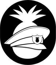
Getting much better, more logo-like... but it's looking sort of visor-like but not exactly in the right place, and the pineapple-in-the-shield-on-the-hat-on-the-pineapple is kind of oddly meta. I think it's going great! Keep up the good work... let us know what you think of next.
You're getting better with the "iconic" look of it. I don't think that the drawing is doing it yet. I know you need to keep the leaves on top to make sure people know that it's a pineapple so why not move the hat up and the leaves stick out of the top as if a hole was there? It seems like that would make more sense. And then, if you move the hat up, you have room for very simple aviator sunglasses (no rendering or transparency, just focus on getting the shape right). With those changes, you might be getting to a good place.
Also, as mentioned before a shield holding shape instead of an oval would probably make this a great deal more successful. Keep pushing!
Also, as mentioned before a shield holding shape instead of an oval would probably make this a great deal more successful. Keep pushing!
I think you need an Illustrator's angle.
A decent illustrator will be able to do you a hand drawn character which you can scan in and manipulate.
A decent illustrator will be able to do you a hand drawn character which you can scan in and manipulate.
I think you need an Illustrator's angle.
A decent illustrator will be able to do you a hand drawn character which you can scan in and manipulate.
This is for a design class, we have to do all the work ourselves. Can't bring anyone in from the outside.
So I changed the back shape to a shield. I wanted to avoid putting the hat on top of the pineapple though. After that I'd need to actually personify it, add texture, etc and that was what I was trying to avoid this time (I just wanted the background to be a plain symbol, with the hat in front) I could try putting the hat at the bottom, like it was laying in front of the pineapple.
Attachments
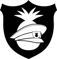
I could try putting the hat at the bottom, like it was laying in front of the pineapple.
I was about to suggest that. It looks like:
a) It's floating
or
b) It's a visor
I think it needs to go up or down. Just try moving it around. Good luck!
Register on MacRumors! This sidebar will go away, and you'll see fewer ads.