I'm going to tell you this right now, I don't know your professor but I can almost guarantee that if you keep that gradient on there he will not be happy. Stick with bold shapes in black and white until you've worked out all the details. Then, and only then should you start considering colors or gradients and highlights, etc. (NOTE: most logos do not need extra effects like web 2.0 highlights, gradients and drop shadows and they generally should be avoided unless you have a specific and meaningful purpose for using them.)
Got a tip for us?
Let us know
Become a MacRumors Supporter for $50/year with no ads, ability to filter front page stories, and private forums.
Class Project Logo - stuck for ideas
- Thread starter JustinG87
- Start date
- Sort by reaction score
You are using an out of date browser. It may not display this or other websites correctly.
You should upgrade or use an alternative browser.
You should upgrade or use an alternative browser.
I'm going to tell you this right now, I don't know your professor but I can almost guarantee that if you keep that gradient on there he will not be happy. Stick with bold shapes in black and white until you've worked out all the details. Then, and only then should you start considering colors or gradients and highlights, etc. (NOTE: most logos do not need extra effects like web 2.0 highlights, gradients and drop shadows and they generally should be avoided unless you have a specific and meaningful purpose for using them.)
couldn't have said it better myself...
Actually the professor (a woman) okayed it. Mainly because this isn't a company logo, it's for a video game. I'm still open to suggestions though.
Actually the professor (a woman) okayed it. Mainly because this isn't a company logo, it's for a video game. I'm still open to suggestions though.
Well then I guess my prediction was wrong
 But my comment and opinion stands. Thanks for posting your progress and good luck with your future projects.
Consider ditching the hat and going with silhouettes for the entirety of the logo. Either the pineapple on the badge shape, or the badge shape on the pineapple. That way it can be 2 colors, it can be 3 colors, it can be gradientized, it can have pineapple texture, or whatever the particular application needs. While the policeman hat is very nicely made (as I said, technical illustration quality!), it just looks unwieldy and amateurish in the application of a company identity.
I would also suggest making your pineapple's foliage look more pineapple-y, even considering having it break out of the top of the police badge... example:

I would also suggest making your pineapple's foliage look more pineapple-y, even considering having it break out of the top of the police badge... example:
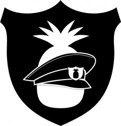
I would just drop the hat. Just have the pineapple on a shield.
Yeah the hat looks way too low anyway. It throws the balance off for me.
I would just drop the hat. Just have the pineapple on a shield.
+1
It's redundant with the extra pineapple.
Also, try reducing the size to about 1/2 an inch and see if it works that way. It will help you eliminate anything that isn't necessary.
Keep it simple. Instead of that kind of badge, maybe a police STAR would work better.
I would just drop the hat. Just have the pineapple on a shield.
+2
Or at least fix the perspective of the badge on the hat. The hat is roughly 3/4 view, the badge on the hat is frontal view. Maybe that's why it's looking a bit off to me.
Simple badge with PineApple patrol on it along with a pineapple. There doesnt need to be any 'interaction' as its implied by being a badge i.e. it needs to be interacted with for it to be used.
I agree -- drop the hat altogether. You will have a much more balanced, coherent mark and it will be a lot simpler. You have too many symbols going on here as it is.
My suggestion - do more thumbnails. Do as many thumbnails as you have to until you get a real concept. So, far, this is all really obvious approaches which is fine to get out of the way but often does not server the company well.
Make it simple, yet clever. The only way I have found to do this is the draw, draw, draw until I think I can't possibly think of any other ideas and then it unlocks a new room or closet of concepts.
-mx
Make it simple, yet clever. The only way I have found to do this is the draw, draw, draw until I think I can't possibly think of any other ideas and then it unlocks a new room or closet of concepts.
-mx
I would just drop the hat. Just have the pineapple on a shield.
I'd go the other way on this. Drop the shield. A pineapple with a police hat on is more engaging/intriguing than a shield with a pineapple on it. I would scale the hat down so it fits properly higher up on the pineapple and if I'm seeing this properly there's a shadow beneath the hat that I would get rid of. It makes that hat look like it's not fitting properly. If you do drop the shield then I'd also put another symbol on the hat's badge as to not be redundant (having 2 pineapples). You could put an image related to gaming (a controller or something) or I'd even consider having no image at all. It definitely pays to keep it simple.
I kind of think the typical UK police hat would fit the pineapple better...
http://www.collectors-badges.com/images/Badges Hats/helmet_uk_northumbria_police.jpg
http://www.collectors-badges.com/images/Badges Hats/helmet_uk_northumbria_police.jpg
I think you could do with the shield but without the hat, but add diagonal cross-cross lines for the texture of the pineapple, then something like a banner whee the top one is "pineapple" and the one on the bottom of the badge reads "patrol". Keep it simple, but make it obvious/authentic. And when I say "banner" I don't mean a wavy banner, just a simple curved bar like onsome real police badges.
I think someone mentioned it, but you could try moving the hat up, and having the "hair" stick out a little bit, to maintain the figure of a pineapple. I would also make the badge smaller and place it like on the chest of the pineapple. That way, you could have a simple design, that gets the point across.
As several people have mentioned, lose the hat. It looks cheap, is around the neck instead of the head and is overdoing it.
Just keep the badge with the pineapple reversed out *exactly like the badge on the hat in your last attachment! See how much stronger that tiny badge on the hat looks than the entire composition.
Just keep the badge with the pineapple reversed out *exactly like the badge on the hat in your last attachment! See how much stronger that tiny badge on the hat looks than the entire composition.
Register on MacRumors! This sidebar will go away, and you'll see fewer ads.