Become a MacRumors Supporter for $50/year with no ads, ability to filter front page stories, and private forums.

rebelo

macrumors newbie
Original poster
Oct 6, 2014
23
26
Brazil
Hey there. Not sure if anyone else around here is a heavy user of MacOS' Contacts app. Under Tahoe RC, it's becoming almost useless to me. I'm quite frustrated. Been using Contacts for 15 years, I got more than 6000 records and keep the app always open while working. The interface under Tahoe really sucks big time. I'm devastated.

Yes, I tried BusyContact and Cardhop. They are paid software and present a lot of stuff that I just don't need. I'd gladly pay for any app to give me back the old Contacts interface.

Thinking about going back to Sequoia now.
 
Sorry, guys. If you haven't noticed the interface change of Contacts, you clearly don't use Contacts. In both sides, actually: the contact listing and contact data. After 2 days of Sequoia, I can't keep using it. I know, silly, but Contacts is a tool I use almost 24/7 while working since the dinosaur age. Went back to Sequoia today. What a relief.
 
Sorry, guys. If you haven't noticed the interface change of Contacts, you clearly don't use Contacts. In both sides, actually: the contact listing and contact data. After 2 days of Sequoia, I can't keep using it. I know, silly, but Contacts is a tool I use almost 24/7 while working since the dinosaur age. Went back to Sequoia today. What a relief.
condescension always works 🙄

am using contacts regularly on my mac without issue. can you break down why "it's becoming almost useless" to you?
 
Hey there. Not sure if anyone else around here is a heavy user of MacOS' Contacts app. Under Tahoe RC, it's becoming almost useless to me. I'm quite frustrated. Been using Contacts for 15 years, I got more than 6000 records and keep the app always open while working. The interface under Tahoe really sucks big time. I'm devastated.

Yes, I tried BusyContact and Cardhop. They are paid software and present a lot of stuff that I just don't need. I'd gladly pay for any app to give me back the old Contacts interface.

Thinking about going back to Sequoia now.
I feel your pain.
I have near 2k customers with a large quantity of notes on them.
Besides the graphics glitches (like the flashing when scrolling), now the Notes field is so small.
I need to do a lot of scrolling to read notes that before were easily visible.
The background color is distracting and unnecessary.

A quick round around for now is to hit Edit, that view is like old times.
 
The tiny notes field -- the huge amount of empty space on both the name list (the pointer shows that it's supposed to be resizable but it's not), and the huge wasted space for displaying an empty bubble for anyone you don't have a photo of (90% of my contacts) instead of any useful information. A lot of good things in Tahoe; contacts though is an embarrassment; sorry team.
 
The macOS Contacts app has not went through the most basic of QC. The fact Apple, a trillion-dollar company, which once prided itself in beautiful UI/UX, went ahead and released this POS to the public, is appalling, and quite honestly insulting.

A quick 30-second look at the app reveals the following:
- Using the top Menu such as going to "Help" results in the contacts background flickering all over the place
- You can no longer copy the user's name, and good luck trying to copy any of the other info such as email. It doesn't work. This has removed any sense of actual usefulness.
- When sharing the "Me" contact (the one I share most often), if you click "Share Contact" and then click away, will force-open Apple Maps for no apparent reason
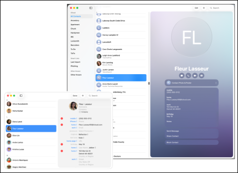
- Visually it's a mess. 1/3 of the screen is taken up by the contact initials or photo, which are then replicated directly below in a small version called "Contact Photo & Poster".

Apple's ability to take something useful, completely break it, and put it forward to the public as an exciting new release, is quite impressive.
 
I agree that contacts is almost useless now.
If you use it frequently, like copying and pasting forms, it’s not as good as it used to be.

Also, when you click on a field for a phone number or email, it triggers the call or opens the email right away.

There’s no longer an option to choose whether you want to call, FaceTime, or message.

It’s really a mess.


PLEASE FIX THIS
 
noticing contactsd process is doing a bunch in the background on my Mac. Seems to be a potential culprit behind some of these performance issues.
 
  • Like
Reactions: Starfia
Sure the interface has changed. I don't find it to be a problem. Sorry you do.
This is absolutely awful. I can't believe anyone would find the new look any bit of an improvement (see attachment).
 

Attachments

  • Contacts_compared.png
    Contacts_compared.png
    320.5 KB · Views: 66
I think the changes bring the macOS version of Contacts more into line with what Apple have moved to on iOS, so the consistency is one benefit of the new UI.

But is anyone else seeing a jagged/pixellated Contacts icon (specifically the white 'person' icon) when using Command + Tab to bring up the app switcher?
 
I think the changes bring the macOS version of Contacts more into line with what Apple have moved to on iOS, so the consistency is one benefit of the new UI.

This not a benefit when it's a usability drawback like this.
Different devices on different OS platforms do not need to all look identical.

The Mac is its own thing, and software should reflect the strengths of that.

In the same way, it's ridiculous how they are adding all this padding to the entire UI, which just nukes effective usable screen space.
 
While I am among those who overall like Mac OS 26, it still beggars belief that the Contacts app hasn't been even tested. Because I take for granted that an internal tester would have flagged these issues. In fact how did it go unaddressed through 8 betas? Maybe only few people actually use Contacts...
 
While I am among those who overall like Mac OS 26, it still beggars belief that the Contacts app hasn't been even tested. Because I take for granted that an internal tester would have flagged these issues. In fact how did it go unaddressed through 8 betas? Maybe only few people actually use Contacts...
The OS including contacts WAS tested through all the betas. I was one of them. Did I like the previous way messages was set up? Yes. Do I find I can still use contacts well? Yes. The changes are cosmetic basically and trust me, the Mac world went crazy when the settings app was changed. Did the world end? Nope. We found out how  wanted it to work and we learned the new way. If you intend to stay in the  ecosystem you too will come to accept the new way forward. But all the hate and dislike comments will wither away and life will go forward and those of us fully vested in the ecosystem will be happy when the hate mongering goes away so we can get back to actual informative posts.
 
This not a benefit when it's a usability drawback like this.
Different devices on different OS platforms do not need to all look identical.

The Mac is its own thing, and software should reflect the strengths of that.

In the same way, it's ridiculous how they are adding all this padding to the entire UI, which just nukes effective usable screen space.
I totally agree with your sentiment. One UI for both iOS and MacOS devices necessarily means the UI will not be optimal for either.
 
  • Like
Reactions: tbgb50 and zevrix
I must agree with the OP. Contacts under Tahoe is HOPELESS and a disgrace.

1. On my Mac Mini M2 with Tahoe and Apple Cinema Display 20 inch displays, the screen flickers in Contacts. It never used to - and it only happens in CONTACTS.

2. The SEARCH box is located on the top right, which is the opposite of where you want it, because you scroll on the left, and then have to move the cursor to the far right to enter some text. Designed by an idiot.

3. The TEXT SIZE is TOO SMALL, and there is no way to make it bigger just for Contacts, or within Contacts, or within System settings (App specific)

4. The GREY background screen is HIDEOUS, and it makes the text difficult to read. Why not allow users to have a clean white background, like previous versions? So bad.

5. Then there is that HUGE space for an image, when you have no image for the person ... so why take up half the screen with a giant circle of an empty head, when it is just an empty head.

6. DISPLAY OF PHONE NUMBERS:
Say you have a COMPANY card, and then enter different phone numbers for different people at the company as say:
0401 111 222 -Dave Black
0402 333 444 - Sam
Under Tahoe, Contacts removes the spaces between the number and the name, and it reads as:
0401111222DaveBlack
Just hopeless. Designed by an idiot.

7. The tiny Notes field.

Hope Apple could release such crap beggars belief.
 
Register on MacRumors! This sidebar will go away, and you'll see fewer ads.