Become a MacRumors Supporter for $50/year with no ads, ability to filter front page stories, and private forums.
Status
The first post of this thread is a WikiPost and can be edited by anyone with the appropiate permissions. Your edits will be public.

Alexander.Of.Oz

macrumors 68040
Original poster
Oct 29, 2013
3,200
12,502
Thanks to the Mod's for making this a sticky thread!

*-*-* WARNING: Expect to be critiqued heavily - ask and ye shall receive. Do not post unless you accept that others will be brutally honest *-*-*

Critics Corner
is a place for in-depth photographic discussions. Posters to this thread should use their photographic knowledge and perception fully to evaluate the given photograph. Also the information provided by the shooter should be taken into account to understand the shooting moment, for its limitations, opportunities, and how well the shooter performed under those circumstances.


For Requesters:

Firsly and most importantly, try to tell us what you set out to achieve when taking the shot; what were your thoughts and hopes about the scene being captured. In other words you, the topic starter, have to start the discussion yourself by providing your own evaluation of the picture and the points you want to discuss. There is a crucial point in the taking of a photo, and much that is done before the shutter is pressed can only be slightly improved with later PP. Describing the situation, surroundings, available shooting positions, available lighting possibilities can all enable the critiquers to come up with much more meaningful evaluations of your photo.

If you think you did the best possible job you could with a given scene and are just wondering if the end result is good in the eyes of others, say that. While you may feel like you should thank people for taking the time to critique your photo, please wait, at least initially when replies are likely to be posted quickly, and reply to several at once. This avoids your thread being bumped twice for every critique you receive. Finally, remember it goes without saying that all comments you receive are "IMO"; they're just somebody's opinion. And your own opinion is what matters most.

Be aware that when you post an image to this forum, you're not asking for a pat on the back. The assumption made by everyone who reads this forum is that you're looking for honest commentary and criticism. Members will tend to critique based on their own skill level so if you're nervous about commentary you might receive, take a few minutes to explain where you think you are, photographically, and what you hope to get out of the critique. If you think that you 'almost' nailed an image, but you're not quite happy with it - say that.


For Critiquers:

You should be honest, but be constructive. You can discuss aspects of a photograph without being judgemental toward the picture or the photographer. The difference between "harsh" and "constructive" lies in the wording and the intent to be helpful. Similarly, if you think a photograph is great and don't really have suggestions for improvement, it can still be helpful to the photographer to explain what you think is right about it. Perhaps the most important issue to comment on is the photographer's motivation for taking the shot; which we are now asking them to outline. Don't assume that every photograph "needs" improvement. If you can see obvious ways that an image could have been improved, either in capture or in post-processing, please feel free to suggest your ideas. Or simply comment on the pros & cons of an image. Remember, images are posted here for critiques, not "attaboys."
 
Last edited:
Baaa..... baaa..... I will show some and be first lamb for the blood letting...

Have at it kiddies... shred away...

L1005815.jpg by Ken OHagan, on Flickr

Let me start you off:

1. The fall off on the top is too much.
2. The cloud in the sky to the left add nothing
3. All that stuff in the front adds clutter and mess
4. the covers on the trees ruin the scene
5. I cut the building off too much on the right
6. It wasnt shot with a DSLR. - :)
 
  • Like
Reactions: needfx
I'll throw this one into the ring to get things rolling.

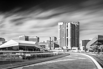
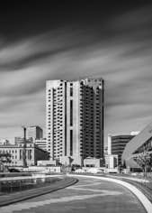
It's an image I have come back to time and time again, capturing it from almost the same point of view repeatedly, but still feel it's not the best it could be for some reason I can't quite put my finger on. I have a feeling it needs to be wider, but am confused as to whether to go really wide, like pano. wide or just the difference that a 17mm (90 degree) perspective could have as compared to the 24mm (70 degree) that I used for this? I'm also yet to get those killer cloud movements that I have longed for here either, that's definitely part of the mix of my own unsettled feelings about this one.

Fire away! I'm thick-skinned and look forward to your insights assisting me understand and see this with clearer vision!

Thanks in advance for the opportunity to do this.
Alex

_MG_5306-X3.jpg

Canon 6D, Canon 24-105mm f/4 L, Multi-segment Metering, Bulb Mode, Formatt-Hitech Firecrest 16 Stop ND
ISO 100, 24mm, f/8, 4 Minutes

[doublepost=1526037463][/doublepost]
Baaa..... baaa..... I will show some and be first lamb for the blood letting...

Have at it kiddies... shred away...

L1005815.jpg by Ken OHagan, on Flickr

Let me start you off:

1. The fall off on the top is too much.
2. The cloud in the sky to the left add nothing
3. All that stuff in the front adds clutter and mess
4. the covers on the trees ruin the scene
5. I cut the building off too much on the right
6. It wasnt shot with a DSLR. - :)
You must have beaten me to post by a couple of seconds, Ken!

  • I reckon it needs more breathing room up top, left and right, but have no idea what's out on the left or right and whether it's good or not?
  • The POV's not really working for me. The eye is pulled to a secondary door, not the main one according to the architecture.
  • I wouldn't leave the first row of beds in the scene, it creates confusion and not a gentle movement into the scene, with them cutting across the scene as they do.
  • The clouds definitely need some tweaking to make them stronger.
  • The nets on the trees do kill it, you're right there.
  • Rather than simply applying a vignette to the scene, try selectively masking and applying gradients to create more of a sense of dimension to the building. Refer to Joel and Julia-Anna's book.
Hope that's of some assistance to you. :D
 
  • Like
Reactions: needfx and kenoh
I'll throw this one into the ring to get things rolling.

It's an image I have come back to time and time again, capturing it from almost the same point of view repeatedly, but still feel it's not the best it could be for some reason I can't quite put my finger on. I have a feeling it needs to be wider, but am confused as to whether to go really wide, like pano. wide or just the difference that a 17mm (90 degree) perspective could have as compared to the 24mm (70 degree) that I used for this? I'm also yet to get those killer cloud movements that I have longed for here either, that's definitely part of the mix of my own unsettled feelings about this one.

Fire away! I'm thick-skinned and look forward to your insights assisting me understand and see this with clearer vision!

Thanks in advance for the opportunity to do this.
Alex

_MG_5306-X3.jpg

Canon 6D, Canon 24-105mm f/4 L, Multi-segment Metering, Bulb Mode, Formatt-Hitech Firecrest 16 Stop ND
ISO 100, 24mm, f/8, 4 Minutes


OK, here goes. as you guys know I am an idiot so feel free to ignore me...

1. I think is needs to be a tad wider so the building on the left is not cut off. The one on the right less so but for some reason the bright contrast of the one on the left attracts my eye
2. I feel it needs to be taken from either a higher vantage point or a lower one with an ultra wide to make the leading line lead the eye and to make the zig zag make a little more sense. As it is the end of the line doesnt lead to the building it kind of cuts off in from of the high rise and who ever laid that pattern of zig zag needs to try again to make it even.
3. I think the "action" is centre heavy so either frame it tighter with less sky and just the high rise and the leading curve as subject, or lower to accentuate the sky
4. Lift the convention centre shadows and the deep sky shadows. They have no detail right now.

I feel quite evil for being this picky. Its a nice image.
[doublepost=1526037691][/doublepost]
I'll throw this one into the ring to get things rolling.

It's an image I have come back to time and time again, capturing it from almost the same point of view repeatedly, but still feel it's not the best it could be for some reason I can't quite put my finger on. I have a feeling it needs to be wider, but am confused as to whether to go really wide, like pano. wide or just the difference that a 17mm (90 degree) perspective could have as compared to the 24mm (70 degree) that I used for this? I'm also yet to get those killer cloud movements that I have longed for here either, that's definitely part of the mix of my own unsettled feelings about this one.

Fire away! I'm thick-skinned and look forward to your insights assisting me understand and see this with clearer vision!

Thanks in advance for the opportunity to do this.
Alex

_MG_5306-X3.jpg

Canon 6D, Canon 24-105mm f/4 L, Multi-segment Metering, Bulb Mode, Formatt-Hitech Firecrest 16 Stop ND
ISO 100, 24mm, f/8, 4 Minutes

[doublepost=1526037463][/doublepost]
You must have beaten me to post by a couple of seconds, Ken!

  • I reckon it needs more breathing room up top, left and right, but have no idea what's out on the left or right and whether it's good or not?
  • The POV's not really working for me. The eye is pulled to a secondary door, not the main one according to the architecture.
  • I wouldn't leave the first row of beds in the scene, it creates confusion and not a gentle movement into the scene, with them cutting across the scene as they do.
  • The clouds definitely need some tweaking to make them stronger.
  • The nets on the trees do kill it, you're right there.
  • Rather than simply applying a vignette to the scene, try selectively masking and applying gradients to create more of a sense of dimension to the building. Refer to Joel and Julia-Anna's book.
Hope that's of some assistance to you. :D


Superb! I like this...
 
OK, here goes. as you guys know I am an idiot so feel free to ignore me...

1. I think is needs to be a tad wider so the building on the left is not cut off. The one on the right less so but for some reason the bright contrast of the one on the left attracts my eye
2. I feel it needs to be taken from either a higher vantage point or a lower one with an ultra wide to make the leading line lead the eye and to make the zig zag make a little more sense. As it is the end of the line doesnt lead to the building it kind of cuts off in from of the high rise and who ever laid that pattern of zig zag needs to try again to make it even.
3. I think the "action" is centre heavy so either frame it tighter with less sky and just the high rise and the leading curve as subject, or lower to accentuate the sky
4. Lift the convention centre shadows and the deep sky shadows. They have no detail right now.

I feel quite evil for being this picky. Its a nice image.
Thanks for stepping up to the plate, Ken! Much appreciated!

  • Definitely feeling the need to go wider, will play with both pano's and just using the 17mm, with shifting the POV, so the tall building isn't smack-bang in the centre.
  • Getting higher would be an issue here, the railing is high, it's at my chest height and I'm 6'. I have tried lower, and you lose too much from the scene...
  • Shall play with positioning myself so that irregular zig-zag draws your eye into the scene.
  • Might have to merge a couple of exposures for that shadow detail. It was a very bright morning when I took this one.
 
  • Like
Reactions: needfx
Baaa..... baaa..... I will show some and be first lamb for the blood letting...

Have at it kiddies... shred away...

L1005815.jpg by Ken OHagan, on Flickr

Let me start you off:

1. The fall off on the top is too much.
2. The cloud in the sky to the left add nothing
3. All that stuff in the front adds clutter and mess
4. the covers on the trees ruin the scene
5. I cut the building off too much on the right
6. It wasnt shot with a DSLR. - :)

I would have liked to have seen the entire building, OR just a significant portion. Right now the image is neither wide enough to encompass the whole building, nor is it framed tightly enough for focusing on just one sections. I feel like the entire frame is tilted to the left and I want to straighten it, although I do think that technically the verticals ARE straight.... ??? I think the leading lines of the garden beds contribute to that. I don't find that stuff "clutter," as it is a natural part of what a person would see IRL. I do wonder if a color version of this would work better.

I don't mind the clouds; I usually leave skies alone for the most part. And who cares what camera you used.

I'll throw this one into the ring to get things rolling.

It's an image I have come back to time and time again, capturing it from almost the same point of view repeatedly, but still feel it's not the best it could be for some reason I can't quite put my finger on. I have a feeling it needs to be wider, but am confused as to whether to go really wide, like pano. wide or just the difference that a 17mm (90 degree) perspective could have as compared to the 24mm (70 degree) that I used for this? I'm also yet to get those killer cloud movements that I have longed for here either, that's definitely part of the mix of my own unsettled feelings about this one.

Fire away! I'm thick-skinned and look forward to your insights assisting me understand and see this with clearer vision!

Thanks in advance for the opportunity to do this.
Alex

_MG_5306-X3.jpg

Canon 6D, Canon 24-105mm f/4 L, Multi-segment Metering, Bulb Mode, Formatt-Hitech Firecrest 16 Stop ND
ISO 100, 24mm, f/8, 4 Minutes

[doublepost=1526037463][/doublepost]
You must have beaten me to post by a couple of seconds, Ken!

  • I reckon it needs more breathing room up top, left and right, but have no idea what's out on the left or right and whether it's good or not?
  • The POV's not really working for me. The eye is pulled to a secondary door, not the main one according to the architecture.
  • I wouldn't leave the first row of beds in the scene, it creates confusion and not a gentle movement into the scene, with them cutting across the scene as they do.
  • The clouds definitely need some tweaking to make them stronger.
  • The nets on the trees do kill it, you're right there.
  • Rather than simply applying a vignette to the scene, try selectively masking and applying gradients to create more of a sense of dimension to the building. Refer to Joel and Julia-Anna's book.
Hope that's of some assistance to you. :D

You boys with your black and white landscapes. I am very color oriented, and these kinds of images tend to throw me for a loop.

I think the ratio of sky to buildings is fine, but I would definitely get rid of the dark black at the way top and make it more midtone gray; I find that black too overwhelming for the scene.

Although your buildings and horizon are generally straight, I am thrown by the trapezoid roof on the left building with it's slant. I suppose it actually looks that way IRL? It's too far in the frame for much distortion, but it kind of leaves me unsettled. But, I don't think that's a changeable thing. I like the leading line of the pathway and the curve of it.
 
You boys with your black and white landscapes. I am very color oriented, and these kinds of images tend to throw me for a loop.

+1

----------------------------

I'll never be posting any pics on this thread BUT I look forward to following along with the pictures and the critiques ... looks like it could be a solid learning resource. Then again, if gets into lots of gear talk and post production processing, I'll easily get left by the wayside.
 
Last edited:
  • Like
Reactions: kenoh and needfx
@kenoh | @Alexander.Of.Oz

if you're really challenging us to nitpick at your images, here's some nitpicking for you, always in my opinion, which really, is only a matter of taste and perception.

I could argue that both these images could use minor perspective corrections, as per attached.

Alex's maybe a minor crop for reframing and more contrast to the +1stop side.
On Kenoh's, some sky burning to bring some more moodiness.

There, mischief managed

_MG_5306-X3 22.jpg Captureddddddd 2.jpg
 
Ok, I'm game...

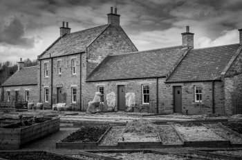
My wife and I were in downtown Phoenix to visit the Pompeii exhibit and the Arizona Science Center. This photo is of the Rosson House which was built in 1895, and is one of the few remaining examples of Victorian architecture within the original boundaries of the city of Phoenix. We were walking back to our car when I noticed the house - and despite the harsh midday sun, I wanted to try to capture it in the vintage of the late 19th century. The photo was originally taken in full color and converted to black and white after the fact.

Shot with iPhone 8+, ISO 20, 3.99mm, f1.8, 1/1000


RossonHousePhx.jpg
 
Last edited:
  • Like
Reactions: needfx
I agree with most of what was said. Also.....

Ken's image definitely lends itself to B&W. I'm not so sure about Alex's.
With both images, I do not see the story you are trying to tell.
Both images seem too flat for my taste, especially Ken's. I would like to see more contrast.

dwfaust's image suffers from two things out of his control: The harsh lighting and the intrusive signage. I would like to see this a little wider to help create some context. I am bothered by the lightening rod being cut off at the top.
 
Last edited:
I got one here for you critics to sink your fangs in.

This was some messing around with studio lighting and a friend of mine, and we both had some time to kill.
I had no particular clear image -or story- in my mind when shooting other than offering the glasses to her to wear, but when I sat in front of the computer, some creative post production juices started flowing.

Now, this is an image that in my view was not well received, and tbh, I always thought it was kinda wronged in terms of final image and work that went into post. To date, it remains one of my favorite images, given its 80's feel and what the original image looked like.

bite away/kthx!

Canon EOS 100D
EF-S 18-55mm f/3.5-5.6 IS STM
ƒ/5.6 38.0 mm 1/250 iso200
Flash (on, fired)


IMG_6828__.jpg IMG_6828_.jpg
 
Last edited:
Baaa..... baaa..... I will show some and be first lamb for the blood letting...

Have at it kiddies... shred away...

L1005815.jpg by Ken OHagan, on Flickr

Let me start you off:

1. The fall off on the top is too much.
2. The cloud in the sky to the left add nothing
3. All that stuff in the front adds clutter and mess
4. the covers on the trees ruin the scene
5. I cut the building off too much on the right
6. It wasnt shot with a DSLR. - :)

Firstly, I like the tonality of the photo and it suits the mono treatment. Not wanting to repeat earlier comments but to me it lacks a main focal point and doesn’t get any particular point or story over to me. This is likely due to the clutter you note yourself. Another angle might have made use of the geometry of the foreground beds albeit perhaps at the expense of building coverage. I’d have perhaps lifted the viewpoint to include more of that interesting sky and less garden.
I'll throw this one into the ring to get things rolling.

,
.
Alex

_MG_5306-X3.jpg

Canon 6D, Canon 24-105mm f/4 L, Multi-segment Metering, Bulb Mode, Formatt-Hitech Firecrest 16 Stop ND
ISO 100, 24mm, f/8, 4 Minutes

[doublepost=1526037463][/doublepost]
You must have beaten me to post by a couple of seconds, Ken
. :D

Obviously I haven’t seen the colour version but I suspect that the contrasting materials might add a bit more life to the image and emphasise the nice leading lines. Again in ignorance of what is off the sides, I suspect that going wider wouldn’t help - I’d almost go as far as suggest a portrait orientation crop around the central building keeping the lead-ins as far as possible. As you say, the sky effect is probably not dramatic enough to justify its major place in the composition.

A couple of alternative crops:

_MG_5306-X3 1.jpg _MG_5306-X3 2.jpg _MG_5306-X3.jpg
 
Last edited:
Before I dive in, I have a request. Please include shooting info for each pic. I don't specifically care about what brand of gear you used, but knowing the focal length, aperture, shutter speed, ISO, external lighting (if any) would be helpful in formulating an informed reply. Sometimes suggestions/critique can relate to "capture" issues and sometimes to how an image was processed in post. Knowing the EXIF data can be really useful (for example, for the "killer cloud movements" you are looking for, how long did you expose this?).

I know, I know. The final image speaks for itself. But if the goal is for honest critique that will influence future efforts, knowing what exactly you did to create the image seems pretty important...
[doublepost=1526065802][/doublepost]@Alexander.Of.Oz, nevermind. Just noticed that you posted it under the image in the space I usually ignore as it's often personal tags.

For everyone else, please post your shooting info with the image :)
[doublepost=1526067303][/doublepost]
I'll throw this one into the ring to get things rolling.

It's an image I have come back to time and time again, capturing it from almost the same point of view repeatedly, but still feel it's not the best it could be for some reason I can't quite put my finger on. I have a feeling it needs to be wider, but am confused as to whether to go really wide, like pano. wide or just the difference that a 17mm (90 degree) perspective could have as compared to the 24mm (70 degree) that I used for this? I'm also yet to get those killer cloud movements that I have longed for here either, that's definitely part of the mix of my own unsettled feelings about this one.

Fire away! I'm thick-skinned and look forward to your insights assisting me understand and see this with clearer vision!

Thanks in advance for the opportunity to do this.
Alex

_MG_5306-X3.jpg

Canon 6D, Canon 24-105mm f/4 L, Multi-segment Metering, Bulb Mode, Formatt-Hitech Firecrest 16 Stop ND
ISO 100, 24mm, f/8, 4 Minutes

I actually like this quite a bit. Lots of good things to say for it from a "traditional" critique standpoint--good balance, nice leading lines, good overall tone. I like the sky you achieved with the 4 min exposure. Doesn't draw the eye to it, but adds to the image. Also I like the darkened foreground that leads the eye into the image.

Going wider would prevent some of the cutoff of the structure on the left, but wouldn't add to the impact of the image. In fact I think it would detract by just making everything smaller. Something of interest in the foreground that was a subject for the pic might make a wider lens better, but for this composition I think you chose a good focal length and shooting position.

For my own pics, my final question when evaluating them is: would I hang this on my wall at home? Why or why not? For other people's pics it's similar: would I pay money for this?

In this case the answer is no. Not because I don't like it or because I don't appreciate the technical skill that went into creating it. It's visually interesting and well done. I don't think I could have shot it better. But at the end of the day the subject isn't something that really speaks to me. I'm not feeling a narrative or story with this subject. I'm not feeling moved. I'm not feeling invested in the image.

This has nothing at all to do with you as a photographer. I like your work. I'm just not feeling connected with this particular subject.

[Edit: something I've talked about with Ken--I've found myself to be limited by thinking in terms of "technical correctness" in many of my images, thinking in terms of checking off boxes for things like "overall tone", "leading lines", "rule of thirds", "sharpness", "focus", etc. while losing sight of the forest for the trees. An image can be "technically" perfect while failing in the most basic requirement--is it interesting? Does it move or engage the viewer?]
 

Attachments

  • image.png
    image.png
    83 bytes · Views: 336
Last edited:
I got one here for you critics to sink your fangs in.

This was some messing around with studio lighting and a friend of mine, and we both had some time to kill.
I had no particular clear image -or story- in my mind when shooting other than offering the glasses to her to wear, but when I sat in front of the computer, some creative post production juices started flowing.

Now, this is an image that in my view was not well received, and tbh, I always thought it was kinda wronged in terms of final image and work that went into post. To date, it remains one of my favorite images, given its 80's feel and what the original image looked like.

bite away/kthx!

Canon EOS 100D
EF-S 18-55mm f/3.5-5.6 IS STM
ƒ/5.6 38.0 mm 1/250 iso200
Flash (on, fired)


View attachment 761450 View attachment 761451


To go against my last post, I don't think there has to be a story for each pic. But there has to be a "why should I care?" for each pic. An initial impression that captures your interest and then something that brings you back to want to look at it again.

This certainly has an '80s feel to it. I was initially thinking after seeing both that I would like to see them combined--I like the background but initially thought I liked seeing her eyes through the glasses. Then I looked at the larger version and saw what you did with the "reflections" on the glasses. I think you got it right the first time. I wouldn't change a thing. *Very* '80s. Nice job :)
[doublepost=1526071219][/doublepost]
Baaa..... baaa..... I will show some and be first lamb for the blood letting...

Have at it kiddies... shred away...

L1005815.jpg by Ken OHagan, on Flickr

Let me start you off:

1. The fall off on the top is too much.
2. The cloud in the sky to the left add nothing
3. All that stuff in the front adds clutter and mess
4. the covers on the trees ruin the scene
5. I cut the building off too much on the right
6. It wasnt shot with a DSLR. - :)

Ken,
You have so many wonderful images, not sure why you chose this one to post. It's not a sample of your best work (for the reasons you outlined).
 
  • Like
Reactions: kenoh and needfx
To go against my last post, I don't think there has to be a story for each pic. But there has to be a "why should I care?" for each pic. An initial impression that captures your interest and then something that brings you back to want to look at it again.

This certainly has an '80s feel to it. I was initially thinking after seeing both that I would like to see them combined--I like the background but initially thought I liked seeing her eyes through the glasses. Then I looked at the larger version and saw what you did with the "reflections" on the glasses. I think you got it right the first time. I wouldn't change a thing. *Very* '80s. Nice job :)
[doublepost=1526071219][/doublepost]

Ken,
You have so many wonderful images, not sure why you chose this one to post. It's not a sample of your best work (for the reasons you outlined).

thanks a bunch for your input @kallisti !! I won't hide how it made me feel better about this image!
 
To go against my last post, I don't think there has to be a story for each pic. But there has to be a "why should I care?" for each pic. An initial impression that captures your interest and then something that brings you back to want to look at it again.

This certainly has an '80s feel to it. I was initially thinking after seeing both that I would like to see them combined--I like the background but initially thought I liked seeing her eyes through the glasses. Then I looked at the larger version and saw what you did with the "reflections" on the glasses. I think you got it right the first time. I wouldn't change a thing. *Very* '80s. Nice job :)
[doublepost=1526071219][/doublepost]

Ken,
You have so many wonderful images, not sure why you chose this one to post. It's not a sample of your best work (for the reasons you outlined).

Political post... First out the gate had to take a mauling for others to see its ok and to follow.. Job done I think... All valid comments that it didnt get first time posted. Liking this thread
[doublepost=1526073351][/doublepost]
I got one here for you critics to sink your fangs in.

This was some messing around with studio lighting and a friend of mine, and we both had some time to kill.
I had no particular clear image -or story- in my mind when shooting other than offering the glasses to her to wear, but when I sat in front of the computer, some creative post production juices started flowing.

Now, this is an image that in my view was not well received, and tbh, I always thought it was kinda wronged in terms of final image and work that went into post. To date, it remains one of my favorite images, given its 80's feel and what the original image looked like.

bite away/kthx!

Canon EOS 100D
EF-S 18-55mm f/3.5-5.6 IS STM
ƒ/5.6 38.0 mm 1/250 iso200
Flash (on, fired)


View attachment 761450 View attachment 761451
Ok i think the biggest disjoint for me in this is not the image look per se. I think her thick winter pullover is a contrast to the feel of the image.

The image has a summer palette yet her pullover says winter to me.

If that makes sense?
[doublepost=1526073414][/doublepost]
To go against my last post, I don't think there has to be a story for each pic. But there has to be a "why should I care?" for each pic. An initial impression that captures your interest and then something that brings you back to want to look at it again.

This certainly has an '80s feel to it. I was initially thinking after seeing both that I would like to see them combined--I like the background but initially thought I liked seeing her eyes through the glasses. Then I looked at the larger version and saw what you did with the "reflections" on the glasses. I think you got it right the first time. I wouldn't change a thing. *Very* '80s. Nice job :)
[doublepost=1526071219][/doublepost]

Ken,
You have so many wonderful images, not sure why you chose this one to post. It's not a sample of your best work (for the reasons you outlined).

Oh yeah also I cant tell winners from stinkers in my collection remember...
 
  • Like
Reactions: needfx
Ok i think the biggest disjoint for me in this is not the image look per se. I think her thick winter pullover is a contrast to the feel of the image.
The image has a summer palette yet her pullover says winter to me.
If that makes sense?

snippy snippy

yes, that would def/y make sense! maybe it's spring :D
 
  • Like
Reactions: kenoh
I'm a big fan of "put up or shut up". If I'm going to offer critique to other's pics, then I need to post something of my own.

Over the past week or so I've become obsessed with shooting dandelions. Have posted 2 pics of them in the POTD thread. Haven't been totally thrilled with either of them.

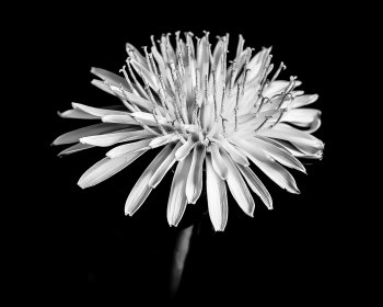
Took another go at it today. For this one I used a 90mm macro lens @ f/11 and ISO 100. Used an off-camera flash on the ground with a Rogue Flashbender soft box attachment at ~45 degrees off center axis. Shot in manual mode with a shutter speed of 1/200 sec to force the flash to be the main light and darken the background.

Converted to B&W in Silver Efex Pro with control points added to further darken the background while keeping the flower light.

My goal for all of these dandelion pics has been to make the dandelion the subject, filling the frame to make them "big" and "noticeable" (as opposed to the small little annoyance at one's feet that they often are). I chose B&W conversions to further abstract them from reality and make them seem "new", "different", "interesting" and not the normal little weed that is how I commonly view them.

I've been using external light in an attempt to find the best way to create tones and shadows on the flower in B&W. My initial post in the POTD thread used an external flash through an umbrella (which created soft light, but lit up the background as well). I then used a ring light on the end of the lens which was okay regarding the background but made the flower itself kind of a soft mess. For this shot I used an external flash fairly close to the flower with a Rogue Flashbender soft box attachment that softened the light but didn't light up the background.

42001917482_984c367e67_h.jpg


Still waiting to find a dandelion in the late stages with all the seeds attached ready to pick up and blow. Not sure how best to light that, but will experiment (and maybe post my results here) when the opportunity develops :)
 
  • Like
Reactions: needfx
I'm a big fan of "put up or shut up". If I'm going to offer critique to other's pics, then I need to post something of my own.

Over the past week or so I've become obsessed with shooting dandelions. Have posted 2 pics of them in the POTD thread. Haven't been totally thrilled with either of them.

Took another go at it today. For this one I used a 90mm macro lens @ f/11 and ISO 100. Used an off-camera flash on the ground with a Rogue Flashbender soft box attachment at ~45 degrees off center axis. Shot in manual mode with a shutter speed of 1/200 sec to force the flash to be the main light and darken the background.

Converted to B&W in Silver Efex Pro with control points added to further darken the background while keeping the flower light.

My goal for all of these dandelion pics has been to make the dandelion the subject, filling the frame to make them "big" and "noticeable" (as opposed to the small little annoyance at one's feet that they often are). I chose B&W conversions to further abstract them from reality and make them seem "new", "different", "interesting" and not the normal little weed that is how I commonly view them.

I've been using external light in an attempt to find the best way to create tones and shadows on the flower in B&W. My initial post in the POTD thread used an external flash through an umbrella (which created soft light, but lit up the background as well). I then used a ring light on the end of the lens which was okay regarding the background but made the flower itself kind of a soft mess. For this shot I used an external flash fairly close to the flower with a Rogue Flashbender soft box attachment that softened the light but didn't light up the background.

42001917482_984c367e67_h.jpg


Still waiting to find a dandelion in the late stages with all the seeds attached ready to pick up and blow. Not sure how best to light that, but will experiment (and maybe post my results here) when the opportunity develops :)

I definitely find the weird aspect ratio fitting the subject, I for one love weird and uncommon crops. I do find though it could use a boost in clarity/contrast/sharpening to further bust it out of the background while pushing the shadows even lower. I know it is frowned upon to meddle in others peoples' pictures, but it is the practical way to visually convey what you (I) imagine. Again, this is nitpicking, the image is enticing as is.

42001917482_984c367e67_h 222.jpg
 
Last edited:
  • Like
Reactions: Alexander.Of.Oz
I definitely find the weird aspect ratio fitting the subject, I for one love weird and uncommon crops. I do find though it could use a boost in clarity/contrast/sharpening to further bust it out of the background while pushing the shadows even lower. I know it is frowned upon to meddle in others peoples' pictures, but it is the only way to show what you imagine. Again, this is nitpicking, the image is enticing as is.

View attachment 761488

It's all good. "Meddling" is what I think this thread is all about. We all put on kid gloves regarding pics in the POTD in an effort to play nice and not offend. Which is great and part of what makes this site great. I think this thread is about a space that isn't as "safe". Take off the gloves and be honest (while still being respectful). I don't see a problem with sharing your own personal takes on a pic posted here.

I was bothered with the background elements that were still showing through on my pic. I ended up cropping it a bit more up from the bottom. About to post that version in the POTD thread. But I hear your ideas and appreciate you sharing them. May end up going back to something more similar to what you shared.
 
  • Like
Reactions: needfx
I'll also put-up...

This shot was taken hand-held in harsh, mid-day sunlight with not a cloud in the sky (iso100 1/125s f8 at 22mm with CP filter on EOSM). Trying to capture something instantly recognisable as San Fransisco without being a traditional tourist hot-spot. Not a bad picture overall but just seems to be lacking something. I'd also guess that rather than purely technical aspects, this corner might usefully help with the 'I don't know what' aspects.


Streets of SF 6
by another scotsman, on Flickr


Here's the sooc version for comparison.

IMG_2887 1.jpg
 
  • Like
Reactions: needfx
You boys with your black and white landscapes. I am very color oriented, and these kinds of images tend to throw me for a loop.

I think the ratio of sky to buildings is fine, but I would definitely get rid of the dark black at the way top and make it more midtone gray; I find that black too overwhelming for the scene.

Although your buildings and horizon are generally straight, I am thrown by the trapezoid roof on the left building with it's slant. I suppose it actually looks that way IRL? It's too far in the frame for much distortion, but it kind of leaves me unsettled. But, I don't think that's a changeable thing. I like the leading line of the pathway and the curve of it.
Thanks for your input, Molly.

There's a bit of an optical illusion going on in this image, where I am not actually square with any of the buildings there, so things may visually seem a little out of whack as a result.

The theatre on the left is indeed not square, so that is how it is!

@kenoh | @Alexander.Of.Oz

if you're really challenging us to nitpick at your images, here's some nitpicking for you, always in my opinion, which really, is only a matter of taste and perception.

I could argue that both these images could use minor perspective corrections, as per attached.

Alex's maybe a minor crop for reframing and more contrast to the +1stop side.

There, mischief managed
Interesting take on the perspective corrections! Something to think about, Patrick, thanks.

The original is very flat and I have added a mountain of selective contrast to sections already. I felt it could have done with yet more again, but held back for some reason. o_O

I agree with most of what was said. Also.....

Ken's image definitely lends itself to B&W. I'm not so sure about Alex's.
With both images, I do not see the story you are trying to tell.
Both images seem too flat for my taste, especially Ken's. I would like to see more contrast.
Thanks for your input, and welcome to the fray!

I feel very strongly that this is a B&W image, in the daytime anyway!

I hadn't thought about that for this image, the storytelling that is... What is it about? I guess I was obsessed with the curve of the bridge first and foremost and then the cityscape next up. It's definitely a story of the bridge told well at night, when it comes to life, as a daytime subject it's ho-hum. The cityscape is not broad enough to pull that off as the subject and is not the sort of immense cityscape of a larger city with buildings on a waters edge.

More contrast, got it, thanks for the input, it's appreciated.

Obviously I haven’t seen the colour version but I suspect that the contrasting materials might add a bit more life to the image and emphasise the nice leading lines. Again in ignorance of what is off the sides, I suspect that going wider wouldn’t help - I’d almost go as far as suggest a portrait orientation crop around the central building keeping the lead-ins as far as possible. As you say, the sky effect is probably not dramatic enough to justify its major place in the composition.
Actually, the colour version doesn't add anything to the scene. Lots of beige, white and grey everywhere, with a touch of dark brown for interest!

I hadn't thought about going portrait in orientation, but will investigate that at some stage, when I next get back there, thanks for that thought being planted!

I actually like this quite a bit. Lots of good things to say for it from a "traditional" critique standpoint--good balance, nice leading lines, good overall tone. I like the sky you achieved with the 4 min exposure. Doesn't draw the eye to it, but adds to the image. Also I like the darkened foreground that leads the eye into the image.

Going wider would prevent some of the cutoff of the structure on the left, but wouldn't add to the impact of the image. In fact I think it would detract by just making everything smaller. Something of interest in the foreground that was a subject for the pic might make a wider lens better, but for this composition I think you chose a good focal length and shooting position.

For my own pics, my final question when evaluating them is: would I hang this on my wall at home? Why or why not? For other people's pics it's similar: would I pay money for this?

In this case the answer is no. Not because I don't like it or because I don't appreciate the technical skill that went into creating it. It's visually interesting and well done. I don't think I could have shot it better. But at the end of the day the subject isn't something that really speaks to me. I'm not feeling a narrative or story with this subject. I'm not feeling moved. I'm not feeling invested in the image.

This has nothing at all to do with you as a photographer. I like your work. I'm just not feeling connected with this particular subject.

[Edit: something I've talked about with Ken--I've found myself to be limited by thinking in terms of "technical correctness" in many of my images, thinking in terms of checking off boxes for things like "overall tone", "leading lines", "rule of thirds", "sharpness", "focus", etc. while losing sight of the forest for the trees. An image can be "technically" perfect while failing in the most basic requirement--is it interesting? Does it move or engage the viewer?]
Thanks for your input, I definitely have to rethink what this image is about. I suspect already that it should be a twilight pano as more of a cityscape, with a different POV, rather than trying to make it work as a long-exposure image.

I suspect the lack of story or subject is a big part of what sat uneasy within me about this one.
 
  • Like
Reactions: needfx and mollyc
I don't want to be a critic and not put up one of my own. I'll post something later today after I brew a batch of beer. Today it's an Irish stout.

In the meantime.......

I'll also put-up...

This shot was taken hand-held in harsh, mid-day sunlight with not a cloud in the sky (iso100 1/125s f8 at 22mm with CP filter on EOSM). Trying to capture something instantly recognisable as San Fransisco without being a traditional tourist hot-spot. Not a bad picture overall but just seems to be lacking something. I'd also guess that rather than purely technical aspects, this corner might usefully help with the 'I don't know what' aspects.


Streets of SF 6
by another scotsman, on Flickr


Here's the sooc version for comparison.

View attachment 761505

What is that heavy black area about?

I am generally not a big fan of really dark shadows. When I hear "San Francisco", I think bright and vibrant. This image conflicts with that expectation. Creating a conflict like that can be a powerful artistic tool. I just don't think it works here.

Here also, I'm not sure what you are trying to convey. What would this be like if it were shot at street level and looking up the sidewalk?

-----------

I would love to see each of us reprocess our images based on the feedback, and then repost them.

.
 
Last edited:
I don't want to be a critic and not put up one of my own. I'll post something later today after I brew a batch of beer. Today it's an Irish stout.

In the meantime.......


What is that heavy black area about?

I am generally not a big fan of really dark shadows. When I hear "San Francisco", I think bright and vibrant. This image conflicts with that expectation. Creating a conflict like that can be a powerful artistic tool. I just don't think it works here.

Here also, I'm not sure what you are trying to convey. What would this be like if it were shot at street level and looking up the sidewalk?

-----------

I would love to see each of us reprocess our images based on the feedback, and then repost them.

.

Good idea...
[doublepost=1526137898][/doublepost]
snippy snippy

yes, that would def/y make sense! maybe it's spring :D

Snippy snippy? No that just makes me feel bad !
 
Register on MacRumors! This sidebar will go away, and you'll see fewer ads.