Become a MacRumors Supporter for $50/year with no ads, ability to filter front page stories, and private forums.
Status
The first post of this thread is a WikiPost and can be edited by anyone with the appropiate permissions. Your edits will be public.

Okay, you seem sincere in wanting feedback. It's a little hard for me to critique a photo that was taken over 20 years ago. Typically people looking for CC are looking to improve a specific image, and with this particular image you certainly aren't going to have the chance to redo it. However, should you find yourself in the midst of dog photography again, you might want to recreate something similar with a different dog.

For me personally, this image misses the mark. The flash wasn't quite strong enough to freeze motion, so the whole thing comes off as a little smudgy. I think this would have worked better with a larger flash unit, as I suspect this was taken with on-board flash. (TBH, though, on board flash is making a very retro comeback, so maybe that's okay here.)

The string breaks up the frame, as well as the resulting shadow, and not being a dog sport/competition person, I don't really know why that string is there in the first place.

I do like the composition, in that you kept all of the dog in the frame - no small limb chops, which people frequently do. I probably would clone or crop out that very little bit at the top of the frame which isn't the grass - it draws my eye away from the dog.

You mentioned you'd like to print this. I would probably sharpen it slightly to offset some of the blur, but definitely don't go overboard as you'll then just make it look like you tried to get rid of the blur - you won't be able to do that well.


Planting 2022 (sorry about the signature)
View attachment 2463334

This image is much more interesting overall; I suspect your dog image has sentimental value that isn't translated to a viewer, but nonetheless important for you.

This image has a good composition; I might extend the canvas at the top slightly to move the horizon line to the bottom third line, but it's not egregious where it is. I would definitely back away from the strong vignette - it isn't even centered on the image, and it just kind of closes the image in, IMO. I'd also be inclined to brush a bit of exposure back on the wheels of the tractors, just to open up the detail there with the harsh sun coming down.

This image seems to have a weird artifact on it, not sure if you over sharpened or added grain, but it's really noticeable in the sky and detracts from the image overall, I think. I also shoot film and don't inherently mind grain, but this comes across as splotchy, not fine grain like film would be.

The lighting here is a strong, hard light, and you used it well to help tell your story. I think with the few editing tweaks I mentioned you can have a much more dynamic final result.
 
Thank you Mollyc.
I am if nothing else always sincere :).
"Onboard flash"? do you mean built in/popup. My flash at the time would have been a Canon 420 (gn 42) and this snap was taken whilst in a bit of a jostling match with other pro.togs besides the CRUFTs main ring other flashes synched with mine (visa versa) to cause the odd lighting. You're right about the personal significance. Agree about the string (used to pull a lure for the terrier to chase) and Affinity should sort that. Your other points (good to have back up). Do you think just local sharpening (face & feet) just for the print?
I rather like destorted editing but will redo this with your advice in mind. I had in mind a 'pinhole' affect and heavy grain when I took the shot - so - not right and thanks again.

I mean, honestly, if the image is that emotionally signficant, I would make just basic edits and get it printed. 🙂 I have plenty of family images that aren't that great on a technical basis, but are still worth me printing and loving, regardless of what others think. Just get it to a spot that enhances the mood for you, and send it off!
 
  • Like
Reactions: Reality4711
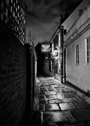
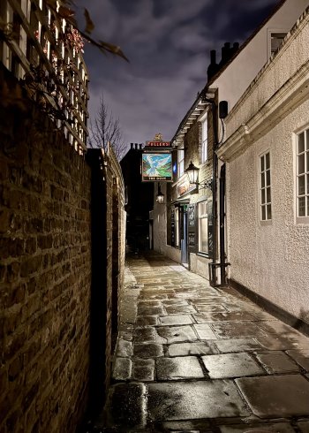
I don't generally attempt much in low light, nor do I generally consider B&W reproduction, but I wanted to test the limits of newly acquired s/h iPhone 15pro. I'd welcome critique here as both seemed to have been crowd pleasers.
 

Attachments

  • IMG_3281.jpeg
    IMG_3281.jpeg
    575.3 KB · Views: 32
  • IMG_3281.jpeg
    IMG_3281.jpeg
    655 KB · Views: 29
I don't generally attempt much in low light, nor do I generally consider B&W reproduction, but I wanted to test the limits of newly acquired s/h iPhone 15pro. I'd welcome critique here as both seemed to have been crowd pleasers.
I prefer the color one for this batch. Black and white doesn't do too much in differentiating color tones and I feel that the sign stands out better in color - it's the standout object against a neutral background, essentially. I want to go in this pub :D . I do like how the composition draws the viewer towards the inviting (to me) pub. For me, I'd prefer a bit of work on keystoning to do a little straightening and perspective shifting, just ever so slightly. Not to de-wonk (not really a word ) any wonky leaning walls per se but just to tweak what the iPhone lens does to perspective. A little stretching, a little vertical nudging. The other thing I did - maybe controversial (!) - is to remove the branch in the upper left. I felt that it was distracting the lead-in to the pub. Obviously, literally everything I say is my own personal approach. :)

IMG_3281_ 2--.jpg


My take, if interested....
 
I prefer the color one for this batch. Black and white doesn't do too much in differentiating color tones and I feel that the sign stands out better in color - it's the standout object against a neutral background, essentially. I want to go in this pub :D . I do like how the composition draws the viewer towards the inviting (to me) pub. For me, I'd prefer a bit of work on keystoning to do a little straightening and perspective shifting, just ever so slightly. Not to de-wonk (not really a word ) any wonky leaning walls per se but just to tweak what the iPhone lens does to perspective. A little stretching, a little vertical nudging. The other thing I did - maybe controversial (!) - is to remove the branch in the upper left. I felt that it was distracting the lead-in to the pub. Obviously, literally everything I say is my own personal approach. :)

View attachment 2464683

My take, if interested....
Agree about the free although it will be intricate work to do well. The 'wonky' look I have to say just looks right to me as the alley seems in reality to curve to the left The paving & (apparently) wall angles on both sides of the ally seem to back this up. The lightest part of the LH wall highlighted by the pub sign is leaning in and the wooden frames atop the wall also show a distinct curve to the left. No keep the 'wonk', I say. Nice image.
 
  • Like
Reactions: StrollerEd
I prefer the color one for this batch. Black and white doesn't do too much in differentiating color tones and I feel that the sign stands out better in color - it's the standout object against a neutral background, essentially. I want to go in this pub :D . I do like how the composition draws the viewer towards the inviting (to me) pub. For me, I'd prefer a bit of work on keystoning to do a little straightening and perspective shifting, just ever so slightly. Not to de-wonk (not really a word ) any wonky leaning walls per se but just to tweak what the iPhone lens does to perspective. A little stretching, a little vertical nudging. The other thing I did - maybe controversial (!) - is to remove the branch in the upper left. I felt that it was distracting the lead-in to the pub. Obviously, literally everything I say is my own personal approach. :)

<snip>

My take, if interested....
Comment and tweaking much appreciated. Perhaps I might forward that version to the landlord?

btw, it is well worth a visit,
 
  • Love
Reactions: r.harris1
Agree about the free although it will be intricate work to do well. The 'wonky' look I have to say just looks right to me as the alley seems in reality to curve to the left The paving & (apparently) wall angles on both sides of the ally seem to back this up. The lightest part of the LH wall highlighted by the pub sign is leaning in and the wooden frames atop the wall also show a distinct curve to the left. No keep the 'wonk', I say. Nice image.
Again, many thanks. I'm still learning and tend not to change too much - ie to keep the wonk. But I'm taken by what @r.harris1 has done.
 
Comment and tweaking much appreciated. Perhaps I might forward that version to the landlord?

btw, it is well worth a visit,
The Dove looks fantastic, indeed; thank you for the link! We're going to be in various parts of London in the latter half of February, and Hammersmith is within striking distance, so it's on the "options list." :)

And it's still your image, regardless of who fussed around with it, so send it to whomever you wish, of course! I hope you know it was just my own take on things and an output of how my brain works—nothing more, nothing less. Thank you very much for sharing this set of images here.
a walk along the river is recommended. I've eaten at The Dove but several good pubs and a very good, but small Italian restaurant,
 
  • Like
Reactions: r.harris1
The Dove looks fantastic, indeed; thank you for the link! We're going to be in various parts of London in the latter half of February, and Hammersmith is within striking distance, so it's on the "options list." :)

And it's still your image, regardless of who fussed around with it, so send it to whomever you wish, of course! I hope you know it was just my own take on things and an output of how my brain works—nothing more, nothing less. Thank you very much for sharing this set of images here.
The only downside is crossing a very busy road by underpass to reach the riverside
 
  • Like
Reactions: r.harris1
Hey all. I’d like your critique of my photo. It was a snap I took on my iPhone when walking back to my car after picking up a pizza. It was raining, and the light just looked cool.

For context, I was an amateur photographer who studied a photography subject or two in collage, but lost inspiration a decade ago and got rid of all my gear. I still take the occasional snap on my iPhone, and do miss the hobby. I keep meaning to get back into it, but it seems I’m just an iPhone snapper now.

As I said, it was a relatively hurried snap, and I just did some light post on it in Photos. I’m happy for any critique offered, what I really want feedback on is the composition and framing. I want to get back into the mindset of thinking about the pictures so I can start seeing more photos out there when I’m going about my life.


IMG_2539.jpeg
 
Hey all. I’d like your critique of my photo. It was a snap I took on my iPhone when walking back to my car after picking up a pizza. It was raining, and the light just looked cool.

For context, I was an amateur photographer who studied a photography subject or two in collage, but lost inspiration a decade ago and got rid of all my gear. I still take the occasional snap on my iPhone, and do miss the hobby. I keep meaning to get back into it, but it seems I’m just an iPhone snapper now.

As I said, it was a relatively hurried snap, and I just did some light post on it in Photos. I’m happy for any critique offered, what I really want feedback on is the composition and framing. I want to get back into the mindset of thinking about the pictures so I can start seeing more photos out there when I’m going about my life.


View attachment 2469229
Personally I don’t see much of an image here. The white car partly hidden behind the one in the foreground doesn’t help.
Personally I’d probably not have taken it. But maybe changing the angle to lose the white car would have helped. In this photo it is neither in the image or out of it.
A slower shutter speed to turn the moving car headlights into light streaks also might have worked. But difficult without a tripod.

I don’t mean to be brutal and I’m no professional. Just how I see the image.
 
Hey all. I’d like your critique of my photo. It was a snap I took on my iPhone when walking back to my car after picking up a pizza. It was raining, and the light just looked cool.

For context, I was an amateur photographer who studied a photography subject or two in collage, but lost inspiration a decade ago and got rid of all my gear. I still take the occasional snap on my iPhone, and do miss the hobby. I keep meaning to get back into it, but it seems I’m just an iPhone snapper now.

As I said, it was a relatively hurried snap, and I just did some light post on it in Photos. I’m happy for any critique offered, what I really want feedback on is the composition and framing. I want to get back into the mindset of thinking about the pictures so I can start seeing more photos out there when I’m going about my life.


View attachment 2469229
Thank you for sharing! I think of your image as a "memento of a feeling." The scene, the rain, and the reflections evoked a sort of "cool, wow" emotion, and you recorded it. Those of us who weren't there—at least me—will find it difficult to discern a particular subject and to feel that same emotion. Pairing emotion with an image can be one of the biggest challenges. To be fair, I shoot my share of these :D .

I know the Photos app - at least on a Mac - allows you to evoke a long exposure simulation if it's a "Live" image. For me, there's an interest in the reflections of the rain on the car, but the upper two-thirds of the image can do with some interest too. As AFB notes above, light streaks on the vehicles might give the image a different perspective. If it was captured such that it has the iPhone Live bits, try seeing what using the "Long Exposure" mode for Live does. An example of where that is in the Mac Photos app is shown in the lower right. Note that the image isn't meant to be an example of "good", just for the technique (it's one of my "memento of a feeling" images :D).
Screenshot 2025-01-05 at 7.26.29 AM.png
 
Hey all. I’d like your critique of my photo. It was a snap I took on my iPhone when walking back to my car after picking up a pizza. It was raining, and the light just looked cool.

For context, I was an amateur photographer who studied a photography subject or two in collage, but lost inspiration a decade ago and got rid of all my gear. I still take the occasional snap on my iPhone, and do miss the hobby. I keep meaning to get back into it, but it seems I’m just an iPhone snapper now.

As I said, it was a relatively hurried snap, and I just did some light post on it in Photos. I’m happy for any critique offered, what I really want feedback on is the composition and framing. I want to get back into the mindset of thinking about the pictures so I can start seeing more photos out there when I’m going about my life.


View attachment 2469229
I like the way the light is reflecting off the hood with all the raindrops. And the reflections on the pavement add to the photo.

But since you are asking about framing and composition, I will ask you, what was your intended subject? Because there doesn't seem to be one here, and to use the terms "framing and composition" implies that you had something specific in mind that didn't quite translate into the final image.

I think there are a lot of really talented iphoneographers, and I don't believe that "good" photography must be done with a dedicated camera. But when you are using a phone or something like a point and shoot camera, composition becomes vastly more important because there is such a large depth of field in those kinds of cameras that can't be controlled like you could with a larger lens and smaller aperture to blur out unimportant details.

Your thought process was good with getting close to the hood of the foreground car to add some blurred visual interest, but then the DOF is so great through the rest of the frame that whatever real subject there is got lost. I would love to see you work on scenes like this to bring your vision to a well executed final image. Keep trying and report back!
 
Hey all. I’d like your critique of my photo. It was a snap I took on my iPhone when walking back to my car after picking up a pizza. It was raining, and the light just looked cool.

For context, I was an amateur photographer who studied a photography subject or two in collage, but lost inspiration a decade ago and got rid of all my gear. I still take the occasional snap on my iPhone, and do miss the hobby. I keep meaning to get back into it, but it seems I’m just an iPhone snapper now.

As I said, it was a relatively hurried snap, and I just did some light post on it in Photos. I’m happy for any critique offered, what I really want feedback on is the composition and framing. I want to get back into the mindset of thinking about the pictures so I can start seeing more photos out there when I’m going about my life.


View attachment 2469229

You're right: the light -- all the different forms of it -- in this image is cool! Think about that for a moment. It, rather than the cars and the buildings and such, actually is your subject, isn't it? Photography IS light -- all about light: capturing it, playing with it, celebrating it.

When I shoot photos and again in working with them during the editing process, I always ask myself, "what is the subject?" In editing I will sometimes play around with various crops and perspectives on images which I otherwise might simply discard to see if I can create something more interesting than what initially came out of the camera. It's a good exercise in developing one's sense of composition and framing.

When I looked at this photo, my attention went right to those beautiful red and bluish/green/turquoise lights created on the road by the reflections of the lights and the cars in the rain. To me, one subject here is those reflections. I immediately saw in my mind's eye how a really interesting abstract could be created with those colors, those lights....

IMO, one thing which makes for a compelling image is simplicity and an approach of getting close to the subject, making it clear both to myself and to any prospective viewer what had caught my attention in the first place. I tend to zoom in on one part of a scene, choosing one potential subject rather than an overall scene (this is why I'm not a landscape photographer!). Unless shooting a wide-angle or panoramic landscape scene, the closer the photographer/camera/lens is to the intended subject the more likely there will be pleasing results when taking photos. In this instance, I would have positioned myself in order to focus on just one or two of the vehicles, framing and composing the shot to eliminate the distracting foreground altogether. (That foreground, with the water drops and beading though, could've become a separate, interesting shot in its own right! I also see about two or three other possibilities in this scene, too!)

I realize that the situation and its location might not have permitted you to reposition yourself and/or the camera though. Also the camera itself (iPhone 14?) may have hindered the possibility of focusing on just the reflections in the road or on just one or two cars to avoid distractions if it is not possible to physically get closer to them and/or to zoom in closer to your intended subject with it.

So, my suggestion is that when you're out somewhere and something catches your attention to the point where you pull the iPhone out of your pocket to take a photo, do just that! However, don't just fire off one shot and call it done. Stop, look -- really look -- at the scene, the intended subject again and see what would happen if you try taking other shots from different angles, different positions.....

Also, you might want to do some reading on the whole topic of composition and seeing creatively. I'm sure there are articles online about just this. In addition, three books for further inspiration:

Peterson, Bryan, Learning to See Creatively

Patterson, Freeman, Photography and the Art of Seeing

Freeman, Michael, The Photographer's Eye

These books are older, but the guidance and information they provide is timeless. One or all may still be in print (a look at a bookstore's website will provide that info), or could be available on the shelves of your local public library.

The best way to learn, of course, is to....simply get out there and shoot! Every time you see that intriguing scene, that interesting lighting, that weird looking object..... Pull out the iPhone. Take not just one photo, take two or three, shoot with intention in order to get the image you see in your mind actually come to fruition in your iPhone.
 
Last edited:
  • Love
Reactions: Bungaree.Chubbins
Personally I don’t see much of an image here. The white car partly hidden behind the one in the foreground doesn’t help.
Personally I’d probably not have taken it. But maybe changing the angle to lose the white car would have helped. In this photo it is neither in the image or out of it.
A slower shutter speed to turn the moving car headlights into light streaks also might have worked. But difficult without a tripod.

I don’t mean to be brutal and I’m no professional. Just how I see the image.
Honesty is why I'm here. I'm not going to get back into the mindset without it. You weren't rude about it, and you gave me things to think about, so thank you!

Looking back, I might have repositioned slightly, rotated my phone 180º to get closer to the roof of my car, and changed the angle, hiding the white Rangie. Maybe that would have helped.
Thank you for sharing! I think of your image as a "memento of a feeling." The scene, the rain, and the reflections evoked a sort of "cool, wow" emotion, and you recorded it. Those of us who weren't there—at least me—will find it difficult to discern a particular subject and to feel that same emotion. Pairing emotion with an image can be one of the biggest challenges. To be fair, I shoot my share of these :D .

I know the Photos app - at least on a Mac - allows you to evoke a long exposure simulation if it's a "Live" image. For me, there's an interest in the reflections of the rain on the car, but the upper two-thirds of the image can do with some interest too. As AFB notes above, light streaks on the vehicles might give the image a different perspective. If it was captured such that it has the iPhone Live bits, try seeing what using the "Long Exposure" mode for Live does. An example of where that is in the Mac Photos app is shown in the lower right. Note that the image isn't meant to be an example of "good", just for the technique (it's one of my "memento of a feeling" images :D).
View attachment 2469233
That is definitely a good part of it. But I had no idea Live Photos had any actual utility! Thank you! I'll be turning Live Photos back on again now.
I like the way the light is reflecting off the hood with all the raindrops. And the reflections on the pavement add to the photo.

But since you are asking about framing and composition, I will ask you, what was your intended subject? Because there doesn't seem to be one here, and to use the terms "framing and composition" implies that you had something specific in mind that didn't quite translate into the final image.

I think there are a lot of really talented iphoneographers, and I don't believe that "good" photography must be done with a dedicated camera. But when you are using a phone or something like a point and shoot camera, composition becomes vastly more important because there is such a large depth of field in those kinds of cameras that can't be controlled like you could with a larger lens and smaller aperture to blur out unimportant details.

Your thought process was good with getting close to the hood of the foreground car to add some blurred visual interest, but then the DOF is so great through the rest of the frame that whatever real subject there is got lost. I would love to see you work on scenes like this to bring your vision to a well executed final image. Keep trying and report back!
Thank you, I saw the light reflecting around in the rain when I put the pizza in the car, and that gave me the inspiration to take the photo, so that's what it was about.

I like the light and reflections, and I like the colours. There's just something about it that feels not quite there.

I've seen what talented people around here can do with an iPhone. I need to put some good time into it.
You're right: the light -- all the different forms of it -- in this image is cool! Think about that for a moment. It, rather than the cars and the buildings and such, actually is your subject, isn't it? Photography IS light -- all about light: capturing it, playing with it, celebrating it.

When I shoot photos and again in working with them during the editing process, I always ask myself, "what is the subject?" In editing I will sometimes play around with various crops and perspectives on images which I otherwise might simply discard to see if I can create something more interesting than what initially came out of the camera. It's a good exercise in developing one's sense of composition and framing.

When I looked at this photo, my attention went right to those beautiful red and bluish/green/turquoise lights created on the road by the reflections of the cars in the rain. To me, one subject here is those reflections. I immediately saw in my mind's eye how a really interesting abstract could be created with those colors, those lights....

IMO, one thing which makes for a compelling image is simplicity and an approach of getting close to the subject, making it clear both to myself and to any prospective viewer what had caught my attention in the first place. I tend to zoom in on one part of a scene, choosing one potential subject rather than an overall scene (this is why I'm not a landscape photographer!). Unless shooting a wide-angle or panoramic landscape scene, The closer the photographer/camera/lens is to the intended subject the more likely there will be pleasing results when taking photos. In this instance, I would have positioned myself in order to focus on just one or two of the vehicles, framing and composing the shot to eliminate the distracting foreground altogether. (That foreground, with the water drops and beading though, could've become a separate, interesting shot in its own right! I also see about two or three other possibilities in this scene, too!)

I realize that the situation and its location might not have permitted you to reposition yourself and/or the camera though. Also the camera itself (iPhone 14?) may have hindered the possibility of focusing on just the reflections in the road or on just one or two cars to avoid distractions if it is not possible to physically get closer to them and/or to zoom in closer to your intended subject with it.

So, my suggestion is that when you're out somewhere and something catches your attention to the point where you pull the iPhone out of your pocket to take a photo, do just that! However, don't just fire off one shot and call it done. Stop, look -- really look -- at the scene, the intended subject again and see what would happen if you try taking other shots from different angles, different positions.....

Also, you might want to do some reading on the whole topic of composition and seeing creatively. I'm sure there are articles online about just this. In addition, three books for further inspiration:

Peterson, Bryan, Learning to See Creatively

Patterson, Freeman, Photography and the Art of Seeing

Freeman, Michael, The Photographer's Eye

These books are older, but the guidance and information they provide is timeless. One or all may still be in print (a look at a bookstore's website will provide that info), or could be available on the shelves of your local public library.

The best way to learn, of course, is to....simply get out there and shoot! Every time you see that intriguing scene, that interesting lighting, that weird looking object..... Pull out the iPhone. Take not just one photo, take two or three, shoot with intention in order to get the image you see in your mind actually come to fruition in your iPhone.
Yes! The light (and its colour) are the subject!

I always used to like taking landscape photos, so I think I tend to not look at the details enough now, and I hadn't even considered cropping!

Yeah, a quick couple of snaps on an iPhone 14 doesn't lend itself to any detailed sort of control, especially since I've not been using any third party camera apps. Now that I've got different ways of considering the pictures, I've got options!

I will definitely do some reading, I might have to go reacquaint myself with a local library. Those books sound helpful.


Thank you for your replies, I've found all of them to be quite helpful. Most of the photos I've taken in the past decade have been functional photos for work, for reference, and I've lost the habit of thinking about photos creatively. I hope this is the start of my getting back into the hobby, even if it is just with my iPhone 14. The best camera is the one you have with you.
 
This man and I had a completely satisfying conversation (me in English and him in Norwegian) sat in a bar around midnight in Narvik.
Had a hug when I left and have no idea what we spoke about to this day.

Although the picture was agreed on, his total indifference to how it turned out or what it was for puts it ( I think) in the anonymous portrait genre.

Not cropped/no flash/iso 3200 .Olympus E5.

What do you think?

Man in Bar in Narvik.jpg
 
Last edited:
What do you think?
Take this for what it is worth and I do apologise if this sounds harsh.

Bear in mind I am just a stranger on the internet and my intention is not to offend, just an amateur and in no way presenting as or am a professional photographer — and learning everyday.

1. As a memento of a fondly remembered encounter your photograph is 100% adequate;

2. As an "anonymous portrait" I find it uncomfortable viewing.

For me there is no textural or tonal variety that makes it worthwhile to be looking at anyone that close.
Just vast expanses of soft (barely in focus) skin.
Lots of skin of a middle aged man with his eyes closed.

Perhaps stepping further further back and some cropping if you needed would have been better — especially if you say you agreed on the photograph being taken.

I'm not suggesting perfectly happy smiling falseness. Just eye contact or the presence of an eye is often what makes a photograph for me.

Some background context could have made this a more striking portrait of a time and place.


Edit:

PS.
Do rethink your watermark/signature.

I know we live in a world where it seems as if everything and anything is stolen or lifted, but… yeah… just Google photograph watermark and a 100+ links tell you how to remove them.

It just looks clunky and the opposite of professional which I assume you are/want to be given that you feel the need to sign your photo.
Interesting.
Eye contact would indicate interest - he was not.
The mans skin is his skin.
Context? A mans face.
Signature - is my signature since retiring and I like it (an over edited copy of my real signature). I sign all my documents (it is an age thing from when we used pens).
Un-comfortable viewing - good. We shared an uncomfortable space at the bar with a lot of others with sad eyes and no reason to go home; including me.
Professional? Yes used to be a pro. (got paid) , now retired.
No need for apology; I asked.
Finally; a lot of skin barely in focus? Absolutely on the lens MF, big man so lot of barely in focus skin.
Let me see. Uncomfortable position, uncomfortable subject, uncomfortable atmosphere and wrong lens - still got the shot. Probably why I was paid.

PS:- "assumption is the mother of mistakes, misrule, misunderstanding and the occasional punch in the face", a quote from me🙃🐋
PPS:- the internet blurs and on checking I find the detail of the skin (pores, hair etc) pixel peeping sharp - what a surprise 👍
PPPS:- I dislike PS'S - afterthought or just lazy? ;)
 
Last edited:
Register on MacRumors! This sidebar will go away, and you'll see fewer ads.