Become a MacRumors Supporter for $50/year with no ads, ability to filter front page stories, and private forums.

mypoorfriendme

macrumors newbie
Original poster
Apr 12, 2006
10
0
Hey guys,

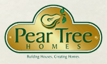
I was wondering if you experts and aficionados out there could help me with my first logo design (for my mom). First, to explain, she wanted me to implement her desire for cooking which goes along with if you buy a house from her, she caters your house warming party...I know the food and house could lead to confusion, so I guess that's why I'm coming to you and hoping for some opinions.

Well, thanks for all the suggestions and criticisms, we both thank you dearly.
 

Attachments

  • Gourmet Logo b.jpg
    Gourmet Logo b.jpg
    23.5 KB · Views: 1,026
And why don't you make separate logos? That way it wouldn't confuse people.


Not sure I understood you well, does your mom sell houses, and she wants you to make something for her clients to know that she also has a cooking business?
 
Seems to suggest wine more than cooking.

Was a little odd, but because it says realtor at the bottom, I know what it's advertising.
 
Alright, I'll try to explain a little better.

She is a realtor and wanted her own logo. Her passions include cooking and wine, so she wanted to implement that as part of her logo. I messed around with other cooking associated items, but a chef's hat or an apron is even more misleading. Also, if you buy a house from her, she will provide gourmet meal and wine for a house warming party (free of charge).

Do you guys think it is possible to combine the two? Am I better off creating real estate logo in order to simplify things? I am open to ALL ideas here.
 
Am I better off creating real estate logo in order to simplify things?


Yes, unless you think someone would buy a house based on a meal I would play it way way down or leave it off. A nice design but conceptually confusing. The passion she should express on her cards is the passion for being a realtor.
 
Yes, unless you think someone would buy a house based on a meal I would play it way way down or leave it off. A nice design but conceptually confusing. The passion she should express on her cards is the passion for being a realtor.

True, but looking at it another way you could interpret the logo as though she sells HOMES, not houses. That could work.

The first thought that came to my head, however, is that the logo (font, colour, etc) makes it look like she caters for female clients (which is fine - if it's true). If I was a blokey bloke (I mean I'm a bloke but not that blokey) I definitely wouldn't be a walk-in client with a logo like that.

Also you may not want to build-in the free housewarming concept into the logo, in case she changes her mind about that offering later on, for whatever reason (e.g. too onerous, expensive, too busy/successful - let's hope the last of these options!)

Nice artwork, btw.

ALT.

PS: I should add that I am not a designer or anything of the sort, just your run-of-the-mill consumer.
 
Can I make a suggestion? This little house needs a 'For sale' sign, maybe on a pole sticking out somewhere, a little whimsical but still blocky enough to offset the artsy rest , semitransparent would be nice, about the size of plate. -> We're selling homes rather than houses, but we still mean business!

no? then it was just one my silly ideas again...anyway, nice work, and enjoy the keynote!
 
OP you are blurring the line between what the business does. Which is a very bad thing.

If its a realty company then do a realty logo. If she wants to incorporate her catering skills then that should be given its own identity in the form of promotional leaflets around the office and in the houses. So people know its definitely a realty company but also offer catering services.

If you confuse a potential customer they have no confidence in the company and will shy away. Brand building is all about brand confidence.
 
The first thing that comes to mind is fine dining or restaurant. I think it is too elegant looking for real estate. I would try to refine the design so it is not so elegant looking, which would include removing the script font and replacing it with something a little more classic.

I did a quick search and pulled the following from the web. These are well done and have that upscale, sophisticated look you are aiming for. Note the font choice, majority classic based fonts.

Nice artwork BTW.
 

Attachments

  • real estate.gif
    real estate.gif
    10.8 KB · Views: 776
  • rea_6.gif
    rea_6.gif
    10.8 KB · Views: 770
  • rea_2.gif
    rea_2.gif
    11 KB · Views: 770
  • rea_7.gif
    rea_7.gif
    11.9 KB · Views: 776
  • rea_4.gif
    rea_4.gif
    11.8 KB · Views: 772
I agree with bluetooth.
Also, I would avoid using layer effects, shadows, bevels etc... during logo development;
Stick to clean vector graphics for the basic design.
BTW, your house symbol is very nicely done.

Here's a variation on your logo using Trajan Pro for the logotype:
KV.png


GL
 
I'm going to preface this with the statement that I am a working Creative Director/Graphic Designer for a Marketing Firm and do logo design as a matter of course, so take whart I have to say however you choose :p

I think the concept you have is good, but it's a little lackluster in execution. I'd play around with making the Wine bottle meld with the house perhaps as the chimney, or something to that effect. This would be if you so chose to keep with the "combined" logo direction.

Personally, I think you'd be better off with a strictly realty related logo. I think you end up with brand dilution "what is it? what does she do? is she catering?" which is bad when it comes to logo design.

Try being more abstract. Everyone has seen the house logo for a realtor, so you have identity built in, so why make it look like everyone else's house? Be abstract, different, exciting!

As far is looking slightly feminine, that's good! Women are typically the ultimate decider when it comes to buying a home, so to appeal to them is smart.

Lastly, stay away from overpowering font choices. In Snickelfritz's concept, the scale of the typeface totally overpowers the icon itself. the Trajan is easier to read, so going with something that is a happy medium might be beneficial. Think about how the logo will be implemented. Print? Web? Embroidered on a shirt? It may look too upscale for some, but the question would be who is her market? If she is selling high 6-7 figure homes, by all means, pull out all the stops.

Just my .02 :D
 
[
I'm going to preface this with the statement that I am a
working Creative Director/Graphic Designer for a Marketing Firm and do logo design
as a matter of course, so take whart I have to say however you choose :p

you'd be surprised how many people on this board have creative credentials. I don't think people give a rat's behind. If you have a valid argument and a good point, you could be a nuclear physicist for all i care.

Sorry you just came across a little - arrogant. What is a creative director/graphic designer, anyway? I thought they are pretty much the same at different levels. It's like saying you are a general/soldier.

Back on topic. She is a realtor first and foremost, as others noted. You will have plenty of opportunity to publicize her other perks in the form of leave-behinds, mailers, brochures, etc.
 
[

you'd be surprised how many people on this board have creative credentials. I don't think people give a rat's behind. If you have a valid argument and a good point, you could be a nuclear physicist for all i care.

Sorry you just came across a little - arrogant.

I was trying to make a point that I had some background, so I wasn't merely speaking out of my you-know-what, like I've seen many people do on this board ... and despite that fact, s/he could take what I said however s/he felt like it.

Arrogance would have been saying "I'm in this position, so you'd BETTER listen to me because I know EXACTLY what I'm talking about."

As far as Creative Director/Graphic Designer, it means I'm a boots-on-the-ground designer as well as doing Creative/Art Direction and the like. Not just someone who sits in an office and manages designers without actually cracking open Creative Suite.

So speaking of, what did your response to my post contribute to the overall theme of the thread? NOTHING.

You just felt the need to smack someone down who dared say they had some level of expertise/experience. Believe it or not experience counts for something. Get off your high horse and stay on track, otherwise, don't post.
 
OT...sort of

I'd like to interject a comment with regard to this business concept.
I'm not a marketing pro; just an artist that has purchased and sold real estate.

Catering house warming parties for buyers is a nice "gimmick" (a spade is a spade), but probably pretty low on their list of priorities with regard to which real estate agent they choose, and will have absolutely nothing to do with their overall satisfaction with the real estate agent at the end of the transaction.
In fact, it may potentially become an uncomfortable obligation in the event that the buyers feel they were poorly represented or taken advantage of during negotiations.
A nice gift of a fruit basket and tickets to a dinner theater might be better received (and easier to do) than something as personal and complicated as a house warming party.

I seriously doubt that the logo design is going have much impact at all on the success or failure of this business model, unless of course, the majority of buyers are easily taken in by the pseudo-yuppie concept of "house warming parties" and consider this to be an overly important aspect of buying a new home.

A slick, perfectly designed corporate ID might actually backfire a little in this context if the buyers are more sophisticated than you.
ie: if you can't impress Wolfgang Puck with your house-warming party, stay away from the concept altogether!
If you can, why the hell are you selling real estate!
In my mind, it's a bit of a paradox, and it exposes your real estate business to reviews on your catering expertise.

I'm not saying this model is not without merit, (although I hope the implication is clear enough) but I believe a talented marketing analyst would not be a bad investment at this point.
The goal should always begin with a viable business model; awesome logo design is just icing on the cake. :p

GL

*clap clap clap*
 
Take the type away and ask yourself what kind of business the logo is for.

Then remove the food and wine.

I like the style overall, but the food element is not working. Sure, it looks nice, but would probably work better as a talking point in her brand story.
 
I like the typeface you've used on there.. and to me this is enough – the imagery adds very little.
I'm not sure about the choice of typeface for 'realtor' though - i think a sans serif with increased letterspace would work better also some of the kerning on this example is very odd

.. oh, and i really like the colours
 
Seems to suggest wine more than cooking.

Was a little odd, but because it says realtor at the bottom, I know what it's advertising.

I tend to agree the food stuff in the home is more related to cooking rather than real estate. Loose the Photoshop filters as well it will make your logo look more professional and it will replicate for different mediums far easier.
 
I quite like it. I didn't see it as two separate messages when I first saw it - I get the impression of her providing you with a 'homely' home where you can relax with a bottle of wine.
 
I was trying to make a point that I had some background, so I wasn't merely speaking out of my you-know-what, like I've seen many people do on this board ... and despite that fact, s/he could take what I said however s/he felt like
...
As far as Creative Director/Graphic Designer, it means I'm a boots-on-the-ground designer as well as doing Creative/Art Direction and the like. Not just someone who sits in an office and manages designers without actually cracking open Creative Suite.

So speaking of, what did your response to my post contribute to the overall theme of the thread? NOTHING.

You just felt the need to smack someone down who dared say they had some level of expertise/experience. Believe it or not experience counts for something. Get off your high horse and stay on track, otherwise, don't post.

ok.
 

Attachments

  • 2005860812964181849_rs.jpg
    2005860812964181849_rs.jpg
    24.7 KB · Views: 76
Another little tip is to avoid using typefaces that come with your Mac. You tend to find that they rapidly become overused by designers everywhere and your logo will lose distinctiveness. Although Zapfino and Trajan are both fine typefaces, I see them everywhere. Invest in a few fonts with a similar style and develop your own personality. If you're brave, customise them for something truly unique.
 
I was trying to make a point that I had some background, so I wasn't merely speaking out of my you-know-what, like I've seen many people do on this board ... and despite that fact, s/he could take what I said however s/he felt like it.

Arrogance would have been saying "I'm in this position, so you'd BETTER listen to me because I know EXACTLY what I'm talking about."

As far as Creative Director/Graphic Designer, it means I'm a boots-on-the-ground designer as well as doing Creative/Art Direction and the like. Not just someone who sits in an office and manages designers without actually cracking open Creative Suite.

So speaking of, what did your response to my post contribute to the overall theme of the thread? NOTHING.

You just felt the need to smack someone down who dared say they had some level of expertise/experience. Believe it or not experience counts for something. Get off your high horse and stay on track, otherwise, don't post.

I completely agree. The utter over-abundance of attitude on these forums drive me crazy, I was actually quite pleased with your original post and thought you to be a humble designer that I would go to for advice.

Most 'experts' on these forums are, as I percieve them to be, mediocre amatuers whose unrecognition in their boring day jobs justifies them to be design diva's on the forum boards. Oscuh... this does not seem to fit your mold. Thank you! I will look forward to your posts elsewhere, whereas a solid handful of posters are quickly ignored for their complete lack of people skills. And skill altogether.

I'm Joel, and I'm just a person.
 
The utter over-abundance of attitude on these forums drive me crazy, I was actually quite pleased with your original post and thought you to be a humble designer that I would go to for advice.

Most 'experts' on these forums are, as I percieve them to be, mediocre amatuers whose unrecognition in their boring day jobs justifies them to be design diva's on the forum boards.

Doh.
 
bejeezus, what's going on around here?

Full moon maybe?

Anyway to the OP, IMHO, the concept of mixing this hobby catering lark and selling houses will never ever, EVER, come across as a logo. That's if one follows the basic precepts of logo design.

And you don't need to be a professional to know that, it's just common sense. Well maybe not that common.
 
Most 'experts' on these forums are, as I percieve them to be, mediocre amatuers whose unrecognition in their boring day jobs justifies them to be design diva's on the forum boards.

Again, I think you'd be surprised. But many of us don't feel the need to list out our credentials.
 
Register on MacRumors! This sidebar will go away, and you'll see fewer ads.