Become a MacRumors Supporter for $50/year with no ads, ability to filter front page stories, and private forums.

iaymnu

macrumors 6502
Mar 23, 2007
328
2
Mithical:

I had the same problem and I found a way to fix it.

1. Go to Macintosh HD > /System/Library/Core Services/

2. Scroll down to Dock and copy this to the desktop as a backup

3. Then right click this and "Show Package Contents"

4. Go to /Contents/Resources/

5. Replace the files with these ones https://www.dropbox.com/s/swddyyjtukx2kk3/newfiles.zip

7. Open Terminal and type: killall Dock


original files: https://www.dropbox.com/s/gxjsy5rjzdhjxxb/backup.zip


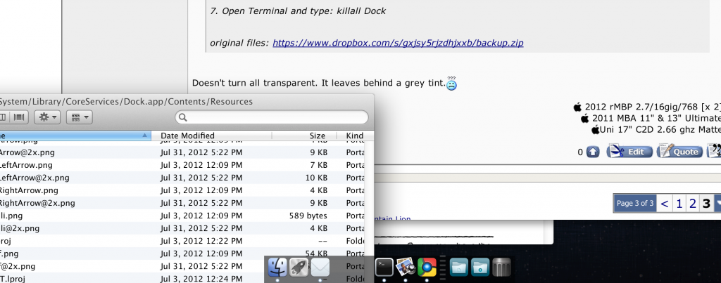
Doesn't turn all transparent. It leaves behind a grey tint.:confused:


ScreenShot2013-02-09at42623PM_zpsf8bfa065.png
 
Last edited:

Ancaster

macrumors member
Sep 10, 2010
66
6
It also left a grey tint for me.
And the indicator lights are gone.

I can't seem to make my dock on my rMBP completely transparent.

Mirage works for you on latest ML?

Any ideas?
 

1920s

macrumors newbie
Jan 5, 2013
2
0
Want to customize the background of your 3D dock in OS X Mountain Lion? Now it's possible, see for yourself

2monr6u.png
.

I used a nice little app called DockMod by spyresoft, it's only 8 bucks and it works like a charm!
 

Silly John Fatty

macrumors 68000
Nov 6, 2012
1,806
514
Very nice @1920’s! When I entered this thread and saw some of the pictures I just thought “Oh my god…” but yours is perfect! Everything fits very nicely, very nice vibe and great background picture too :)

Did you do the icons yourself?

Apart from this, I don’t think I’d change my Doc — I like it the way it is :D The only thing I disliked at some point was this little dot/arrow that shows you which app is open (it used to be black, now it’s white and shining). At first it was hard to see but now it’s fine, maybe I got used to it or perhaps something was changed… :)

Oh and another thing that someone could eventually try would be to have the design of the dock when it’s at the left or at the right to appear when the dock is in the centre. Not sure if you guys see what I mean, but when set to the sides it has a different design, I like this one as well :)
 
Register on MacRumors! This sidebar will go away, and you'll see fewer ads.