iOS7 notifications and control center are like Gandalf the White to Android's Saruman the White. It's not copied, it's finally as it should have been.
Got a tip for us?
Let us know
Become a MacRumors Supporter for $50/year with no ads, ability to filter front page stories, and private forums.
Dear Apple: Get notifications right!
- Thread starter skinnylegs
- Start date
- Sort by reaction score
You are using an out of date browser. It may not display this or other websites correctly.
You should upgrade or use an alternative browser.
You should upgrade or use an alternative browser.
Biggest plus (atleast for me) of Notification on iOS as compared to Android - Able to view on lockscreen ! (Not possible on Android "natively")
Big number of whatsapp and messages , its so easy to quickly see whats happening by just peeking at the phone instead of scrolling from top all the time
Big number of whatsapp and messages , its so easy to quickly see whats happening by just peeking at the phone instead of scrolling from top all the time
Which one of the notifications you mentioned lets you know you have a missed call/message/alert/etc without picking up the phone and checking each time?
First World Problems.
----------
Biggest plus (atleast for me) of Notification on iOS as compared to Android - Able to view on lockscreen ! (Not possible on Android "natively")
Big number of whatsapp and messages , its so easy to quickly see whats happening by just peeking at the phone instead of scrolling from top all the time
Plus Android STOCK does not support pop up alerts like iOS does. And it doesn't support app badge icons, either, which I like much more than widgets. I tried for two months to like Android but it didn't work, mainly for two reasons. Notifications, imho, suck on Android and Android's backup and restore function severely sucks.
Good. It was terrible back in Gingerbread 2.3.4. Like it or not it flashed until you cleared it.
----------
So you are weighing in multiple times, telling us how Android works, and you haven't used Android since Gingerbread with an HTC EVO?
First World Problems.
----------
Plus Android STOCK does not support pop up alerts like iOS does. And it doesn't support app badge icons, either, which I like much more than widgets. I tried for two months to like Android but it didn't work, mainly for two reasons. Notifications, imho, suck on Android and Android's backup and restore function severely sucks.
This. I HATE the way Android natively does notifications, it's so stupid. The LED light is for AFTER the alert shows, if I'm not there. When I have the phone near me I want to know what the notification is, so the screen should come on.
Android is that OS where when you get it you have to tweak it like 100 times just to get it as you want it to be (when I got my Nexus I was so frustrated with the notification system). iOS is that OS that just works but allows no customization. Personally, I prefer something easy to use.
At least you know someone called you without picking up the phone every 5 minutes.
You can customize and set different led colors for missed calls, emails, texts, etc.. so you know exactly what messaged you missed while you were away based on the color of the led notification.
The iPhone's camera led is useless since it only alerts you during incoming notifications and not afterwards. So 5 minutes later when you come back into the room, you wouldn't know you had a missed call unless you picked up the phone and checked.
Completely incorrect as you can set it to keep going off after.
Your whole request is kinda asinine anyways. God forbid you have to hit the power button of a phone that's always in your hands to see who called you.
I see Apple making progress via "borrowed" proven ideas implemented by Samsung. I'd say after another year or so of experience, Apple will have alerts well sorted out.
Which one of the notifications you mentioned lets you know you have a missed call/message/alert/etc without picking up the phone and checking each time?
I don't know about you but whenever I get a missed call or message, it's right there on the lock screen...
iOS7 notifications and control center are like Gandalf the White to Android's Saruman the White. It's not copied, it's finally as it should have been.
I think it's worse in iOS 7 because of the font size. It's way too large, only like 3 notifications fit on the lock screen.
Maybe I should have been more specific in my original post. I am referring to what is commonly referred to as the notifications curtain. You know; when you swipe down from the top to the bottom of your display and it lists all notifications. They are grouped into App Store, individual news feeds like USA Today, Calls, Emails, Texts, Tweets etc.This is a central repository for notifications. I will agree that the banners and badges are great but if you get as busy as I do, I dismiss the vast majority of notifications when they come in then go to the notifications curtain when things slow down to review stuff.
So here's my gripe.....
Even though notifications within a category are listed individually you can't swipe them away individually. You have to dismiss the whole group. Makes no sense to me. Also, when you are in the Today view of notifications, where your calendar events are listed, it will not display all-day events. Once again, makes absolutely no sense to me.
I think it's worse in iOS 7 because of the font size. It's way too large, only like 3 notifications fit on the lock screen.
This is my issue. The font is entirely too big and looks awkward.
Maybe I should have been more specific in my original post. I am referring to what is commonly referred to as the notifications curtain. You know; when you swipe down from the top to the bottom of your display and it lists all notifications. They are grouped into App Store, individual news feeds like USA Today, Calls, Emails, Texts, Tweets etc.This is a central repository for notifications. I will agree that the banners and badges are great but if you get as busy as I do, I dismiss the vast majority of notifications when they come in then go to the notifications curtain when things slow down to review stuff.
So here's my gripe.....
Even though notifications within a category are listed individually you can't swipe them away individually. You have to dismiss the whole group. Makes no sense to me. Also, when you are in the Today view of notifications, where your calendar events are listed, it will not display all-day events. Once again, makes absolutely no sense to me.
Go into the app and deal with each item. They go away when you take care of them.. (i.e, delete the message in Mail, etc.)
So you are weighing in multiple times, telling us how Android works, and you haven't used Android since Gingerbread with an HTC EVO?
What part of my statement are you rolling your eyes at? The LED notification feature on Android that has probably only gone through 1 change in the last 4 years or is it something else?
Clearly having alerts going off 10 times is less annoying than an led light.
Since you're comparing notifications from Gingerbread, maybe I should be comparing notifications from iOS4? I love notification center and banners.. oh wait. There weren't around yet.
How did your love for LED notifications suddenly turn into another debate? I wasn't comparing Android notifications to iOS. I was talking about those annoying LED light notifications that tell you nothing about the person who tried to contact you. You could be on Android Keylime Pie or Lollipop and those blinking lights will still not tell you who the person is.
----------
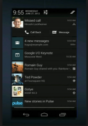
Here is an example of the Android notifications curtain in case you've never seen it.
I like the look. Yeah that definitely looks more informational than what iOS has to offer as of now.
Last edited:
It does have a better look but equally as important, each one of those notifications can be dismissed individually by swiping them away.
I obviously feel strongly about the need for a robust, centralized notifications center/curtain. I don't know about you but I commonly receive quite a few emails and texts and voicemails within a short period of time and it can become a bit overwhelming. I understand I can go to each individual app and take care of things but it would be nice to be able to handle most of it directly from notifications.
I obviously feel strongly about the need for a robust, centralized notifications center/curtain. I don't know about you but I commonly receive quite a few emails and texts and voicemails within a short period of time and it can become a bit overwhelming. I understand I can go to each individual app and take care of things but it would be nice to be able to handle most of it directly from notifications.
Here is an example of the Android notifications curtain in case you've never seen it.
How is that better? It takes up way more space and you see less of your notifications.. looks like you can't even see your mail that you have, unlike iOS.
Basically, iOS tells you you have notifications and gives you a clue what they are. Android just says you have something but we're not going to tell you what it is, sorry.
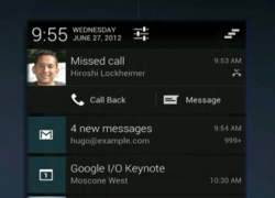
Here is another nice feature. Notice the missed call and the ability to either reply with a text or call back directly from the notifications curtain? Honestly, I don't care if Apple basically copies these features. Just do it. LOL
Attachments
Actually it depends on how you have it set up. You can display email messages individually and they can be dismissed individually.How is that better? It takes up way more space and you see less of your notifications.. looks like you can't even see your mail that you have, unlike iOS.
Basically, iOS tells you you have notifications and gives you a clue what they are. Android just says you have something but we're not going to tell you what it is, sorry.
Understand that I am not completely dissing iOS. I think it is the most robust and well-oiled machine out there. I simply thing they should put some thought and effort into notifications.
How about giving the option to group notifications (as they are now) or provide them individually? How difficult would that be?
.....and once again. It makes absolutely not sense that all-day events are not displayed.
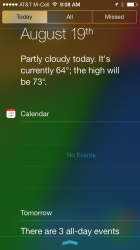
Here is a screenshot of my notifications curtain in the Today view. Notice how it says there are no events for Calendar. Not true. I have 5 all-day events scheduled today. It *does* say there are 3 all-day events for tomorrow but when tomorrow rolls around they won't display. Huh???
Attachments
Here is another nice feature. Notice the missed call and the ability to either reply with a text or call back directly from the notifications curtain? Honestly, I don't care if Apple basically copies these features. Just do it. LOL
While i dont have much of a problem with iOS notifications, i can say the android 4.1+ notifications are easier to use. By that i mean, you can pinch to zoon on some notifications and it expans all the messages. You can view email messages right from the notification dropdown (and Delete them) without ever going into the gmail app.... thats all i really like about it. the rest is the same.
Two things I wish apple would add.
1. Notification led
2. Status bar notification icons
I wouldn't want to clutter my status bar. There are already dots, a carrier message, a wifi icon, and a battery status icon. There's just no need.
As for a notification led, there are better solutions (like the moto x).
First World Problems.
Because discussing poverty and hunger on a forum dedicated to iOS7 makes more sense, right?
----------
Completely incorrect as you can set it to keep going off after.
Your whole request is kinda asinine anyways. God forbid you have to hit the power button of a phone that's always in your hands to see who called you.
The thing is, it's not ALWAYS in your hand. I'd rather have a simple notification led notify me of a missed message than to continually pick up the phone and check or constantly having alerts go off. Didn't realize that was so crazy..
How did your love for LED notifications suddenly turn into another debate? I wasn't comparing Android notifications to iOS. I was talking about those annoying LED light notifications that tell you nothing about the person who tried to contact you. You could be on Android Keylime Pie or Lollipop and those blinking lights will still not tell you who the person is.
You were referencing an Android notification from Gingerbread. That would be like me referencing an iOS notification from iOS4. Makes no sense.
The point of the light is to notify you of a missed call. Like an answering machine blinking back in the day. It doesn't tell you who called, but notifies you have a missed call. Since you mainly care about WHO is contacting you, certain Android phones have the option to read out loud the person calling or the message coming in. But I guess that's a useless feature as well.
----------
Here is a screenshot of my notifications curtain in the Today view. Notice how it says there are no events for Calendar. Not true. I have 5 all-day events scheduled today. It *does* say there are 3 all-day events for tomorrow but when tomorrow rolls around they won't display. Huh???
This is one of the things I hated about the calendar. You should have the option to select how many days/weeks ahead you can view your calendar. A quick swipe down to show your appointments and schedules for the next week would be more efficient and useful than just appointments for that day. Makes it easier to plan ahead and see what's upcoming.
I used to jailbreak and install lockinfo to get my calendar notifications setup in a more functional and useful manner. Was able to see events weeks ahead with a quick swipe.
I got to mention that looking at that, you can see how emails are bunched up together simply saying there are 4 new emails and that's it--certainly no way to dismiss each one separately, and in fact less information than iOS provides since in iOS those emails would be grouped together, but each one would have a separate notification showing some of the details of the email. So, not quite sure if there's really an improvement there with the way Android handles it, at least using that particular example.Here is an example of the Android notifications curtain in case you've never seen it.
You can already call back directly from the notification center. Being able to text back would be an enhancement, although not necessarily one that would be needed or even used by most.Here is another nice feature. Notice the missed call and the ability to either reply with a text or call back directly from the notifications curtain? Honestly, I don't care if Apple basically copies these features. Just do it. LOL
Today can be improved in iOS, but since it's a new feature (that's still in beta) hopefully that means that it will be improved. Could it have been better from the beginning? Yes, most likely. But, as a first take on it, it's not bad, just not that good yet--basically average. Hopefully it will be improved.Here is a screenshot of my notifications curtain in the Today view. Notice how it says there are no events for Calendar. Not true. I have 5 all-day events scheduled today. It *does* say there are 3 all-day events for tomorrow but when tomorrow rolls around they won't display. Huh???
----------
For a few important things, like at least calls and maybe messages (essentially those that are primary for a phone) a status bar notification can be useful for some if not most. If they could get rid of the signal strength dots that uselessly take up more space that needed and go back to bars which everyone knows and are used worldwide basically (and perhaps even get rid of the carrier as well) it could really help.I wouldn't want to clutter my status bar. There are already dots, a carrier message, a wifi icon, and a battery status icon. There's just no need.
As for a notification led, there are better solutions (like the moto x).
As for notification LED, whatever Moto X might do, something more than what iOS currently provides would already be of more use.
Register on MacRumors! This sidebar will go away, and you'll see fewer ads.


