Become a MacRumors Supporter for $50/year with no ads, ability to filter front page stories, and private forums.

venividivigor

macrumors 6502
Original poster
Jun 11, 2013
316
99
We went from edge to edge design to a an ugly, extremely rounded card view.

Huge bolded fonts that just makes me wanna gag, what happened the to the title bar?

A lot of the elements take up a lot of space as well, the menu bar for iMessages? Terrible!
 

batting1000

macrumors 604
Sep 4, 2011
7,464
1,874
Florida
I like many aspects of the new design, I actually quite liked the big fonts. What I wasn't sure about was the design for notifications, I like the current edge to edge design. I guess well see what its like on an actual device.

Agreed. I feel like it'll look even better on a device too.
 

Freakonomics101

macrumors 68030
Nov 6, 2014
2,740
1,799
Worse than what? My battery life has been the same since iOS 8.4.1 and I'm on 9.3.2

Within iOS 9, the best battery life I've had was with iOS 9.2. Since then, it has been crap, even with an iPhone 6 Plus/6S+ with a fresh install and without restoring a backup. With these enhancements to iOS 10, I have a feeling it'll be even worse.
 

Jessica Lares

macrumors G3
Oct 31, 2009
9,612
1,057
Near Dallas, Texas, USA
You have an option to turn off photos in the contact list to begin with. I'm sure that if you turn that off, it'll default to the regular title view in iOS 10.

EDIT: No, it doesn't. :( But that could always change.

I really like the changes (but things could definitely be refined). I'm already used to the idea of rounded cards because it's how peek & pop and 3D Touch look.
 
Last edited:

shenfrey

macrumors 68030
May 23, 2010
2,507
778
I like many aspects of the new design, I actually quite liked the big fonts. What I wasn't sure about was the design for notifications, I like the current edge to edge design. I guess well see what its like on an actual device.

Don't forget that there will be many revisions before official public release, so we may still get edge to edge.
 

clukas

macrumors 6502a
May 3, 2010
990
401
Don't forget that there will be many revisions before official public release, so we may still get edge to edge.

Minor revisions yes, but I doubt they would do such a dramatic shift. Im guessing the new design is here to stay and will be refined before release.
 
  • Like
Reactions: na1577

AZhappyjack

Suspended
Jul 3, 2011
10,183
23,657
Happy Jack, AZ
I like many aspects of the new design, I actually quite liked the big fonts. What I wasn't sure about was the design for notifications, I like the current edge to edge design. I guess well see what its like on an actual device.

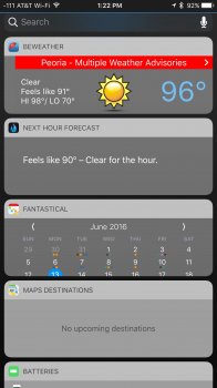
I am still undecided. Clearly this is beta 1, and I have some concerns. My biggest knock is the fixed size of each item on that screen - and I expect that it will be something that the developers will need to embrace ... and variable sizes MAY be based on third party app updates... for example, both BeWeather and Fantastical 2 have truncated displays... can't see the full forecast on BeWeather nor can I see the full monthly calendar and/or appointments in the Fantastical window.

IMG_6960.jpg
 
  • Like
Reactions: Skoal

bushido

Suspended
Mar 26, 2008
8,070
2,755
Germany
I am still undecided. Clearly this is beta 1, and I have some concerns. My biggest knock is the fixed size of each item on that screen - and I expect that it will be something that the developers will need to embrace ... and variable sizes MAY be based on third party app updates... for example, both BeWeather and Fantastical 2 have truncated displays... can't see the full forecast on BeWeather nor can I see the full monthly calendar and/or appointments in the Fantastical window.

View attachment 635609

what the heck? this reminds me of the Symbian times, aka 2005ish
 

LordQ

Suspended
Sep 22, 2012
3,582
5,653
It looks good on the notification bubbles and 3D touch, but that Proactive screenshot above looks hideous. Control Centre also looks terrible, but overall looks decent for a coat of paint. Quite sure this will change through the beta process. Relax guys.
 

Polaroid

macrumors 65816
Oct 1, 2013
1,439
1,576
Music app is HORRIBLE. Its so horrible, in your face and over the top. They have improved or made anything easier, well certain elements are nice but its too IN YOUR FACE and it actually really hurts to look at, there is a reason I chose the iPhone 6s Plus to display everything small - this hurts my eyes.
 

C DM

macrumors Sandy Bridge
Oct 17, 2011
51,392
19,461
At this point, I'm just happy we get any change at all. There's nothing more boring than zero visual changes (such as iOS 4-6).
There were some visual changes in those versions as I recall, like to the status bar and the whole notification redesign and notification center part of it.
 
  • Like
Reactions: na1577
Register on MacRumors! This sidebar will go away, and you'll see fewer ads.