Become a MacRumors Supporter for $50/year with no ads, ability to filter front page stories, and private forums.
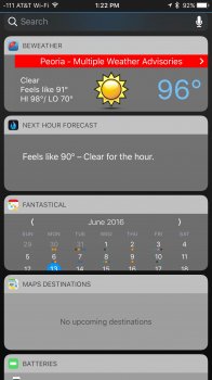
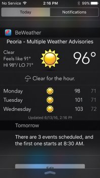
I am still undecided. Clearly this is beta 1, and I have some concerns. My biggest knock is the fixed size of each item on that screen - and I expect that it will be something that the developers will need to embrace ... and variable sizes MAY be based on third party app updates... for example, both BeWeather and Fantastical 2 have truncated displays... can't see the full forecast on BeWeather nor can I see the full monthly calendar and/or appointments in the Fantastical window.

View attachment 635609
Do you have reduced transparency on? Otherwise that has to be a bug.

Ck28wj5WYAAp372.jpg
 
There were some visual changes in those versions as I recall, like to the status bar and the whole notification redesign and notification center part of it.
True, but the overall skeumorphic feel was still there. Very minor changes imo.
 
True, but the overall skeumorphic feel was still there. Very minor changes imo.
It sounds like you are talking more of a whole design change rather than visual changes that can be new or modified things within the same overall design aesthetic.
 
It sounds like you are talking more of a whole design change rather than visual changes that can be new or modified things within the same overall design aesthetic.
No, you were right the first time. I just feel like the small visual tweaks in iOS 8-10 were bigger than those in iOS 1-3 and 4-6.
 
Do you have reduced transparency on? Otherwise that has to be a bug.

I do... but that's not my issue... it's not the color of the boxes around the widgets... it's the fact that the widgets appear to be fixed size, regardless of the content... for example, here's my weather app (BeWeather) on iOS 10 and iOS 9.x:

IMG_6960.jpg IMG_0157.jpg
 
The single biggest thing I do not understand with this design is, in the widgets view (at least on an iPad) the 'edit' button for widgets is a circle.

Why.

I mean seriously, WHY?

At the very worst I expected it to be a rounded rectangle.
 
  • Like
Reactions: na1577
The drop shadow on the album art looks terrible (but does it have parallax maybe?) Also the buttons, controls and text are way too big and bold. Also that "card" view is horrible IMO.
I guess I don't see most of what you're seeing. But thank god the buttons are bigger. That's one thing I hate about the current music app, the controls are way too tiny.
 
Last edited:
God the new design is horrible, from notifications, to widgets (washed out), to the new apple music UI, and the bloody hell horrible new health app. Did you saw that one? looks childish, and now i can't see all my dashboard at glance...
 
I really like the design of the new cards/notifications/widgets.

It's simple and professional and finally moving back to a mature design interface after the damage done in the iOS7 redesign.

Someone just needs to tell the team that worked on the messages app to use the same new design language and to move away the childish design aimed at teenagers.
 
  • Like
Reactions: BvizioN
God the new design is horrible, from notifications, to widgets (washed out), to the new apple music UI, and the bloody hell horrible new health app. Did you saw that one? looks childish, and now i can't see all my dashboard at glance...
Do you have a screen shot of this bloody horrible health app?
 
God the new design is horrible, from notifications, to widgets (washed out), to the new apple music UI, and the bloody hell horrible new health app. Did you saw that one? looks childish, and now i can't see all my dashboard at glance...
Interesting juxtapositions:
I really like the design of the new cards/notifications/widgets.

It's simple and professional and finally moving back to a mature design interface after the damage done in the iOS7 redesign.

Someone just needs to tell the team that worked on the messages app to use the same new design language and to move away the childish design aimed at teenagers.
 
It is really weird to see Apple returning to boxes and cards again, after they ditched everything for subtle, edge-to-edge designs in iOS 7. I thought the point was to remove visual clutter, not just replace it with translucency. We are coming full circle again and it seems that Apple is using more shadows too.

The music app in particular is the low point, the design is garbage. Supersized fonts, huge margins, no navigation bar, lots of non-standard UI components that you can't find in UIKit. They are even using different levels of translucency now. The result is messy and imbalanced. It is even worse than what Apple did to iTunes back in the days, it looks very foreign instead of being a proper native app.

Apple seems to be losing all the things that I liked about their design language, even if the style itself has not appealed to me since iOS 7.
 
Register on MacRumors! This sidebar will go away, and you'll see fewer ads.