Can I get a Spock mind meld from you guys? Some excellent creativity here!needed a break from annoying sunday night client work:
Got a tip for us?
Let us know
Become a MacRumors Supporter for $50/year with no ads, ability to filter front page stories, and private forums.
Design & Graphics Forum Activity 1: User Name
- Thread starter Blue Velvet
- Start date
- Sort by reaction score
You are using an out of date browser. It may not display this or other websites correctly.
You should upgrade or use an alternative browser.
You should upgrade or use an alternative browser.
Can I get a Spock mind meld from you guys? Some excellent creativity here!
surely....
:::::::::::::::::::::theneedsofthemanyoutweightheneedsofthefew::::::::::::::::::::
melded.

I like the Blue one....love how simple it is too. very nice.
-JE
I like the Blue one....love how simple it is too. very nice.
-JE
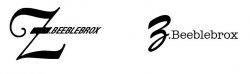
Cheers, I prefer the blue one too. Although it is simple I did actually put quite a bit of thought into to so that the angle of trailing x would point to the corner of the background and adjusted the positioning so that it looked good while doing so.
Can't claim to have any more insight than that but I am by no means a graphic designer, far from it (chemical engineering student). But it is always the little touches like that, that I put in. Perhaps i'm weird but I take a slight sense of pride when I hand in a report with these touches, even though I know that these little things will not get picked up on or even extra credit given.
Hey BV where is yours
I'll get round to it soon; there's no closing date. I like what I'm seeing so far from everyone, and I like seeing others join in too.
")
Don't forget; if you have suggestions for the 3rd assignment, to start on Apr 1st, please PM me with ideas.


I'm really glad no one has used Comic Sans, I really thought someone would have stolen my work in progress....
I'm really glad no one has used Comic Sans, I really thought someone would have stolen my work in progress....
I actually choose that straight away just to see how bad it looks, it is good to remind yourself how bad it is from time to time.
Although my University own fonts (that they spent a huge amount of money on) aren't the greatest either, in fact I think they are shocking.

*Tada*
Might be my dyslexia but I read it as chipoweb rather than chicoweb.
I actually choose that straight away just to see how bad it looks, it is good to remind yourself how bad it is from time to time.
I've had a client hand me a logo all in comic sans, 3 lens flare, an ugly "not so subtle" drop shadow and with a very nice rainbow gradient fill....
It still makes me laugh because they ended up using that logo on their web site because the director of the company created it and was not willing to change it at all.
I've had a client hand me a logo all in comic sans, 3 lens flare, an ugly "not so subtle" drop shadow and with a very nice rainbow gradient fill....
It still makes me laugh because they ended up using that logo on their web site.
link
link
The company a few years ago was bought out by a larger company so they are now using the parent company's branding. I'll look around my Mac at home and see if I can find the logo, it really was quality MS Paint at it's best.


But it is always the little touches like that, that I put in. Perhaps i'm weird but I take a slight sense of pride when I hand in a report with these touches, even though I know that these little things will not get picked up on or even extra credit given.
Good type operates on an almost subconscious level. I've shown people the same page of a CV, essentially laid out identically, one in Word and one in InDesign
The only difference between the two was that the InDesign one had been given some typographical attention - ligatures, sympathetic leading, H&Js corrected manually, ugly kerning pairs fixed, and so on.
Without exception, people would pick the InDesign page, but no-one could ever articulate why.
Cheers
Jim

Register on MacRumors! This sidebar will go away, and you'll see fewer ads.