Become a MacRumors Supporter for $50/year with no ads, ability to filter front page stories, and private forums.

Did Home Screen widgets change your device for the better?

  • Yes absolutely

    Votes: 27 42.9%
  • No it stayed the same

    Votes: 36 57.1%

  • Total voters
    63

1rottenapple

macrumors 601
Original poster
Apr 21, 2004
4,836
2,857
Simple yes or no question. Ok let’s get out the vote in the spirit of the 2020 election.

iOS 14 had a lot of hype. Did it deliver? did having the weather or picture add more to the functionality and usefulness to your device. Did it change your workflow. Or did it take away certain things from iOS 13.
 
For now I’m saying no. I use the calendar and weather widgets in the square format so they don’t take up the whole screen. But I also wear an Apple Watch and that same information is already displayed in complications. Hopefully third party widgets make it more interesting but in my case they don’t add much value to the experience. At least not yet.
 
i use the Marvin .ebub book reader app
Marvin had some sort of widget functionality in ios13, still working in ios14
 
Customization features seem to be tempting on some level, but ultimately often lead to a fair bit of experimenting, tweaking, and perfecting and potentially never being fully satisfied thinking there might be something better if more is added or tweaked. Of course that's not necessarily something that applies to everyone, and more of a subjective view than anything else.

Personally I'm mostly sticking to what I've been using before and just trying out a few newer/additional widgets mainly on the Today View where I've always used widgets (and continue to do so with most of the previously existing ones still being there, at least so far).

Ultimately it's not a bad thing that the new options are there for those who might want to make use of them. That said, that's really more as long as it all doesn't degrade the existing experience, and unfortunately with the removal of some of the existing widgets and more limited abilities of some new ones it seems like there has been some of that.
 
Ultimately, its just more options, which are always a good thing, but I find myself toying around with idea before going back to may old layout. I've just grown used to working within Apple's confines.
 
I like them. Apart from Readdle Calendars (as their 4x2 widget nicely changes to match the relevant calendar colour when an event is happening), I'm using stock widgets.

They're not updating reliably, but I'm hoping that'll get fixed over time. I like the fact I can use 2x2 widgets on the left of the screen to push my icons into easier-to-reach locations.
 
  • Like
Reactions: 1rottenapple
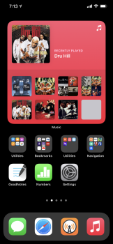
In the past I was more than happy to mod my phone with jailbreak and other icons. And I would do this again with the widgets, but: this massive amount of wasted space is ridicolous. There are many apps I want to reach with one tap - no folder, no swipe. First homescreen. If widgets would be 1x2 or 2x1 i could sacrifice some slots on first homescreen but this monsters which eat up 16 slots to start an app and which are looking like a three year old boy wearing the suit of his father are way too big. So first HS looks the same and second hs are some widgets.
Nevertheless I gave up my perfect muscle memorized folders and throw them all in the app library.
Felt a great relief to my surprise... hundreds of hours of tinkering around have gone.
And: some of the widgets imho are belonging to the lockscreen like weather, batteries, tasks, reminders (put your favorite here)
I want to take my phone and: sun is shining, airpods are loaded, no tasks, milk is out. And leave my flat.
Without any other touch or swipe.
And second: beside the wasted space the widgets seem made so loveless. Just loveless.
 
Last edited:
I get that iOS 14 widgets weren't going to be Android-level dynamic. But when I create a calendar reminder in my third party calendar app (the reminder IS part of the OS level reminders) but the Reminders widget never updates unless I open the Reminders app, that's really lacking to me.
 
  • Like
Reactions: adrianlondon
They just eat up too much space on the home screen, so I still like having them to the left. Also consistent with iPadOS that way.
 
I don’t see my phone very much compared to my watch. However, iOS 14 widgets work for me. I like them better on the Home Screen, than seeing a bunch of folders filed with apps. IOS 14 changed how I use my phone.
 
The only thing I have liked is really finding out what the Siri Suggestions widget does and I have found that incredibly useful. I also like searching for the app I want to use, without going to the App Library. Other than that, nothing has changed and I'm still waiting for some of my most used apps to have IOS 14 updates (like Pocket Casts).
 
i like having a couple on my homescreen... but would be fine without them as well. what i like is having them if i want them; apple, never one to give us many options, has taken a step forward.

here's to a customizable lockscreen by 2040... :cool:
 
I really appreciate the weather widget because it gives the temperature . I have it stacked with the battery widget . I played a lot with them the first days and find they are the only two I really need .
 
The widgets didn’t really change my experience. There are only a few that matter to me, and the only ones I consider ‘can’t live withouts’ don’t exist. Further, I’m feeling (once again) that with the lack of widget interaction, lack of lock screen anything, coupled with inability to sort the App Library, that Apple is still tending its garden a bit too heavy-handedly.


I really appreciate Apple for a lot of reasons. But I find this update is pissing me off more so than any other. Doling out only the conveniences they think I need...

How has my phone life changed? I no longer affix an actual post it containing my list for the day on my phone. I now have a virtual post it on my home screen.
 
Literally, only widget I have on my screen is weather. If Apple by some weird reason chose to remove them from iOS 15, I would feel pretty indifferent about it. That’s my whole opinion on this.


If I wanted widgets so bad, I would have moved to Android a long time ago.
 
I want them back on MacOS.. big time.

the few that I use on iOs are ok, I like the resizing options. I leave them on the left so far... looking forward to seeing if devs come up with new ones i might like to put on my own pages.
 
I'm probably in the minority but I am/was a heavy user of NC widgets. I had high hopes but these new widgets are just so neutered. Maybe iOS 15 they'll have the same functionality as NC widgets did back in iOS 12.


Literally, only widget I have on my screen is weather. If Apple by some weird reason chose to remove them from iOS 15, I would feel pretty indifferent about it. That’s my whole opinion on this.


If I wanted widgets so bad, I would have moved to Android a long time ago.
 
I like them. Apart from Readdle Calendars (as their 4x2 widget nicely changes to match the relevant calendar colour when an event is happening), I'm using stock widgets.

They're not updating reliably, but I'm hoping that'll get fixed over time. I like the fact I can use 2x2 widgets on the left of the screen to push my icons into easier-to-reach locations.
Lol I think that’s one benefit. Too left screen to push the apps lower.
 
  • Like
Reactions: adrianlondon
i’m a android user so yes it is better now
427EAA20-8A31-4E32-A2CB-8FA7AB787F06.jpeg
 
I voted No.

Perhaps I'm so used to having a very organized set of app icons filling my home/pages, so widgets feel out of place there - for me.

Also, I don't really care for them in the left-most default widgets area either.

Buttons in the Shortcuts widget are wayyy too big; I used to could fit so many more Shortcuts in the same amount of space.

The Reminders (or Reminders in the new Fantastical widget) do not allow me to to just check-off when a Reminder has been completed. It actually opens up the app and I then have to check-off the Reminder.

Widgets have not made my usage any more efficient, nor easier. They are merely bling to me.
 
  • Like
Reactions: adrianlondon
They’re like the emperor’s new clothes. Sound awesome but are actually functionally worse. I can no longer swipe through months on my calendar widget. Why did they remove the interactivity?

It‘s worse than the dumb FaceTime notification that requires you to press the answer button twice…
 
  • Like
Reactions: phillytim
i’m a android user so yes it is better now View attachment 958468
Ok I know it’s personnel preference but there’s some information I don’t need to know. Like I don’t need to know the battery life all the time or how much I’ve closed my rings. I prefer those on the today screen. And I don’t get having access internet to notes.
I have the large music widget on the second Home Screen cause it looks neat. It’s doesn’t affect functionality but the large widget pushes the widgets down. I do have the weather on the top left of the first Home Screen to again push the icons lower. I’m pretty minimal in terms of my apps. (I’m on a 90s music kick these few eeeks).
 

Attachments

  • 781076EC-9EED-4E21-80C9-D8D18F8071D9.png
    781076EC-9EED-4E21-80C9-D8D18F8071D9.png
    1.1 MB · Views: 152
They’re like the emperor’s new clothes. Sound awesome but are actually functionally worse. I can no longer swipe through months on my calendar widget. Why did they remove the interactivity?

It‘s worse than the dumb FaceTime notification that requires you to press the answer button twice…
I think for battery saving purposes they removed functionality.
 
Register on MacRumors! This sidebar will go away, and you'll see fewer ads.