Better organised is a matter of opinion. Previously I could see all drives in the same window but for some reason resizing window isn't possible in new Disk Utility and it means I can't see all of the drives I'm using for backups. Apparently Apple thinks no one is using many drives simultaneously?
As for features I am not impressed by the way Apple removed option to burn disk images. Yes, I can use Finder for that but why remove usable features?
Furthermore I don't understand what was the Apples goal in the redesign? In my opinion updates should provide better functionality, not strip away things that worked previously without warning!
Preventing window resizing is definitely a break with Apple's design conventions and there is really no excuse for this. I trust that Apple will fix this.
I think we have to assume that Apple's goal was to make the program more approachable. For this they rewrote the user interface, but not the underlying code. I think they left features out that were available elsewhere. Finder can burn discs just as good and it kind of makes more sense to do it there, as you are doing something with a file, not manipulating a drive or disk image. Making Disk Utility more Finder-like was also a good idea and I really appreciate the clear separation between actions and content. The old version was a bit confusing sometimes, there were buttons and tabs everywhere and it wasn't always clear which part of the drive you were addressing or which 'mode' you were in. I know that some of my less tech-savvy friends found it intimidating.
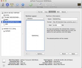
As an example (see image below): the partitioning panel was a bit weird. When you clicked on the partition tab, it looked as if you were already in the process of partitioning your drive. If you made one small change, you couldn't leave the panel without discarding the changes first. To that end there were two buttons at the bottom: revert and apply. This is a weird behaviour that you don't find anywhere else. Destructive actions are typically designated with separate panels, so that your workflow is interrupted and you become consciously aware that you are in fact doing something that has consequences. The new approach is, in my opinion, much better: you click on the partition button in the menu bar or toolbar, a panel slides open with a cancel and apply button. This gives the distinct impression that you are in an intermediate stage that you can always discard by clicking on cancel. It's like a save panel; it's familiar.
There are other neat changes. For instance, when you remove a partition, the one that comes before it will just be upscaled by default instead of marked as free-space. I also like how particular actions are more focussed now, for instance, to format a drive you just select the drive or partition, click on the format button and it will present the relevant options to you. Another example: first aid now verifies and repairs in one go, removing needless choices the user has to make. The same with restoring: you select a drive or partition, click on restore and choose the image you want to to apply to it.
As for RAID, I don't know why they removed it. Some here have said that it's not a very common function. If you accept the premise that Apple wants to keep the program straightforward, it could be an explanation. Also note that Apple does have a separate program for AppleRAID cards (RAID Utility) for Mac Pros. Maybe they actually want to relinquish that to professional third-party tools.


