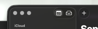
View attachment 2560848
Also, this looks misaligned to my eyes.
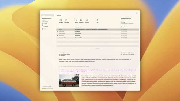
🤮 everywhere in Tahoe
Your eyes are working as designed.
Shocking that a company the size of Apple refuses to hire actual UI designers, or are retaining the ones that clearly don't know what they're doing. So many amazing graphic designers out there who are making beautiful icons and GUIs that we can't use because Apple locked the option to change icons on most apps. They should have snatched these designers and did an
actual visual overhaul for their OSs, because OS 26 is, for the most part by appearance, the same old, but with a (glass, but at the right angle, or if you scroll over certain things, or with the right wallpaper) theme grafted over it, button and menu changes for the sake of change, with QOL functionality and overall UX reduced in the process. While iOS, iPadOS and tvOS look somewhat better than Tahoe, the design changes are actually minimal despite Apple's claims of an 'all new' OS.
And, since just about every big Apple YouTuber who's reviewed Tahoe and iOS 26 (who prioritize staying in Apple's good graces) are just praising all the bells and whistles and are speaking nothing to the reduction in user experience, visibility, and overall bugginess, so there isn't enough buzz getting back to Apple. If nothing else, Apple has got to tweak Dark Mode because it's not giving Liquid Glass, just weird illusions trying to force the eyes to see a highlight of something that isn't there. Notice how almost every single 'review' is in Default/Light Mode with emphasis on the 'Liquid Glass' effect with just the right wallpaper and with just the right overlay scrolling.