Become a MacRumors Supporter for $50/year with no ads, ability to filter front page stories, and private forums.
1024x768 is quite a standard screen size by now in my opinion.

However, instead of full-size pics on the first page, I would go for a gallery of thumbnails which wouldn't eat up all bandwidth for modem users. Additionally, with some clever use of flexible DIVs and CSS you could even optimize the page for both 1024x768 and 800x600 then. ;)
 
gammamonk said:
I've run a photo website for about 3 years. Just my personal pics. I have a cool calander setup where you can click a day and get a bigger pic with comments. Everything works fine. I made it my designing in dreamweaver and then adding in dynamic stuff with php.

However, basically the only comment people I don't know send me about my website is that I use tables and therefore am a n00b.

It's true, changing a theme would be a major ordeal, as would using different image sizes. So I've been looking into replacing a lot of stuff with CSS. So here's my question: Do you think CSS sucks? I do. I can't do anything without using hacks so it works in different browsers. I have to hard-set widths and heights everywhere, which takes away the flexibility CSS is rumored to give you. I can't do what I want.

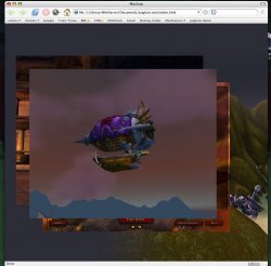
I attached my new Photoshop design. This is what I want. Can CSS do it? I want to be able to release this design to the public and with a quick background picture change and a color theme change, you'd have a nice personal look. And lets assume I don't want to hard-set the pics to 800x600, but whatever the user feels is appropriate.

If you want to see what CSS is possible of then go here

http://www.csszengarden.com/zengarden-sample.html

This is the plain XHTML file and as you can see there are no images.

To see what you can do with CSS go to here

http://www.csszengarden.com/

And keep checking out the links - each link is the same page but only the CSS is different.
 
pashazade said:
To see what you can do with CSS go to here

http://www.csszengarden.com/

And keep checking out the links - each link is the same page but only the CSS is different.
That is quite impressive. I see that they used extra div containers in several places to make it all work. The key is having plenty of markup in the HTML, to provide freedom in the stylesheet. The rest requires imagination.

Speaking of imagination, I'm trying to imagine whether I'd be able to use some of these same techniques in my own web pages.
 
Doctor Q said:
Speaking of imagination, I'm trying to imagine whether I'd be able to use some of these same techniques in my own web pages.

I pretty much think so. The CSS Zen Garden highly encourages its visitors to get inspired by their efforts. :)
 
Why does the HTML at CSS Zen Garden do this?
Code:
<h3><span>This is the heading</span></h3>

<p class="p1"><span>This is a paragraph.</span></p>
What extra flexibility does it provide to use style settings for spans inside of an h3 or a paragraph when you can already set the style of an h3 or a "p1" paragraph?
 
Doctor Q said:
Why does the HTML at CSS Zen Garden do this?
Code:
<h3><span>This is the heading</span></h3>

<p class="p1"><span>This is a paragraph.</span></p>
What extra flexibility does it provide to use style settings for spans inside of an h3 or a paragraph when you can already set the style of an h3 or a "p1" paragraph?

I got the book at home, and if I remember correctly, this might be a compatibility tweak of some sorts. I will look it up tonight.
 
Sooo... in the early days it was necessary to put a <h3> and a <span> for the header and "hide" the <span> (with a "display: none" for example) in order to "replace" the header with an image. Nowadays these are usually not necessary anymore.

:cool:
 
c-Row said:
Sooo... in the early days it was necessary to put a <h3> and a <span> for the header and "hide" the <span> (with a "display: none" for example) in order to "replace" the header with an image. Nowadays these are usually not necessary anymore.
If I understand correctly...
* If you want to style the heading text, you set the H3's style and set nothing for the span.

* If you want to replace the heading text with an image, you set an image as the H3's background and use span { display:none } to suppress display of the text.​
If this is no longer necessary, what's the other way to do it?
 
Doctor Q said:
If this is no longer necessary, what's the other way to do it?

I guess a simple background-image: url(...) should do the trick. However, with the <span>, you would have an alternate version with visible headers for those browsers that don't support CSS for example, since the display:none wouldn't apply anymore.
 
I actually do own the CSS Zen Garden book-- unfortunately it's the only CSS book I own, and it doesn't cover the basics.

I've made a little progress, but it's going slowly. Frustration is a huge barrier for me.

I've attached a current screen shot, and the site code (.txt added to allow upload)

A huge problem I have is the background image. Currently it's nicely anchored to the lower right corner, like I want. But I had to encase everything in a table to do it-- and that added it's own problems. And I can't figure out how to add a comment box to the bottom. If anyone can help, I'll name my first born after you.


[Edit] Also, the centering is screwed up. I don't know why it's centering vertically, and the horizontal centering is obviously not what it should be.
 

Attachments

  • Picture-1.jpg
    Picture-1.jpg
    109.7 KB · Views: 114
  • default.css.txt
    981 bytes · Views: 101
  • index.html.txt
    811 bytes · Views: 129
gammamonk said:
A huge problem I have is the background image. Currently it's nicely anchored to the lower right corner, like I want. But I had to encase everything in a table to do it-- and that added it's own problems.

Uhm... why not something like this?

Code:
body {
   background-color: #000000;
   background-image: url('../gfx/background.gif');
   background-repeat: no-repeat;
   background-position: bottom right;
}

No need for a table, and the background image is always in the lower right corner.
 
c-Row said:
Uhm... why not something like this?

Code:
body {
   background-color: #000000;
   background-image: url('../gfx/background.gif');
   background-repeat: no-repeat;
   background-position: bottom right;
}

No need for a table, and the background image is always in the lower right corner.

[Edit] [Edit] I thought I had it figured out, but no... The code you gave should work, but it doesn't... At least in everything except Safari. (Tho Safari screws up basically everything else)
 

Attachments

  • Picture-1.jpg
    Picture-1.jpg
    107.3 KB · Views: 103
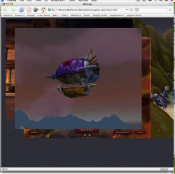
I've made a lot of progress-- the page is starting to resemble my photoshop mockup.

I'm still having a heck of a time with the background image. I thought I had it figured out-- but I guess not. Seems like it should be such an easy thing.
 

Attachments

  • Picture-2.jpg
    Picture-2.jpg
    133.2 KB · Views: 102
I added drop shadows to the pictures, and the background is temporarily cooperating. It renders like a disaster in Safari and IE 5.2 ( I don't have access to IE 6)

I'll attach the code so far:
 

Attachments

  • Untitled-4.jpg
    Untitled-4.jpg
    138.9 KB · Views: 93
  • default.css.txt
    1.4 KB · Views: 123
  • index.html.txt
    1.5 KB · Views: 149
I've made a lot of progress. For the comment field I had to use a table. I love tables.

I have a live link available now at my test domain.

Have a look, and any feedback would be great! ^__^
 
A bit less transparency for the comment fields would be great... ;) It's hard to read black letters on a dark background.
 
c-Row said:
Uhm... why not something like this?

Code:
body {
   background-color: #000000;
   background-image: url('../gfx/background.gif');
   background-repeat: no-repeat;
   background-position: bottom right;
}

No need for a table, and the background image is always in the lower right corner.

Which can be further optimized to this:

Code:
body {
   background: #000000 url(../gfx/background.gif) no-repeat bottom right;
}

:)
 
radiantm3 said:
Which can be further optimized to this:

Code:
body {
   background: #000000 url(../gfx/background.gif) no-repeat bottom right;
}

:)

I prefer my code bulky but readable. :p Well, no real reason to not optimize of course. Just a matter of taste I guess.
 
gammamonk said:
Hey everybody-- Thanks for all the input. I'm getting closer to what I want. Here's another question for you tho. What screen size should I assume people have? I've been thinking 1024x768 is probably pretty safe.

Do you think 800x600 pics are too big? Let's say each pic is 100k; so 300k+ is going to take what, 20 seconds on a modem. My grandparents are on a modem (out in the countryside), so I want it to be modem friendly.

What's the longest you would wait for a picture to load on a photo website?

I suggest you use Firefox for viewing your pages. And if you use Firefox, give yourself a huge favor, dowload their developer tool bar because it provides a wealth of extremely useful tools including screen sizes, CSS validation and much more.
 
ercw said:
I suggest you use Firefox for viewing your pages. And if you use Firefox, give yourself a huge favor, dowload their developer tool bar because it provides a wealth of extremely useful tools including screen sizes, CSS validation and much more.

I just downloaded the developer toolbar you suggested-- it's pretty nice. I like the easy CSS validating. (looks like I have a lot to fix) ^__^
 
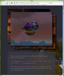
I removed the background pattern and increased the contrast in the comment boxes. A couple people told me it was hard to read. I think the design looks more professional now. link
 
Register on MacRumors! This sidebar will go away, and you'll see fewer ads.