Become a MacRumors Supporter for $50/year with no ads, ability to filter front page stories, and private forums.

TheWheelMan

macrumors 6502a
Mar 15, 2011
982
0
Pretty sure he was just being sarcastic. :) Besides, I said that if it were sleek and minimalistic, it would be boring. I think it's fine now, though I also would like to see Apple add something to it. Maybe not change the look as much as allow us to customize the look how we want.
 
Last edited by a moderator:

cocky jeremy

macrumors 603
Jul 12, 2008
6,487
7,076
Apple doesn't need to do anything as long as Android is a fragmented, buggy POS. Anything new added is just a bonus.
 

Rogifan

macrumors Penryn
Nov 14, 2011
24,723
32,183
I'd rather the apps had personality than all look "sleek, minimal" and VERY boring.:p

Personality maybe, patronizing, no. Lookmat the iphoto app. Is this really necessary? That's skeuomorphism on steriods! Or the find my friend app. Do we really need faux leather and stitching to give it a personality? Or fake bookshelf in iBooks.

IMG_5378.jpeg


fmfSmall.jpg


ibooks_hero.jpg


But I fear we're stuck with it as SJ clearly approved these ornamental touches. :(
 

ToddFSU

macrumors member
Jul 16, 2008
40
2
Geneva, IL
3rd party information on the notification center, possibly alloying for users to replace page 1 of apps with these notification widget/apps.

Also change the blue popup/alert. It's old.
 

MonkeySee....

macrumors 68040
Sep 24, 2010
3,858
437
UK
I would have liked Apple to use OSX style app icons as the two seem to be conjoining.

It would have been a logical step but I see Samsung have gone down that route on the SIII so all the droid fans will say Apple copied Samsung if it did happen.

I hope they do it anyway. Will be a nice change but I'd not be too fussed if they didnt :)

----------

There was an iOS6 concept kicking about on here somewhere and the guy used a "Launchpad" icon for the apps instead of lots of pages. That would be a nice touch even though it would an "Extra step" to get to your apps.
 

Dustman

macrumors 65816
Apr 17, 2007
1,381
238


----------

There was an iOS6 concept kicking about on here somewhere and the guy used a "Launchpad" icon for the apps instead of lots of pages. That would be a nice touch even though it would an "Extra step" to get to your apps.

Like Android's app drawer? I like this approach better actually.
 

Dustman

macrumors 65816
Apr 17, 2007
1,381
238
No like Macs Launchpad :p

Only joshing. Yeah it seems like a suitable step for continuity

----------

Like this...

(not sure why the dock just goes to 1 Icon though when launch pad its run?? :confused:

Image

Image

http://www.mod-gadget.com/ios-6-con...ium=rss&utm_campaign=ios-6-concept-homescreen

LOL yes, like Android's App Drawer. One icon in the middle when clicked shows you all of the icons on your device leaving your 'desktops' free for only your most important apps and widgets.

EDIT: NVM you clearly know what you were talking about. The 'Only Joshing' flew right over my head.
 

applefanDrew

macrumors 65816
Jul 17, 2010
1,437
4

apollo1444

macrumors 65816
Jul 22, 2011
1,329
27
mexico
if you want advanced tweaking you can rely on the community yes they jb community, the regular standard user does not need all that customizable crap android has, it makes things more complex and downright impractical

if you can't understand this then you aren't an Apple customer, or just haven't got the memo yet, apple have never sacrifized ease of use for more complexity in their OS's or their products
 

blackhand1001

macrumors 68030
Jan 6, 2009
2,600
37
What would be the point? iOS is about simplicity. You can't get any more simple than having all your apps right there on the screen to begin with.

The app drawer method is better. I hate using peoples iphones where they have like 80 apps and they aren't in any particular order. With the app drawer you can put your favorite ones on the home screens and then the app drawer gives you an alphabetical view so you can quickly find any app.
 

applefanDrew

macrumors 65816
Jul 17, 2010
1,437
4
The app drawer method is better. I hate using peoples iphones where they have like 80 apps and they aren't in any particular order. With the app drawer you can put your favorite ones on the home screens and then the app drawer gives you an alphabetical view so you can quickly find any app.

The apps not being in order is the person's fault. I have a total rhyme and reason to where my apps are on my iPhone. If they just let them sit wherever they download too...it's their fault.
 

Slinkwyde

macrumors regular
Jan 26, 2012
130
0
The apps not being in order is the person's fault. I have a total rhyme and reason to where my apps are on my iPhone. If they just let them sit wherever they download too...it's their fault.

To me, the way I arranged my icons makes sense. To someone else borrowing my device for a moment, maybe not. In that scenario, alphabetic order and categories would be more efficient. I think that's what blackhand was getting at, but I think it's an unimportant scenario.

Then again, after the first homescreen my icon arrangement starts making less sense even to me.
 

dogthateats

macrumors member
Apr 9, 2012
42
0
The only things that I really want in ios 6 is some way to respond to a text or iMessage without leaving the app i am currently running, and a better way to instant message someone (without leaving another app to respond each time).
 

Slinkwyde

macrumors regular
Jan 26, 2012
130
0
All I want is quick toggles for WiFi, brightness, etc so that I won't have to jailbreak anymore.

The look is fine. Then again, it isn't "old" to me because I started with iOS 4.
 
Last edited:

macbook pro i5

macrumors 65816
May 13, 2011
1,338
1
New Zealand
Well I don't think so... But I came in 6 months ago with the 4S and iOS5, so I haven't been using it since 2007 like some people :eek:

Trust me the iOS's look is OLD I have had the 3GS on launch day then the the 4 then the 4S,iOS gets pretty boring thats why my iPhone is jailbroken:)
 

kdarling

macrumors P6
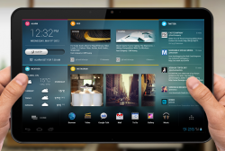
Much of the time that people are talking about the "look" needing changing, they mean the homescreen(s).

The biggest debate is often over widgets. To me, it's an easy "yes" that widgets should be allowed. After all, if a person has no interest in them, they can just not use them. It's a simple and easy personal choice, no different than deciding if they wish to use folders or not.

--

Tablet homescreens present even more opportunities, because of the huge amount of visual/working space constantly available.

Obviously widgets are very useful in this case. Another option or even alternative would be allowing multiple apps to run in their own window.

A very useful option would be different homescreens (and permissions) for different users and/or times of day.

If you haven't seen the Android Chameleon homesceen Kickstarter project yet, take a look at the video in Update #5 about how you lay out the screens. (Btw, they use HTML5 for their widgets, with the idea that it'll be easy for people to develop their own.)

I'd love to see something along these lines for the iPad.
 

Attachments

  • chameleon.PNG
    chameleon.PNG
    594.6 KB · Views: 143

Cod3rror

macrumors 68000
Apr 18, 2010
1,809
151
No, it does not.

It just needs more functionality, more features, much improved stock applications, things like third party widgets API in the notification center, live updating icons that displace minor information... like weather display an actual weather temperature on the icon, needs Zephyr tweak integrated into the OS, but the UI itself does not need to be changed drastically.
 

bigjnyc

macrumors G3
Apr 10, 2008
8,287
7,627
The only things that I really want in ios 6 is some way to respond to a text or iMessage without leaving the app i am currently running, and a better way to instant message someone (without leaving another app to respond each time).

All I want is quick toggles for WiFi, brightness, etc so that I won't have to jailbreak anymore.

The look is fine. Then again, it isn't "old" to me because I started with iOS 4.

Same here, my biggest reason for jailbreaking is bitesms and sbsettings.... If I can get these 2 things from Apple I may not jaibreak anymore... everything else is just for fun and messing around.
 
Register on MacRumors! This sidebar will go away, and you'll see fewer ads.