Got a tip for us?
Let us know
Become a MacRumors Supporter for $50/year with no ads, ability to filter front page stories, and private forums.
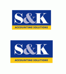
Does this logo look alright?
- Thread starter dogbone
- Start date
- Sort by reaction score
You are using an out of date browser. It may not display this or other websites correctly.
You should upgrade or use an alternative browser.
You should upgrade or use an alternative browser.

It looks fine now, but I think it would look neat if you made the & symbol the same yellow as the bottom of the logo.
I agree with p0intblank, try the ampersand the same shade of yellow as "Accounting Solutions".
A good rule to keep in mind when creating logos is try to keep the colors as limited as possible. Especially if said design is for a small company, because the more colors there are the more expensive it will be to print.
Generally I try to create my designs in black and white first, and then start adding colors. The reason I do this is because it's inevitable that your design will be printed in black and white at some point, and sometimes a great design when in color looks bad in black and white. I think you'd be okay with this particular design since it's relatively simple, but just something to keep in mind.
On the other hand, the ampersand in yellow would pull the attention to 1) the ampersand, 2) the "accounting solutions" and finally 3) the "S" and "K", hence the name. Isn't it a little backward order 
Additionally, in grey / black & white, both the yellow and the grey could be turned into grey or even white, no ?
Otherwise, to follow the line of the other posts, maybe the S and K in yellow, the ampersand in white ? But that looks "gold" oriented.
Don't know, just talking about my perception...
A.
What is SEK's business again? (say it out loud if you don't get it the first time)
Gotta watch out for graphic elements that read like letters, or letters that read like the wrong letters --- the first-glance impression may be unfavorable.
Consider what would happen with FLICK your BIC
if the L and I were kerned too close. (Saw something like this on the grocery store shelf yesterday)
OK, my 2 cents... no to the ampersand being yellow. Why put such a strong visual emphasis on an ampersand?
The first thing I immediately noticed was that the top line doesn't look centred even though it may be as measured by a ruler. The amount of negative space to the right of the K outweighs the margin to the left of the S.
The more I look at it, the more it bugs me.
The first thing I immediately noticed was that the top line doesn't look centred even though it may be as measured by a ruler. The amount of negative space to the right of the K outweighs the margin to the left of the S.
The more I look at it, the more it bugs me.
Blue Velvet said:OK, my 2 cents... no to the ampersand being yellow. Why put such a strong visual emphasis on an ampersand?
The first thing I immediately noticed was that the top line doesn't look centred even though it may be as measured by a ruler. The amount of negative space to the right of the K outweighs the margin to the left of the S.
The more I look at it, the more it bugs me.
The negative space effect could be reduced with broader sides, with both letters away from the sides, so that the relative amounts are reduced too.
You don't really need to almost-stick the letters to the side of the logo, do you ?
You could also start from the Ampersand, centered, and then place S and K with some space, not all stuck together.
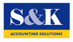
Terrific comments, thanks to everyone. My first thoughts on dealing with this ridiculous ampersand between two letters was to make it smaller but that looked as bad or worse. I thought a + sign might work which I have seen in other accounting logos but the ampersand is part of their registered name.
I mainly put this up here to see if there was a unanimous response to make the amp smaller, which there wasn't so that is good.
They wanted blue and yellow and the amp is a tint so it's still two colours and It does work well in B/W. So I'll go with putting some more tint in the amp to knock it back and I'll try some more space on the side to see if I can visually centre it better.
I'll put a couple of minor variations up soon.
Blue Velvet
Yes what you have said is exactly as I saw it.
both these have more tint. The bigger one has some extra tracking on the 'account sol'
My challenge now is to get the tint percentage right. And I am at a bit of a loss here. I want it dark enough to kill the ampersand but not so dark as it looks odd, it's 30% at the moment.
What do you guys think,
My challenge now is to get the tint percentage right. And I am at a bit of a loss here. I want it dark enough to kill the ampersand but not so dark as it looks odd, it's 30% at the moment.
What do you guys think,
Attachments
btw, here's the logo of their umbrella organisation. Which is why they chose yellow and blue. I wanted a logo that would associate with their logo without looking too blatent.
PS CanadaRam
About 20 years ago there was a huge hand painted billboard in Thailand advertising the latest Clint Eastwood movie and the L and I were indeed run together.
PS CanadaRam
About 20 years ago there was a huge hand painted billboard in Thailand advertising the latest Clint Eastwood movie and the L and I were indeed run together.
Attachments

I have to agree with the comments taking issue with the font. The K just looks way bigger than the S...I would probably feel better if the S was a bit wider. Right now the first thing I think of is Agustus Gloop after going through the pipes - his fat got all smooshed together. Would it be unreasonable or inappropriate to try out the S&K with the same font as CPA?
nbs2 said:I have to agree with the comments taking issue with the font. The K just looks way bigger than the S...I would probably feel better if the S was a bit wider. Right now the first thing I think of is Agustus Gloop after going through the pipes - his fat got all smooshed together. Would it be unreasonable or inappropriate to try out the S&K with the same font as CPA?
The problem is that K's are often bigger than S's, especially in bold and more classical fonts with serif... The font of CPA might give the same disbalance! (Compare the P and the C for instance).
S&K
(In bold Times New Roman).
But, if you compare your TNR with the original, the two are at least somewhat more balanced. I'm not denying that there will always be some imbalance (unless you use terminal...hmmmm), but I just wonder if the two letters will demand something that provides more balanceArnaud said:The problem is that K's are often bigger than S's, especially in bold and more classical fonts with serif... The font of CPA might give the same disbalance! (Compare the P and the C for instance).
S&K
(In bold Times New Roman).
dogbone said:This is the final version. There was much agonising over how to deal with the ampersand.
I would suggest adding some transparency to the ampersand. Also, can you convert the 'K' to outlines and shrink the width of the K a bit so that it's a bit more narrow (like the 'S'). It looks like the K is somewhat off in comparison to the 'S'.
Just my opinion, for what it's worth.
I don't know why I always seem to get stuck with letters that don't logo together, (is it legal to use logo as a verb?). Last time it was AAC, try it, it's a crap combination.
OK I do tend to agree with everyone, I got to this font because all the other ampersands were so fugly.
Here's a thinned down 'K' which is better balanced with the 'S' unfortunately it sort of opens up the neg K space again, or does it?
OK I do tend to agree with everyone, I got to this font because all the other ampersands were so fugly.
Here's a thinned down 'K' which is better balanced with the 'S' unfortunately it sort of opens up the neg K space again, or does it?
Attachments
Change the fonts...too much attention is on the & thats the focus point in your logo and it distracts from the name. Make it smaller or something and a yellow color would be fine.
Bless
Bless

Arnaud said:On the other hand, the ampersand in yellow would pull the attention to 1) the ampersand, 2) the "accounting solutions" and finally 3) the "S" and "K", hence the name. Isn't it a little backward order
.
The above is EXACTLY TRUE! You want your business and "name" = S K to be front and center either by size or color.
Just to throw out some ideas- (not that I agree with all of them but it might spark another idea:
What about shortening to just accounting?
Making accounting larger with solutions smaller?
Keep the & a light blue, S K a screen of the gold and make the & much smaller?
Make the S and K overlap with a small & in white or light blue- then accounting much larger?
What about changing the company name to A & S Accounting Solutions...say it fast and yout will get the joke.
Hope some of this helps.
dogbone said:How about this, I think it is an improvement. I'm never going to be able to do anything about the extra neg space to the right of the K unless I don't use an eclosing box.
I like the improvements but I still think that the accounting part is too small- If the letter part of the logo were catchy or something I would say it might be easy for people to identify with the "name" and know it is accounting, but really, I think most people will not remember the letters therefore you really need two things to happen- you need a very identifiable logo (which I think you are close to) and you need to convey the main business (acconting) very clearly.
What about making the logo just be S & K accounting and then have a short sentence that is included below or next to the logo like "Financial solutions for..." or "Financial Solutions for an ever changing world." or something like that. Then your logo is very identifiable, says your business and the extra text gives a soft message about the company.
Does this company have a niche at all or are they simply an accounting firm? That would be important to know. (I worked in advertising and marketing for 15 years before becoming an educator. If I had more time I would brainstorm more for you.)
good luck
Unfortunately their registered business name is S&K Accounting Solutions and I can't do anything about that.
It's 6:40 am here and the kookaburras have just started. I might try 'accounting solutions' on two lines and rework it tomorrow...er...later today.
It's 6:40 am here and the kookaburras have just started. I might try 'accounting solutions' on two lines and rework it tomorrow...er...later today.
If you want to draw the least attention to the ampersand, I'd suggest making it white, the same color as the S and K. That way it is blends in and is "camouflaged" by those letters.
dejo said:If you want to draw the least attention to the ampersand, I'd suggest making it white, the same color as the S and K. That way it is blends in and is "camouflaged" by those letters.
It might as well confuse more, now ? A big, white name.
What about thinning the Ampersand, i.e. keep a bold-looking typo the letters and the thinner looking typo for the Ampersand ? You can even mix different fonts, as long as they get close to each other.
I'd still keep a Serif typo though, it looks "classical and serious". A non-serif would be too modern for a company which takes care of your money... (It'd look like Enron to me !)
Proposal 251: S&K
...Ok, this one looks ugly, but you can play more with your own typos !
NB: 20 assistants, only one being really responsible for the logo... Good luck !
Register on MacRumors! This sidebar will go away, and you'll see fewer ads.