I really appreciate you guys taking an interest in this.
I couldn't sleep so I had a few more goes. The ampersand will not work as white, too confusing.
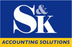
I think this latest one looks about as optically balanced as I could make it. I had to enlarge the blue copy to disguise the off centre logo (which actually appears centred, sort of) which is a good thing anyway. What makes this job even more challenging is that they have already accepted it, so I'm only doing all this for my own sake of not wanting to supply crap.
I couldn't sleep so I had a few more goes. The ampersand will not work as white, too confusing.
I think this latest one looks about as optically balanced as I could make it. I had to enlarge the blue copy to disguise the off centre logo (which actually appears centred, sort of) which is a good thing anyway. What makes this job even more challenging is that they have already accepted it, so I'm only doing all this for my own sake of not wanting to supply crap.

")