Become a MacRumors Supporter for $50/year with no ads, ability to filter front page stories, and private forums.

SpaceMagic

macrumors 68000
Original poster
Oct 26, 2003
1,744
9
Cardiff, Wales
Hi all,

Just bought myself my first dSLR. I am really happy! Got the Canon D350/XT as a starting camera. I went on a little trip, took some of my best shots and now even happier. I'm only just playing with photoshop so far and would like some photoshop/lightroom post processing help. Here's the photo:

K_nigssee_133.jpg


What do I need to do to it to make it truely, say for example, print ready?

Cheerrsss!! SpaceMagic
 

M@lew

macrumors 68000
Nov 18, 2006
1,582
0
Melbourne, Australia
It's alright at the moment. I wouldn't really say you need to do anything. The resolution is a little small though if you want a big print. Here's just a few sec playing around in Lightroom, but nothing special.
 

Attachments

  • K_nigssee_133.jpg
    K_nigssee_133.jpg
    61.9 KB · Views: 186

SpaceMagic

macrumors 68000
Original poster
Oct 26, 2003
1,744
9
Cardiff, Wales
It's full 8.2 MP, just uploaded a smaller version to my server that's all...

Thanks for the edit, looks good... perhaps a bit too energetic though for the solumness of the place?
 

netdog

macrumors 603
Feb 6, 2006
5,760
38
London
I'd clean up some of the schootz on the water. I know it's there and it's natural, but on a large print (and even on screen), it serves as noise for me and distracts me somewhat from focussing simply on the beauty of the image.

Lovely picture.
 

Spanky Deluxe

macrumors demi-god
Mar 17, 2005
5,285
1,789
London, UK
I'd say you want to try to darken part of the image to counteract the glare. Its not too glary so you haven't really lost any information so you should be able to, with a bit of fiddling darken and richen up the tones in the sunny side of the picture.
 

Lovesong

macrumors 65816
I'd agree with Spanky Deluxe. Printers tend to have a much more narrow bit depth, meaning that anything that is slightly "in the shadows" will print as pure black, and anything that is highlighted will be left as white (I'm assuming that you don't have a $7000 Fuji Pictographer, if you do, ignore what I've said, just set the color space to CYMK, and photoshop will do the rest).

The sunlight in the image is overblown to begin with, so there is litlle that you can do there. Try to extract as much info out of that part of the image as you can, and pray for the best. Here's what I would do for printing:
 

Attachments

  • K_nigssee_133.jpg
    K_nigssee_133.jpg
    997.5 KB · Views: 142

baby duck monge

macrumors 68000
Feb 16, 2003
1,570
0
Memphis, TN
I don't know about the rest of you, but a quick going-over of the really light areas with the burn tool in CS2 was able to bring detail back to more or less the entire picture (sky, mountain, water). Adjusting the levels a bit and darkening those areas (perhaps also dodging the darker areas a tad) should be sufficient for this picture, but you could always do more or less than that.
 

juanm

macrumors 68000
May 1, 2006
1,626
3,053
Fury 161
Crop the bottom and work on the channels in B&W. Instead of a dull landscape, you'll get a nice B&W panorama.
;)
 

Lovesong

macrumors 65816
I'd agree with Spanky Deluxe. Printers tend to have a much more narrow bit depth, meaning that anything that is slightly "in the shadows" will print as pure black, and anything that is highlighted will be left as white (I'm assuming that you don't have a $7000 Fuji Pictographer, if you do, ignore what I've said, just set the color space to CYMK, and photoshop will do the rest).

The sunlight in the image is overblown to begin with, so there is litlle that you can do there. Try to extract as much info out of that part of the image as you can, and pray for the best. Here's what I would do for printing:

Edit: Wow I jst looked at this at work. Note to self- never, ever, ever use your glossy MBP to do color corrections.
 

Aperture

macrumors 68000
Mar 19, 2006
1,876
0
PA
Okay using someone else's suggestion I tried it out in PS. I don't know if I feel it is over PS'd. Either way, I'm going to try again later in color.

editme.jpg
 

bocomo

macrumors 6502
Jun 29, 2007
495
0
New York
nice shot. i just cut some of the blue haze and darkened some of the outerlying areas to keep the viewer's eyes on the subject
 

Attachments

  • K_nigssee_edit.jpg
    K_nigssee_edit.jpg
    1.1 MB · Views: 102

Digital Skunk

macrumors G3
Dec 23, 2006
8,100
930
In my imagination
Any photo editors in here???? :confused:

Naw just kidding. The photo is fine the way it is really. I don't mean anything negative by it but every edit that was done is over done. Tone it and call it a day. If purple wasn't in the original don't put it in there. Wait a minute...

Edit

K_nigssee_133 edit.jpg

Original

K_nigssee_133.jpg

Yup... there isn't much to change outside of turning it into an illustration.
 

jczubach

macrumors 6502
May 15, 2007
385
0
northwest
what it's really missing is one of those Super-duper clever 'LOL'Cat captions. y'know what I mean? those really explanatory descriptions of what's really going on? there is a cat somewhere in this picture, isn't there?;)
 

MacUserSince87

macrumors member
Aug 18, 2007
74
0
Northern Virginia, USA
K_nigssee_133.jpg


What do I need to do to it to make it truely, say for example, print ready?

Cheerrsss!! SpaceMagic

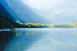
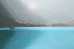
Contrast attracts the eye in a photo. In this shot, which is dark overall the eye is drawn to the bright -- empty :( -- 
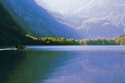
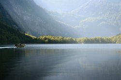
spot on the lake then up into the lighter background and up and out of the photo. What I suspect you intended as the center of interest -- the boat -- is off to the side hidden in the shadows. Better if you had waited for the boat to reach that bright patch of water in the lake; something to keep in mind next time: 1) decide on a center of interest / focal point for your shot, 2) make it contrast most (tone, color, size, sharpness) with the background tone, 3) compose it to create an interesting path in the photo to it, 4) eliminate distractions from it.

Here there's no magic trick which will help the boat pop out of the shadows but you can reduce the pull of the background by making it darker. I do this in Photoshop by duping the background layer, setting the mode of the dupe layer to "multiply" then adding a black filled mask over it. By selectively erasing the mask in the background it can be made darker and more saturated. The same technique can be used with "screen" mode to lighten areas like the boat selectively. These adjustment layers are similar to "burn" and "dodge" in their net effect but they add saturation rather than more or less gray to the existing color. A dupe masked "hard light" or "soft light" layer can also be added to adjust contrast. A little goes a long way with those two so it's necessary to scale back the effect with the opacity slider on the dupe layer.

The other main thing you can do to improve appearance is to sharpen with USM. How much to sharpen varies with size of print and subject matter but it should be done as the last step before printing or saving a copy of the unsharpened master edit file. USM increases contrast between color and tonal borders which tricks our eyes into thinking the borders are sharper. There are three numerical controls: amt, radius, threshold.

Radius controls how far on either side of the transition gets sharpened. 2. to 1.5 is a good range to start with.

Threshold controls how much difference in color/tone there must be before the sharpening will be applied. 0 sharpens everything. Above 5 only very contrasty transitions (e.g. eyelashes surrounded by skin) will get sharpened. 0 is good for landscapes like your shot. 2-4 for portraits.

Amount controls the strength of the sharpening. There's a ying/yang relationship between Amount and radius. For example I use 500, .2, 0-3 for screen images to crisp them up, but USM in the range of 150-200,.5--1.0, 0-3 for inkjet prints where the borders are less well defined due to the random overlapping of the 8 color dots.

As with most things USM is subjective and the best way to learn what works best for you is to try various methods on the same image and compare the results at various viewing distances. Viewing distance and output method are two key variables. In general the bigger and further away an image is viewed the most USM it needed to retain the overall contrast and impact of a smaller copy from reading distance. When making large prints its a good practice to make a small test of a cropped section of the full size up-res file at various USM settings and then view the tests from the same distance the full size print will be viewed.

Chuck Gardner
http://super.nova.org/DPR/
 

raptor96

macrumors regular
Nov 5, 2006
146
0
RI

This is really cool...may I ask how this was done? I'm curious as to how people manage to make their images look hyper-real.

Not to hijack this thread but I've never edited my photos though I take a lot and just cull out the ones that don't meet my standards, so I'd like to learn. So a good starting point to me would be to learn how stuff like this is done. :-D Thanks!
 

camomac

macrumors 6502a
Jan 26, 2005
778
197
Left Coast
okay, just a couple minutes, but i'll try.

see if you like...
 

Attachments

  • edit_K_nigssee_133_opt.gif
    edit_K_nigssee_133_opt.gif
    193.2 KB · Views: 94
Register on MacRumors! This sidebar will go away, and you'll see fewer ads.