Become a MacRumors Supporter for $50/year with no ads, ability to filter front page stories, and private forums.

timmillwood

macrumors 6502a
Original poster
Apr 7, 2006
955
1

Attachments

  • spun.jpg
    spun.jpg
    59.5 KB · Views: 315
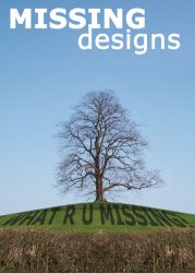
Pretty informal feedback, but...

Here is what I like:
- Colors -- vivid and striking
- Photography -- the composition of the shot is really well suited.
- Overall layout
- Text at the top

Here is what I do not like:
- The shadow "What R U Missing?" text -- it looks unprofessional and hasty -- it does not match the curve in the landscape correctly, it does not match the rest of the flyer stylistically, and I'm not sure why you want to be using sms-speak in a flyer marketed to professionals, unless you're doing it intentionally tongue-in-cheek (in which case I don't get the joke).

Hope that helps. I'd say definitely gotta do something about that shadow text.

Good luck! :)
 
i only used 'txt' speak because I am thinking about using the domain name whatrumissing.com.

I tried to get it to match the curve as best i could.

would i be better putting 'What are you missing?' as shadow text?
or
putting 'what r u missing.com' as shadow text?
or
forgetting the shadow text idea?
 
I'd vote for "What are you missing?" (or title case) at the bottom in the thicket or whatever it is. I'd get rid of the sms-speak and the curve.

Also, I'd have to go with Shecky... whatrumissing.com sounds like a social networking site or something like that. I think if you're marketing as a designer to professionals, it would not go over well. It's something you could get away with later after you had a brand identity, but right now, I think you would not be taken seriously.
 
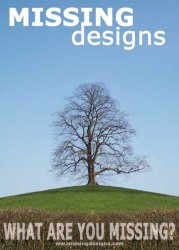
Any better?

I think this looks more 'movie poster' so may draw more interest?
 

Attachments

  • missing.jpg
    missing.jpg
    30.7 KB · Views: 199
Last one looks good - love the transparency on the bottom text.

I don't understand how the tree is in relation to the slogan? Unless its because its missing leafs?
 
So what are you missing?? With a line like that, the poster should contain witty imagery — a picture with something missing, something incomplete, etc. As it is now, I'm just not sure I get it. What does the tree have to do with any of it? Is it supposed to be missing its leaves? If so you need to make it about 100% more obvious.
 
I do design and my honest opinion is that its missing the target by a huge margin. The first thing I see is the text at the top and the tree which together says garden/landscape design, not web design as you say.

I also think the slogan should go at the top rather than the company name, and that slant/txt speak is just not a professional image. Have you got a logo, often a logo is remembered more than a company name.

On the second, although a slight improvement with the slogan I still think the same as the first one. The web address also fades into the scenery to much too.

And just out of curiosity - are you just going to work by the net or are you going to have a telephone number for the person to ring you on.

If its a flyer it needs to say what you do, most people I know who get a stylised flyer usually just throw it in the bin because they can't be bothered to work out what its for.
 
Well i like the picture and the Missing designs name is relating to the company having all the designs you are missing.

I guess it is the tree missing the leaves.

I would explain on the back what i offer, pricing etc

I was planning on using the name in that layout as the logo

U got any suggestions?
 
The more I think about it the more it has holes not just with the design but the concept. The whole leaf/tree idea is doesn't mesh with your marketing slogan.

Are the leaves missing or are they not needed at the time? Tree's leaves don't go missing in real life but are just not necessary due to dormancy and then the reproduce them as needed on their own.
 
I think the concept has potential, but you might have to find a way to bring it home a little harder.

I had an idea of a watch without a face, perhaps a shoe without shoe laces ... something simple where people can easily notice exactly what's missing.
 
I think the concept has potential, but you might have to find a way to bring it home a little harder.

I had an idea of a watch without a face, perhaps a shoe without shoe laces ... something simple where people can easily notice exactly what's missing.

I think you finished my thoughts in words - sorry it is late but thank you
 
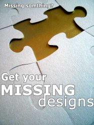
I really like the tree photo, but this one goes better with the name.

could try something with this photo http://www.sxc.hu/photo/46295

EDIT: only thing i dont think about this design in the text, i will have to look at colours
 

Attachments

  • missing.jpg
    missing.jpg
    38.7 KB · Views: 169
I think the concept has potential, but you might have to find a way to bring it home a little harder.

I had an idea of a watch without a face, perhaps a shoe without shoe laces ... something simple where people can easily notice exactly what's missing.

eg, Britney with no hair, or Paris with no knickers! ha ha!
 
timmillwood said:
U got any suggestions?
yep got plenty if you want to pay me :)

I really like the tree photo, but this one goes better with the name.

could try something with this photo http://www.sxc.hu/photo/46295

EDIT: only thing i dont think about this design in the text, i will have to look at colours

Better, still needs more info but if thats on the back then thats ok. Now I may be overly picky here but look at the text placement, the top text is very close to the cut out of the jigsaw and the bottom text is too close to the right in relation to the left and the edge of the page. If youre using photoshop put a guideline at say 5mm from each edge and keep within those guides.
 
I really like the tree photo, but this one goes better with the name.

could try something with this photo http://www.sxc.hu/photo/46295

EDIT: only thing i dont think about this design in the text, i will have to look at colours

I would pull probably a 1/8" - 1/4" margin on your sides (at least on your text; I come from a print design background) and I would at least make sure your text lines up on the left hand side, I think that would be more visually appealing.

You might also go into photoshop and mess with your puzzle image. I would probably just select the yellow puzzle piece and make it a new layer via cut, then drop a black square over the whole thing (with the yellow image on top of it all), and change the opacity of the black square to see if you can make them a little bit of a darker grey, I think that would give you the contrast you need for your font.
 
well, here are my suggestions. As far as this being a design company thing...I don't think it's quite there yet. I mean, i think your type is too big. If anything the "what are you missing" should be the biggest thing on there (i'm assuming it is like a tagline) and the "missing designs" should be smaller, and somewhere a little less in the middle of everything. I mean, if that is the name of this "company", shouldn't it be a logo? Have you tried coming up with a logo? To me, that would be my first step before designing a flyer.f

On to the concept...
concept is good, but you need better photography. The tree pic is quite nice, but to me it doen'st have anything to with this. The puzzel pic to me is a little better, but is also very expected. Think outside the box a little. Think everyday objects that without one part of them would look completely wrong. You could even take it even further and make it about color. Like a picture of an orange, that is in greyscale. Not quite as pretty, or obvious, but would still get the point across. I mean, people would recognize it as an orange...but without the color it would still look like it was missing something. You could even tie that into your website and have a simple flash intro that showed the b&w orange and asked the viewer "what are you missing?". Then the orange would pop up in color and immediately people would think "color". This could even be a series, where you cover other design principles. I don't kow...just thinking outoud.

-JE
 
Think outside the box a little. Think everyday objects that without one part of them would look completely wrong. You could even take it even further and make it about color. Like a picture of an orange, that is in greyscale. Not quite as pretty, or obvious, but would still get the point across. I mean, people would recognize it as an orange...but without the color it would still look like it was missing something. You could even tie that into your website and have a simple flash intro that showed the b&w orange and asked the viewer "what are you missing?". Then the orange would pop up in color and immediately people would think "color". This could even be a series, where you cover other design principles. I don't kow...just thinking outoud.

-JE

I actually like the orange idea a lot, it's subtle, but with the flash it becomes obvious.
 
Register on MacRumors! This sidebar will go away, and you'll see fewer ads.