Become a MacRumors Supporter for $50/year with no ads, ability to filter front page stories, and private forums.

JohnMC

macrumors 6502
Original poster
May 5, 2006
386
1
Duluth, MN
Here is the official thread for our second Fortnightly Challenge. The topic is Texture(s), interpret that any way you like. Please remember the point of the challenge is to get out (or in), take photographs, and improve upon our skill sets. If you post pictures you have taken in the past, you only cheat yourself.


Rules

The rules are open for debate at any time although a consensus will be sought before making changes. The preference is to create a broad but flexible framework to work within.

Submission rules:
1. Members must produce the artwork they submit (limit 3 images).
2. The photo(s) must be created during the challenge period.
3. Submissions should be posted in the challenge thread for that time.


Comments/critique/discussion:
1. Discussion can begin at any point in the thread.
2. You are expected to give comments and critique images in the current thread if you submit images.
3. Comments, critiques and discussion most be constructive, objective and aimed at improving the quality of the artwork.


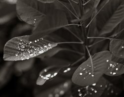
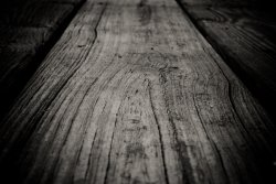
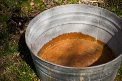
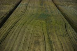
The topic for this two week challenge is: Texture(s)
The challenge will run from right now until 11:59PM CDT Aug 11.

Challenge topics:
1. Suggestions for the bi-weekly's challenge are made in a single thread which will be set up two weeks before.
2. The challenge topic will be voted on by all members (although only those intending to submit pictures should vote).


Lets have Fun!!!
 

bootedbear

macrumors 6502
Sep 13, 2004
373
1
Austin, TX
Tart!

IMG_3664.840.jpg
 

Chappers

macrumors 68020
Aug 12, 2003
2,247
1
At home

I like this - it certainly makes me salivate and my 3 year old who loves lemons and limes was keen. My only thought is that it is slightly overblown and therefore my attention is drawn to the lime in the middle but not for the right reason.

Where was it taken - my son wants to go.
 

deep diver

macrumors 68030
Jan 17, 2008
2,709
4,502
Philadelphia.
I've been shooting gems and minerals for the past few years. It can be pretty challenging and a lot of the character of the mineral does not come out except with the flash.

Sometimes the texture is tactile -- in the form of the mineral. Sometimes the texture is in the coloration and, therefore, strictly visual.

The first image is hematite, an iron oxide.
The second is native copper.
The third is cacoxenite -- asecondary mineral found in oxidized zones of phosphatic magnetite deposits, in novaculites, in phosphate-rich pegmatites, and rarely in iron-rich sediments and soils.

You need to look at the full sized images. There is too much lost in the thumbnails.
 

Attachments

  • Hematite WM8x10.jpg
    Hematite WM8x10.jpg
    1 MB · Views: 116
  • Copper 1000.jpg
    Copper 1000.jpg
    941.7 KB · Views: 126
  • Cacoxenite 5.jpg
    Cacoxenite 5.jpg
    938.2 KB · Views: 134

deep diver

macrumors 68030
Jan 17, 2008
2,709
4,502
Philadelphia.
bootedbear --
I agree that the limes, as they are, don't quite work for me. I do not think it is overblown. My problem is that it is only that one piece of lime that is in focus. The lack of focus obscures most of the texture in the overall image.

Chappers --
I think I get what you were going for in the leaves. I love the variety of textures in the leaves, berries, and wall. My eye keeps getting drawn to the middle where I see a big patch of brighter red with a fairly flat texture. I have to make my eye go to the more textured parts of the image. I think this could be a really good image if it were framed or cropped differently.
The water, on the other hand, is outstanding. It has great movement and flow. The variations in the lighting and larger ripples, and the subtleties of the smaller ripples give the image an exceptional depth. Very well done.
 

jrm27

macrumors 6502a
Jan 3, 2008
579
31
Corrugated Concrete

2952769103_5697208a84_o.jpg


Bootedbear: I love the texture of the limes that you can pick up...kinda slick on the fruit, and rough on the peel nice.

Chappers: I can almost feel the water. Nice! I think a tighter crop on the leaves would give more of the "texture" feel of the leaves.. maybe across the center where you have so many different colors coming into play. Nice work!
 

Chappers

macrumors 68020
Aug 12, 2003
2,247
1
At home
Corrugated Concrete


Bootedbear: I love the texture of the limes that you can pick up...kinda slick on the fruit, and rough on the peel nice.

Chappers: I can almost feel the water. Nice! I think a tighter crop on the leaves would give more of the "texture" feel of the leaves.. maybe across the center where you have so many different colors coming into play. Nice work!

That's an interesting photo - it's not something I'd normally like (concrete) but I love the texture and perspective on this - it makes my eyes go dizzy.

deep diver - great shots as always from you with amazing texture - the only downside for me is the colour - but that's just a personal thing on otherwise flawless photos.

As for my red leaves - the light wasn't great and I was rushed, never a good combination - I've tried various things on the few shots I have but it doesn't quite work. Thanks for the feed back though. I've found a new plant in better conditions - just waiting for it to happen.
 

bootedbear

macrumors 6502
Sep 13, 2004
373
1
Austin, TX
Chappers:
3764781133_55b182e8bb_b.jpg

I like this one a lot for the subject matter -- the texture almost looks "oily".

deep diver: the mineral shots are impressive -- the cacoxenite is especially interesting. Is it really growing downwards or is the photo inverted to give it interest?

jrm27: I like this shot a lot. Makes me want to run along it with my hand -- and then I'd probably be sorry.
 

deep diver

macrumors 68030
Jan 17, 2008
2,709
4,502
Philadelphia.
Chappers: I completely agree about the color on the hematite and copper. Other than cropping, I will not do any PP on my gem/mineral images. The color of the iron oxide is flat, and it is what it is. There are some interesting colorations you can see on the full size image, but there is no way to punch up that color. Sometimes colors will come out because of the flash. I had hoped some richer metallic tones would have come out of the copper but it just did not happen.

bootedbear: the "hairs" (for lack of a better description) are the natural mineral structure of the cacoxenite. This particular specimen developed within a specimen of quartz. The coloration is, therefore, internal to the larger specimen. This is what I was referring to when I said the texture is strictly visual. Here is the full specimen.

BTW, can you deliver some of that limeade to Cleveland???????????
 

Attachments

  • xDSC_2708.jpg
    xDSC_2708.jpg
    728.1 KB · Views: 92

Chappers

macrumors 68020
Aug 12, 2003
2,247
1
At home
Chappers: I completely agree about the color on the hematite and copper. Other than cropping, I will not do any PP on my gem/mineral images. The color of the iron oxide is flat, and it is what it is. There are some interesting colorations you can see on the full size image, but there is no way to punch up that color. Sometimes colors will come out because of the flash. I had hoped some richer metallic tones would have come out of the copper but it just did not happen.

I just have a thing about brown - sad but true. :eek:

I'm most attracted to the full specimen of cacoxenite and think a crop of that to bring in some of the surrounding rock would be interesting. I certainly wouldn't want any PP on them - your pics are great - keep it natural that's what I say.
 

deep diver

macrumors 68030
Jan 17, 2008
2,709
4,502
Philadelphia.
jrm27 -- great picture. The ribs take my eye all the way across the picture. I like shots like this.

salvatore -- also a great picture. I love the texture in the moss and the contrast with the stone. It reminds me of one of my favorite folk/protest songs called "G-d Bless the Grass." (lyrics at http://www.wku.edu/~smithch/MALVINA/mr053.htm). The only thing that bothers me is the out of focus spot on the bottom left. Even though it is on the fringe, my eye keeps going there -- don't know why. I tried cropping it out both horizontally and vertically. Both changed the composition enough that it did not look good. If you used a smaller aperature or shot from a greater distance with a longer lens, the the background would be too much in focus and that would also take away. I'd love to see this same shot but reframed a bit.
 

Abraxsis

macrumors 6502
Sep 23, 2003
425
11
Kentucky
Here are my entries. It wasn't till I was resizing them that I noticed a theme. I give you WWW. Wood, Water, and Washtubs, lol.

As for the other images here.

jrm27. I LOVE the corrugated cement, the angle at which is was taken makes for good relief.

Bootedbear, The limes are a little blown out IMO, but the composition is nice. Maybe a contrasting cloth underneath, but I cant make up my mind on that one.

Chappers, your water shot is great, such fluidity. The rocks is a great still life image. I like how the little beams of light are around the rocks.

salvatore, I like the moss shot, maybe sat the greens just a little to bring
more weight to the bottom of the image. Otherwise, I likes.

deepdiver, love the mineral macros, theyre lovely. Nice rich color, you really capture the luminosity of the specimens.
 

Attachments

  • drops.jpg
    drops.jpg
    458.9 KB · Views: 85
  • deck.jpg
    deck.jpg
    526 KB · Views: 88
  • tub.jpg
    tub.jpg
    999.9 KB · Views: 96

deep diver

macrumors 68030
Jan 17, 2008
2,709
4,502
Philadelphia.
Chappers - another great image. I really like the way the black marbled stone (just NE of center) stands out. Excellent composition with these multiple textures.

psxguru - beautiful, period.

Abraxsis - the plank is an interesting effort that does not work well for me. Between the DOF perspective, B&W, and vignetting there is just too much "technique" going on for me. I would love to see this with same DOF perspective but in color (which provides much of the visual texture in wood) and without the vignetting. The tub has a lot of potential but I think there is too much in there and my eye doesn't know where to go. The leaves and droplets are amazing. The shape and softness of the droplets are such a great contrast to the shape and stiffness of the leaves. Great job.
 

Abraxsis

macrumors 6502
Sep 23, 2003
425
11
Kentucky
Abraxsis - the plank is an interesting effort that does not work well for me. Between the DOF perspective, B&W, and vignetting there is just too much "technique" going on for me. I would love to see this with same DOF perspective but in color (which provides much of the visual texture in wood) and without the vignetting. The tub has a lot of potential but I think there is too much in there and my eye doesn't know where to go. The leaves and droplets are amazing. The shape and softness of the droplets are such a great contrast to the shape and stiffness of the leaves. Great job.

Just thought I would let you see the wood image without the heavy processing I took it through. The image was taken for the purpose of "fine art" this week, and just thought it would make a good addition here as well. IMO it lacks something in the original form, becomes to "flat" for my personal tastes.

As for the washtub, I can only blame my education. I hold Graduate degrees in Psychology and Sociology, and it plays into my photography quite often. It's human nature for the eye to be drawn to the reds/oranges because most often, even in nature, these signal danger. Personally, I felt that the eye would b drawn to the huge swath of red rust first, and then the rings of the wash tub would draw the eye out to the more boring portions of the image. Perhaps instead of leaving those outer areas in I should toy with the idea of cropping them out to increase the overall level of interestingness of the shot.

Thanks for the input, it was helpful.
 

Attachments

  • 20090710-DSC_0099-1.jpg
    20090710-DSC_0099-1.jpg
    531.6 KB · Views: 85

deep diver

macrumors 68030
Jan 17, 2008
2,709
4,502
Philadelphia.
Just thought I would let you see the wood image without the heavy processing I took it through. The image was taken for the purpose of "fine art" this week, and just thought it would make a good addition here as well. IMO it lacks something in the original form, becomes to "flat" for my personal tastes.

I see what you mean about it being flat, but there is a lot of interesting stuff in the color between the wood, the moss, and the paint. I think the DOF perspective is what limits this the most. There is such a small section that is in focus it is hard for me to get a feel for the richness of the texture. I think a greater area of focus, lightening the highlights would, and keeping it in color would likely draw me in.


As for the washtub, I can only blame my education. I hold Graduate degrees in Psychology and Sociology, and it plays into my photography quite often. It's human nature for the eye to be drawn to the reds/oranges because most often, even in nature, these signal danger. Personally, I felt that the eye would b drawn to the huge swath of red rust first, and then the rings of the wash tub would draw the eye out to the more boring portions of the image. Perhaps instead of leaving those outer areas in I should toy with the idea of cropping them out to increase the overall level of interestingness of the shot.

I'm a therapist. I guess we could discuss the imagery and meaning in these things all day.:D
 

Chappers

macrumors 68020
Aug 12, 2003
2,247
1
At home
I see what you mean about it being flat, but there is a lot of interesting stuff in the color between the wood, the moss, and the paint. I think the DOF perspective is what limits this the most. There is such a small section that is in focus it is hard for me to get a feel for the richness of the texture. I think a greater area of focus, lightening the highlights would, and keeping it in color would likely draw me in.

I've got to agree with deep diver on this and psxguru's painted lady - its beautiful.

On a side note - this thread needs some help to get more people involved.
I think we should scrap the rules and just have a theme.
 

deep diver

macrumors 68030
Jan 17, 2008
2,709
4,502
Philadelphia.
On a side note - this thread needs some help to get more people involved. I think we should scrap the rules and just have a theme.

I agree but with one exception. I still think we should only be able to submit our own work.

Also, is it kosher to let folks know about this forum by posting messages in related sites?
 

JohnMC

macrumors 6502
Original poster
May 5, 2006
386
1
Duluth, MN
I agree but with one exception. I still think we should only be able to submit our own work.

Also, is it kosher to let folks know about this forum by posting messages in related sites?

Why do you think we should scrap the rules? We started with three times as many. The idea behind the challenge (and the reason it is called such) is to promote growth in photography by getting out and photographing new things. If we allow people to simply summit work they have already done this would become a C&C thread, which we already have. Discussion is good, let it continue, I would be interested in what others have to say.

deep diver, I don't see why links can't be posted on other sites. I don't think it would be a violation of forum rules to do so, just don't go spamming other sites as that would not be good PR.

JohnMC

BTW, I'll get around to posting my photo as soon as I can (I took it while out in Yellowstone this week.)
 

Chappers

macrumors 68020
Aug 12, 2003
2,247
1
At home
Why do you think we should scrap the rules

Well to be honest hardly anyone is posting and there is still a wall of rules.

I think its off putting.

Maybe this would be better

1. Theme for challenge
2. Post your own work
3. Try and post work produced within the challenge period. (not a golden rule.

My reason behind my number 3 is : its not always possible (I'm a full time dad) to get out and shot even within the 2 week period. Discussion on other on-topic work produced before the challenge dates is just as valid and just as useful.

I think the thing that separates this thread is the theme, and C&C. Other threads either have a theme or have C&C - you have both.

I have supported the thread as I think it's a great idea but as it stands - not much is happening.
 

Designer Dale

macrumors 68040
Mar 25, 2009
3,950
101
Folding space
From my new Panasonic Lumix fs15. It was hard to shoot texture with this little thing. No PP other than size and resolution. The native file was 120dpi. It could use a better black, I think.

Dale
 

Attachments

  • P1000011.jpg
    P1000011.jpg
    1 MB · Views: 98
Register on MacRumors! This sidebar will go away, and you'll see fewer ads.