Become a MacRumors Supporter for $50/year with no ads, ability to filter front page stories, and private forums.
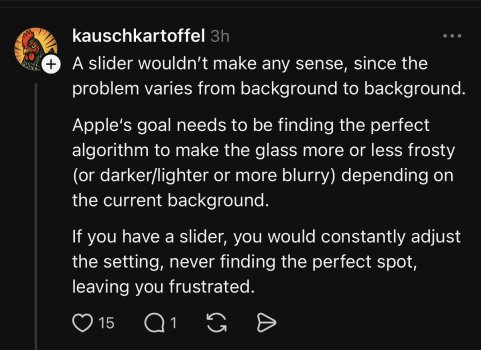
I saw this on Threads. I assume it came from the same types who do hardware mockups but don’t know the first thing about hardware engineering. I’m just going to take a wild guess that the Liquid Glass UI is quite complex and not something that can be easily dialed up or down in settings.

Every time I open Threads or Reddit I wish Apple would lock down who can access developer betas. I saw a post on Reddit yesterday lamenting Apple supposedly abandoning Liquid Glass. Sigh.
 
I saw this on Threads. I assume it came from the same types who do hardware mockups but don’t know the first thing about hardware engineering. I’m just going to take a wild guess that the Liquid Glass UI is quite complex and not something that can be easily dialed up or down in settings.

All the refraction and lens effects are still there they just made the front layer more opaque so labels are more legible. When pb1 comes out they’ll get a wider range of feedback and can make better decisions about what the majority of their users want but Apple isn’t likely to design the main style to appease the 13 year olds crying about any change from db1 and make a majority of users dig through menus to reduce transparency or whatever. In the meantime db3 is thankfully less buggy than db2.
 
I don’t really care about what the phone looks like, whether I have rounded icons or square icons or how opaque the liquid glass effect is.

I wonder how rare people like me are, people who just want a stable phone that works without bugs.

I must be in a microscopically small minority, judging from the amount of time and effort Apple is putting into things that aren’t “make the phone work properly”.
 
I love db3. It's looking more and more like a deliberate UI change rather than a janky and chaotic Android theme. I hope they continue refining it in this direction. Lock screen and control center in particular look lovely.

I’m of the complete opposite opinion funnily enough. I think a lot of the Beta 3 changes are trying to put one leg in each bucket: they want the conspicuous definition of the old paradigm with a couple of the Liquid Glass treatments slapped on top so they can claim it’s still Liquid Glass. The lack of decisive identity feels more “janky and chaotic” than ever before. IOS 7 was bold because the transition from one design language to another was aggressive; that’s always going to be jarring for a lot of people but it doesn’t mean it was the wrong thing to do.

Loosely speaking I think there’s two camps of people. The first think of Liquid Glass as a “new coat of paint” and the second think it’s a new UI paradigm. The difference between them is whether or not you think Liquid Glass is functionally different from what we had before. I’m in the second camp because I believe from a functional perspective it enables a unique UI state: elements exist but disappear from your peripheral vision, they are maximally tuned to be as least blocking as possible. Once you add more frosting, tinting, etc. they no longer serve that purpose — they are back to being ever-present, distinct ‘blocks’ of UI which always occupy your peripheral vision.

Let me be clear: I do not believe the refraction and lensing effects were made for neat eye candy, they are there to enable a functional UI change. The transparency and ‘disappearing’ nature of Liquid Glass IS the defining quality of the whole thing; once you remove it it’s no longer Liquid Glass, it’s just iOS 18 with a pointless fancier background blur — aka, jank.

Change in function (most noticeable in the initial versions of Liquid Glass) will require a new learning curve because the UI (on meta level) no longer aligns with the mental model. I remember the first couple days with Liquid Glass felt a little strange but I got used to it quickly and that’s when it fully clicked. That’s also why I’m defending it so much because I genuinely believe it’s setting a precedent for something great but a lot of the reactions are coming from static screenshots and people freaking out because something “feels off.” It’s valid to not like it and think there’s a readability problem, there were bugs in db1, but Apple’s solution went too far and now Liquid Glass is no longer glass. Readability bugs aside, I don’t think the right move is to pander to people that don’t find it comfortable, they will come around like they did for iOS 7.

I was looking forward to something new and exiting and honestly, at the end of the day liquid glass is just a new coat of paint. Some things are different and will change the way apps look and feel. The floaty menus, morphing buttons etc. This is a bigger change than the texture of the menus. And no matter how it looks in September they will iterate in the coming years with opacity, colors and shading. I believe though the style of the apps will stay for while.

This obsession with showing the content got way out of hand. Sometimes the menus and buttons in a app is the content and I sure want to see them clearly. All apps are not photo albums or websites.

Apples demo videos look good because they are in motion. I’m not always scrolling in an app. As soon as you stop scrolling the UI looked like when you mix different colored clay and many times this combination made text unreadable.

The supposed goal was UI that was not in the way. Most of the time it still is and more so than before. Look att media controls for video. Before the middle buttons for skip and play pause where simple glyphs. Now they are a drop of glas shimmering and refracting the content. Just to show off this new effect.

With that said. People like different things and that’s fine. In my opinion beta 1 was ugly. My biggest issue though is their reasoning for doing it. Thankfully they are starting to come to their senses.
 
Earth is NOT flat, no matter what flat design fanboys or Jony Ive think about that. Earth is round, beautiful, colorful, with tons of natural looking shapes and imperfections.

Minimalism must die. Acidic, unnatural colors in UI must also die. Or Apple will eventually die, people will realize they don’t need to waste this much money for something that looks same as 5 or 10 years ago.

It is not “functional design”, it is a boring design that really makes us not want to use our devices for longer.

The problem is that Apple is not only backing down on design, they haven’t really went further. They stay at the same place.

The settings app, the settings icons that are across whole system have horrible, ugly and acidic colors. Each time I need to visit settings app I have to endure and it turns into whole quest to find the exact icon I need, because how else am I supposed to find setting? Hopefully there is search, but why visual cues are no more important?

1752050312276.jpeg
 
  • Angry
Reactions: DennisdeWit
Try having a chronic disease that messes up your vestibular system. We’re not crybabies that hate change. We are people who want to use their iPhone without getting sick.
I mean I am short-sighted for **** knows how many years, maybe ever since the first iPhone came out. And when Apple changed everything that was so good about iPhone in iOS 7 in 2013, not a single “crybaby” except me said anything about that! People all around said how good and functional this digital bauhaus is. That was the day when my already poor vision said “f that, I am quitting the chat”. And I have been trying to endure all of this mess with zero digital cues and humongous eye strain for more than 10 years already. It sorta became more useable when they added night shift and dark mode tho, but is is far from ideal.

The problem is not in the UI, there was zero reason to change liquid glass to frosted glass. The problem is with the ugly, flat and acidic colored UI elements that paired with bad animations can cause motion sickness. The lack of visual cues adds up as it is very hard to navigate the system without having to look at the screen. With ever-increasing UI complexity and new options added every year it makes it almost impossible.

Smh I still can use old iPhone 4 with iOS 5 without even having to look at phone display. Maybe Scott Forstall was right after all?

1752051454076.jpeg
 
iOS 7 was a complete overhaul of the ui by one of the best designers in the world (Ive). Apple just doesn’t have that level of talent anymore
It was ugly tho. Very ugly. And we still haven’t recovered from this “world best designer’s” creation. Liquid Glass is just a sticker they put over already aged, outdated UI aesthetic that looks like early computer interfaces from late 1970s
 
  • Like
  • Love
Reactions: Mr_Ed and Macbookey
I mean I am short-sighted for **** knows how many years, maybe ever since the first iPhone came out. And when Apple changed everything that was so good about iPhone in iOS 7 in 2013, not a single “crybaby” except me said anything about that! People all around said how good and functional this digital bauhaus is. That was the day when my already poor vision said “f that, I am quitting the chat”. And I have been trying to endure all of this mess with zero digital cues and humongous eye strain for more than 10 years already. It sorta became more useable when they added night shift and dark mode tho, but is is far from ideal.

The problem is not in the UI, there was zero reason to change liquid glass to frosted glass. The problem is with the ugly, flat and acidic colored UI elements that paired with bad animations can cause motion sickness. The lack of visual cues adds up as it is very hard to navigate the system without having to look at the screen. With ever-increasing UI complexity and new options added every year it makes it almost impossible.

Smh I still can use old iPhone 4 with iOS 5 without even having to look at phone display. Maybe Scott Forstall was right after all?

View attachment 2527283
Even in 2025, pre-iOS 7 era still looks so much better. The home screen is so much better looking compared with today iOS.
 
I don't know, imho they should just make a design that's legible for everyone who doesn't have a vision impairment apart from near-/farsightedness (with glasses) - everything else would just be bad design. We'll see (or not) what comes out of it in the end.
 
  • Like
Reactions: Mr_Ed
Another whole thread about a dev beta. Which has been changing with each version. As they should, they're beta versions.

I'm glad people at MR have so few problems in their lives, that they have the bandwidth to focus on this like it's the end of the world.
 
I don't know, imho they should just make a design that's legible for everyone who doesn't have a vision impairment apart from near-/farsightedness (with glasses) - everything else would just be bad design. We'll see (or not) what comes out of it in the end.

Apple’s design philosophy since iOS 7 has been to emphasize the content of your screen rather than make the ui a showy ornamentation that competes with it. Liquid Glass in this respect is the opposite of that. You can see through it to glimpse your content more but so far it seems to requires more concentration for people to understand what they’re seeing. Db3 is better in this respect but it’s still competing with your content more than 18.x which seems misguided. People like eye candy when they get something new though, c’est la vie.

I don’t know what the guy who thinks he should be able to use a screen without looking at it is on about but that may be medical issues unrelated to how most people use a phone. I know there were some people who had trouble with the oled screens Apple is using in iPhones now but it doesn’t seem like any of the various accessibility settings solves that for people so it’s probably not related to the ui.
 
They will never do that. Apple is allergic to options. They'll double down on this inherently bad design and keep making it worse somehow. They had so many other ways to go about radically changing the UI design but they chose this. I mean WTF.
 
I'd like to be able to toggle it off. If it is such a great innovation then almost no one will turn liquid glass off.

I don't care about cosmetic changes unless they affect me - I can use iOS18 without wearing my glasses so I rarely have them on me. I've turned off automatic updates and will wait and see - maybe to Best Buy when it is out. I have no intention of having to wear my glasses just to use a phone.
 
  • Like
Reactions: zeus423
What made Liquid Glass so great is that Liquid Glass elements had practically no silhouette unless you were directly looking at them. They had no color either. It was the bending of light behind and around them that gave them definition. That's what made the illusion work; that's why Apple's apps with full Liquid Glass adoption felt more content focused than ever. That's why the same exact material worked in both light and dark environments. Elements "disappeared" unless you were looking directly at them. It looked gorgeous, there was a tangible sense of crystalline physicality to it like real glass.

Beta 3 light mode took that philosophy and shoved it out the window. WHY!?

Suddenly many of the elements have transformed into grotesque frankensteins of pre and post liquid glass design philosophy. They have presence again, and not in a good way. Control center buttons turned into grey goo, it's the worst it has ever looked. Light mode elements in many cases look too much like white shapes with a slight transparency effect. Dark mode has been given the same cowardly treatment with a black tint. BLACK GREY and WHITE being the key words here because Liquid Glass elements should NOT have any discernible color in their default state, they should be GLASS. They should not convey weight and presence, they should be weightless and transparent. They should not call attention to themselves and their silhouette at all times, they should give way to content as much as possible.

Cowards. This was supposed to be a courage moment where they double down on their ideas. I am so disappointed. These changes should have been optional toggles for those with vision problems.
This 👆 What is so hard to read about LG elements? Photos app has such a good use case for it. The elements are clearly there when you look at them for an action. Otherwise, they are secondary to the content.
IMG_2219.jpeg


My only gripe is the use of accent colors for nav bar icons and text. Why do they need to have an accent color when they are already outlined showing active status? I think this is the Achilles heel of the otherwise smart color adaptation. The system can switch between black and white depending on the content behind, but it doesn’t take the accent color into account. That’s where I would agree legibility can be poor.
IMG_2220.jpeg

[edit: fixed typo]
 
Liquid Glass feels like a (half-hearted) solution to the long-lost elements of depth and personality.

Aqua worked well because it communicated depth through texture and shadow without sacrificing legibility. UI was clearly distinct from content. And it was distinctly beautiful and unique. Those aspects got lost in the jump to flat design.

Liquid Glass planted a seed of new personality and does bring back depth, but I'm worried there'll be no happy medium if they do it though the transparency alone. If it's transparent it's beautiful but hard to read, but if it's too frosted it'll feel like the flat style it was meant to replace.

Honestly even in DB1 I felt like they could have committed even harder to a new visual identity... it still felt like they were playing it safe. At least it was a step into a new direction and I really hope that continues to develop and doesn't get walked all the way back.
 
Last edited:
This 👆 What is so hard to read about LG elements? Photos app has such a good use case for it. The elements are clearly there when you look at them for an action. Otherwise, they are secondary to the content.
View attachment 2527493

My only gripe is the use of accent colors for nav bar icons and text. Why do they need to have an accent color when they are already outlined showing active status? I think this is the Achilles heel of the otherwise smart color adaptation. The system can switch between black and white depending on the content behind, but it doesn’t take the accent color into account. That’s where I would agree legibility can be poor.
View attachment 2527494
[edit: fixed typo]
Library is hard to read in the second screenshot
 
Library is hard to read in the second screenshot
Agreed. I feel that’s a problem with the default nav bar tinting for the active view. It needs to be white or black to contrast with the background; not dark blue against a dark background. That color choice isn’t Liquid Glass, but Liquid Glass gets blamed.
 
They are the same. The only difference is that it looks different. And in this case, it looks bad.
 
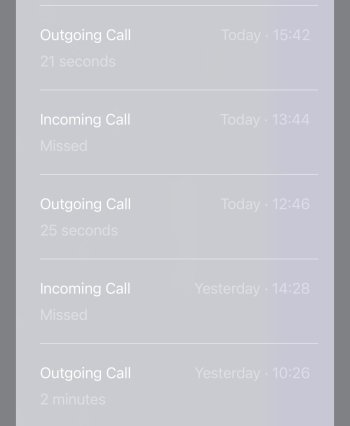
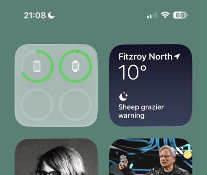
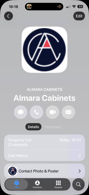
Using B3, I'm really surprised at some of the lousy graphics, particularly white and light grey text on grey backgrounds, as shown in the files attached. Pretty hard to comprehend how something this bad gets out into the field. And yes, I realise it's a beta.
 

Attachments

  • IMG_2576.jpeg
    IMG_2576.jpeg
    92.7 KB · Views: 46
  • IMG_2578.jpeg
    IMG_2578.jpeg
    141.7 KB · Views: 43
  • IMG_2575.PNG
    IMG_2575.PNG
    590.1 KB · Views: 45
Register on MacRumors! This sidebar will go away, and you'll see fewer ads.